. . . : : Font Forge / Type Specimens
“I began to see the dark and the light simultaneously giving me insight into the love language of letterform lockups and ligatures. During my senior year in high school my AP Art concentration was ‘stencils applied across various media.’ Graphic design was in my DNA.”
V I N S O N D E S I G N / A H I S T O R Y I N T Y P O G R A P H Y / 1 9 9 4 – 2 0 2 6
. : .
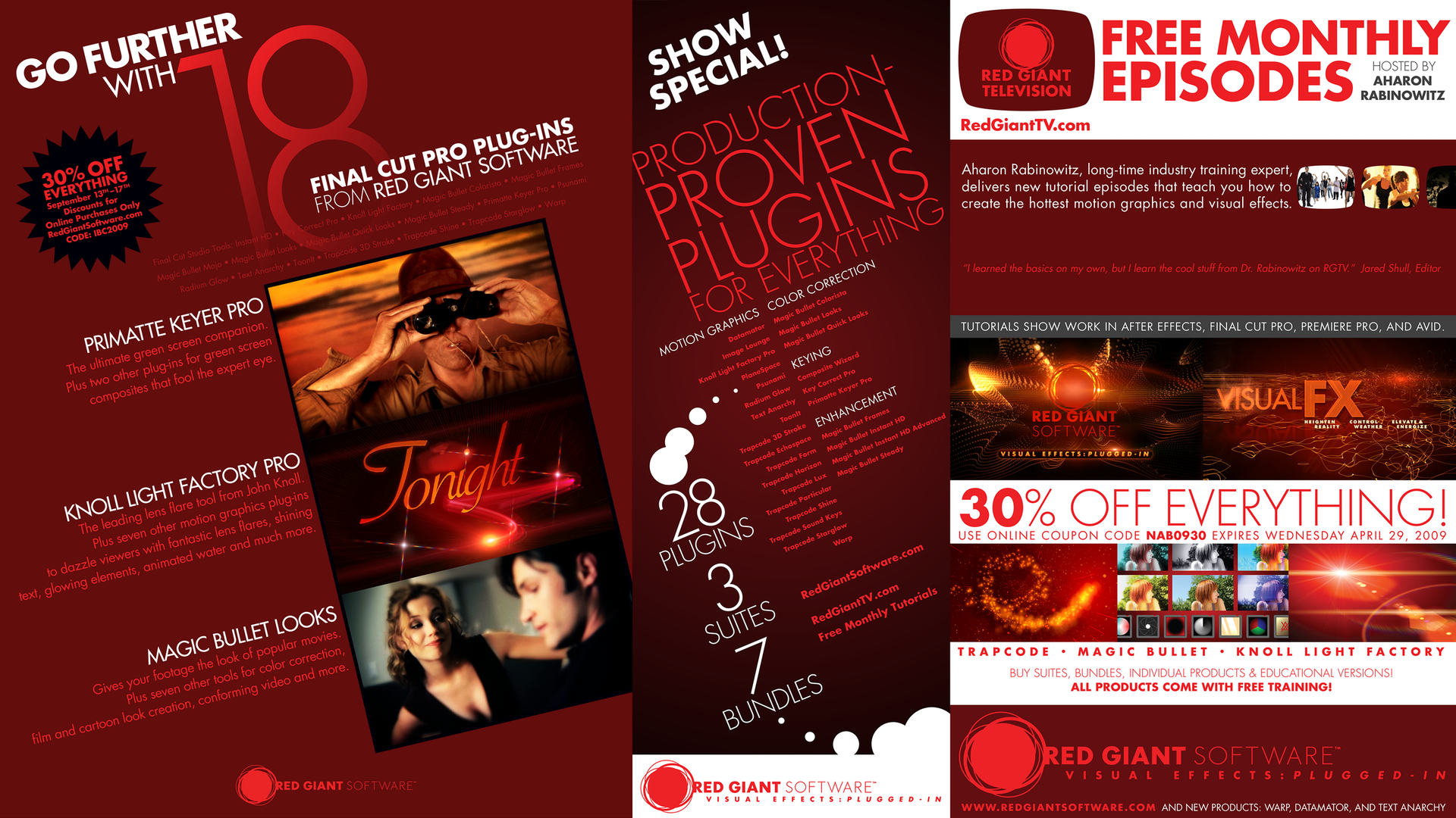
R E D G I A N T S O F T W A R E M A R K E T I N G T O O L K I T / 2 0 0 9
. : .

R U S S E L L A T H L E T I C R E T A I L T A G S / 2 0 0 1
. : .
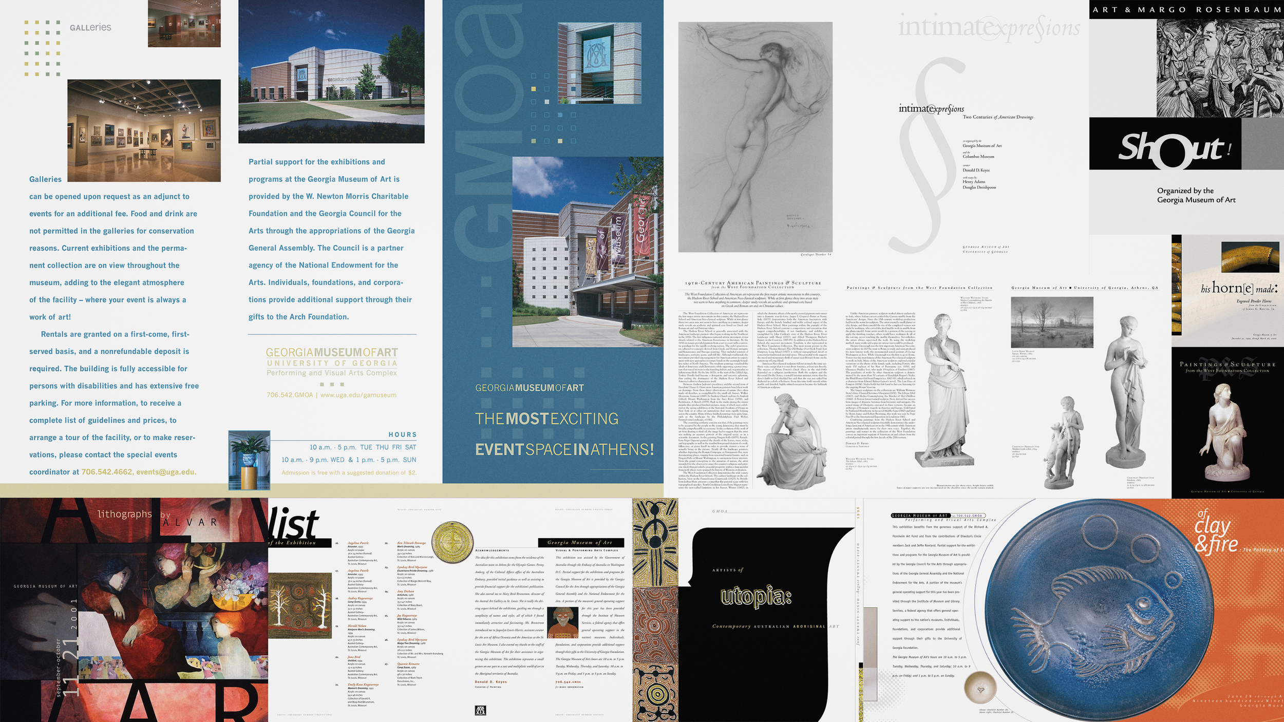
G E O R G I A M U S E U M A R T E X H I B I T I O N C H E C K L I S T S A N D B R O C H U R E S / 1 9 9 4 – 2 0 1 5
. : .

N B A T V O P E N C O U R T T Y P E A N D L A Y O U T S T U D I E S / 2 0 1 3
. : .
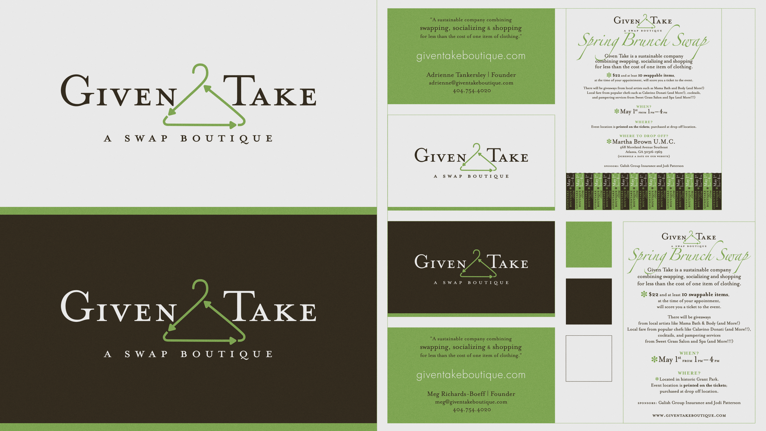
G I V E N T A K E A : S W A P B O U T I Q U E I D E N T I T Y / 2 0 1 3
. : .

Z A X W E R K S , I N C O R P O R A T E D I D E N T I T Y / 2 0 0 0
. : .
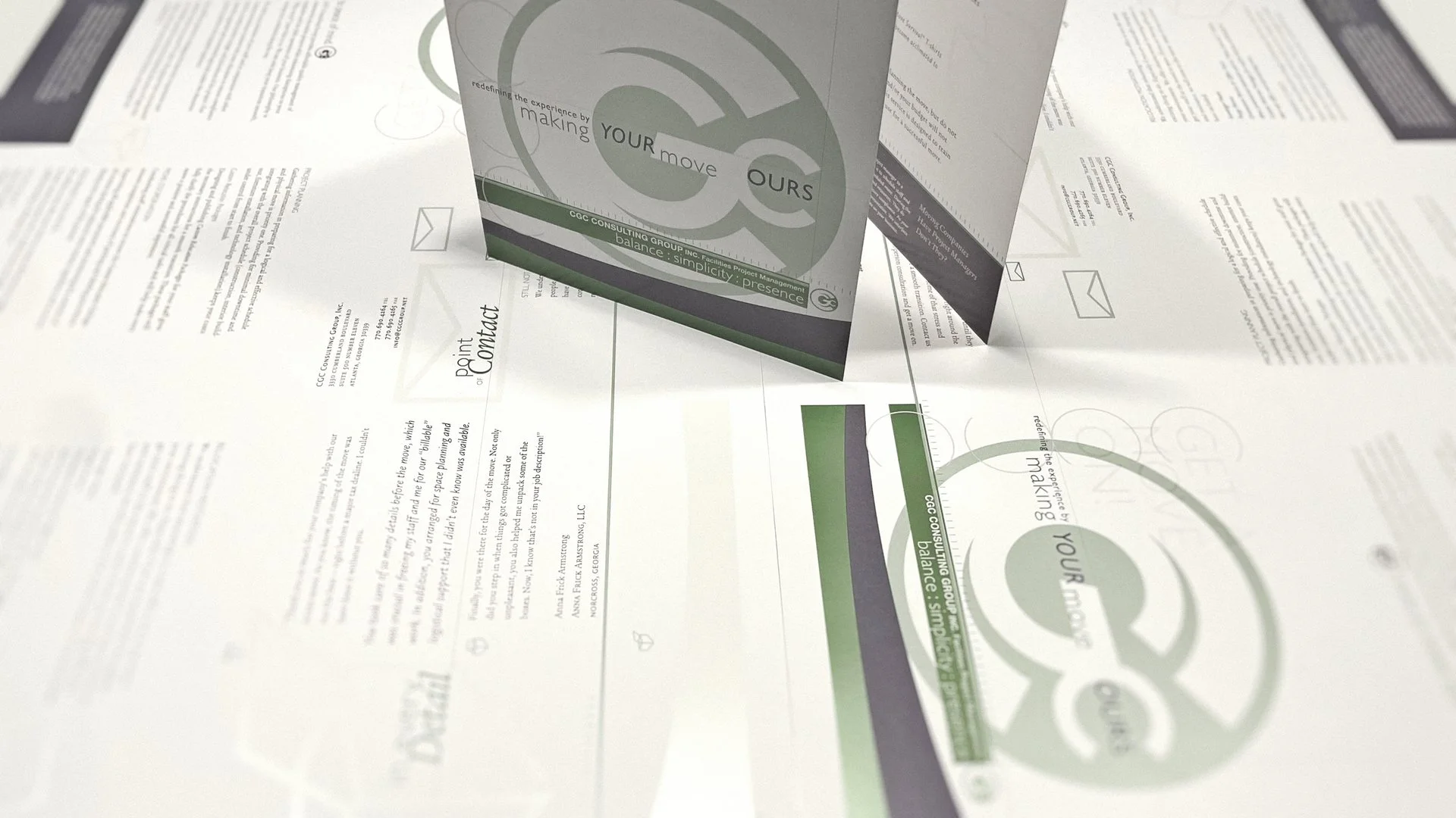
C G C C O N S U L T I N G G R O U P I D E N T I T Y / 2 0 0 1
. : .
“Consciousness expresses itself through creation. This world we live in is the dance of the creator. Dancers come and go in the twinkling of an eye, but the dance lives on. In those moments, I felt my spirit soar and become one with everything that exists.”
— M I C H A E L J A C K S O N / A U T H O R O F D A N C I N G T H E D R E A M : P O E M S A N D R E F L E C T I O N S / 1 9 5 8 – 2 0 0 9

The pursuit of solving a design challenge is a dastardly task unto itself. We must further seek truth in its longevity. Living in a world where bland design runs rampant with little to no staying power, I must admit I am getting more weary each time I witness another vanilla abomination. Rebrands, a rather obtuse term, are discarded even quicker than the time it took to create them. Homogenized design language speaks endless volumes of self-serving, manipulative cognitive distortions and must be brought to its knees. It’s past time for us all to abandon these meager attempts that must justify every stroke in some bloated manifesto with nothing but manipulation at the very heart of its narrative. Seriously. Enough. Tricking commoners for a short-term win is not a victory. Truth lies in its longevity.
Off the shelf solutions will never suffice when seeking timeless, precious, priceless design that will live on past your own short lifespan. Each mark is a gift, not to be taken lightly, as it carries forth the true test of all: solving the challenge with no need for an embellished preamble tricking the receiver. It will hold its own ground and speak for itself, for that is the true heart of refining the language of design. We must understand how to communicate to a specified audience before we ever attempt to bestow a mark that elevates the brand to such an accurate depiction, that the mark’s own inertia naturally vibrates across the entire zeitgeist. Providing a localized stage is usually necessary for the rollout. The true test lies in its performance on the world stage where it proves its mettle for the long run. Time will tell.
. : .

Happy Accidents: Lucky Twenty-seven and Eleven : Eleven
V I N S O N D E S I G N / 2 7 + Y E A R S
There’s something magical about discovering happy accidents. We revel in those precious moments when we surprise even ourselves. It’s in these moments of clarity when we’re given the final clue to discovering the hidden treasure subliminally hiding in plain sight. If it were a snake it surely would’ve bitten me. While designing logos and logo variants lightning struck twice. First in college when I discovered the Yin and Yang nature of the letters in my last name when they’re split by syllables and stacked. The second aha moment occurred two years ago while creating a logo variant celebrating my 27th year milestone as a professional graphic designer.
When I reached my 27th year I wanted to celebrate by designing a Vinson logo variant. I didn’t purposely hide the number twenty-seven within the letters of the “27+ Years of Crop Marks + Keyframes” graphic. It was completely by chance that there were two clear instances of the number hidden within the design. I didn’t discover it until I finished designing the graphic. My primary Vinson logo has two vertically-aligned dots and seven parts so that’s 2 & 7. If you look closely you’ll see the dots aren’t perfect circles. I intentionally stretched them on the y-axis for a subtle boost of “infectious creative energy,” as I’ve been described by my peers.
I’ve always been naturally drawn to patterns especially in regard to letterforms and mathematics. Twenty-seven is also my lucky number. Eleven : Eleven is riddled throughout my identity.
. : .

“Let go your conscious self and act on instinct.” and “If you strike me down, I shall become more powerful than you can possibly imagine.”
— S I R A L E C G U I N N E S S A S O B I - W A N K E N O B I / S T A R W A R S / 1 9 1 4 – 2 0 0 0
. : .
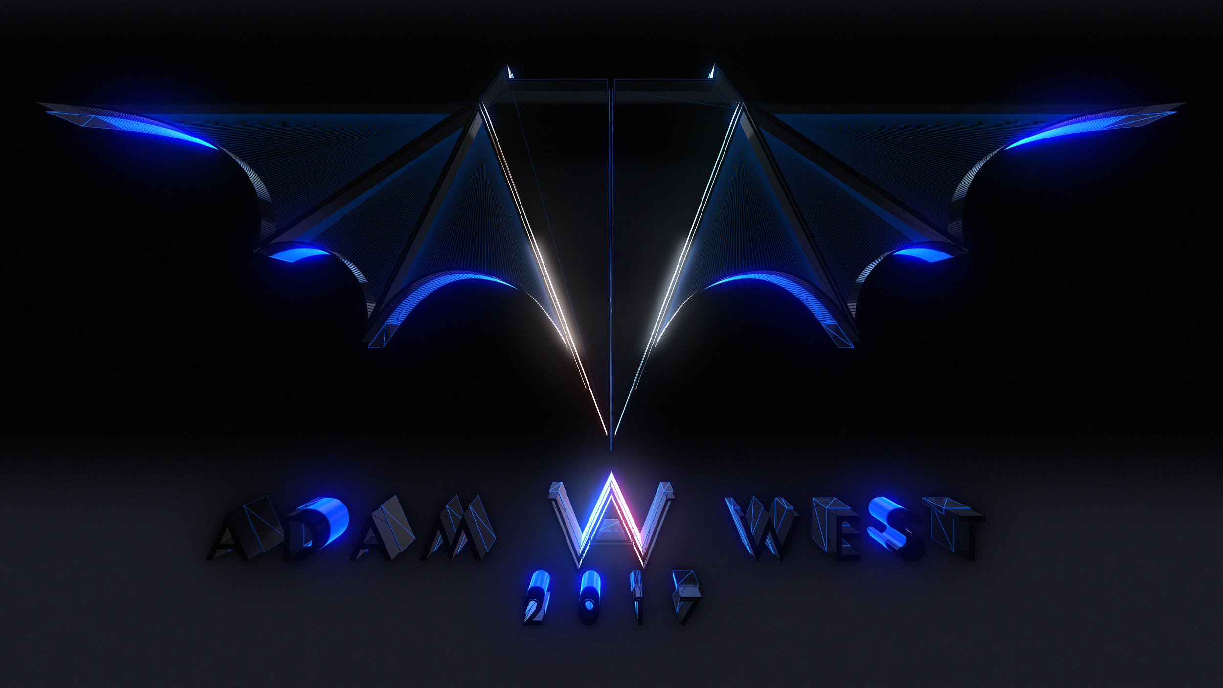
“When Adam West passed June 9, 2017, I designed a Batman logo in his remembrance; one that hides each letter within the design itself. Batman first appeared in Detective Comics Issue 27, 1939. 27 is also my lucky number. My daughter calls me The Dark Knight.”
A D A M W E S T T R I B U T E / H I D I N G T H E D A R K K N I G H T I N P L A I N S I G H T / 1 9 2 8 – 2 0 1 7 / T I T L E S
. : .

“I believe that whatever doesn’t kill you, simply makes you...stranger.”
— H E A T H L E D G E R A S T H E J O K E R / T H E D A R K K N I G H T / 1 9 7 9 – 2 0 0 8 / T I T L E S V 2 V I L L A I N S A N D H E R O E S
. : .
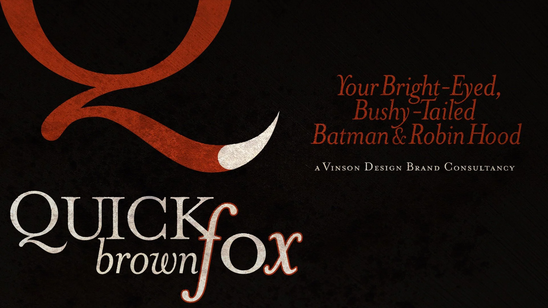
“This Fox Spirit's raw, even childlike, 'infectious creative energy' has been chasing and redefining ligatures while designing local brands since 1990 and global brands since 1996. But I first fell in love with ligatures when I first saw the Star Wars logo when I was six years old.”
— T H E F O X S P I R I T , Q U I C K B R O W N F O X F X B R A N D C O N S U L T A N C Y

According to Leonardo da Vinci: “To develop a complete mind: Study the science of art; Study the art of science. Learn how to see. Realize that everything connects to everything else.” This keen observation cannot be further from the truth when applied to typography. Many font families are designed with additional, connected characters called ligatures allowing for more natural two and three letter combinations attempting to reduce the chance of character specimens crossing over one another. While developing the core identity for Quick Brown Fox FX I knew I wanted to place ligature studies at the very core of the brand including the logo. Building this brand’s journey quite literally began during my childhood at the corner of West Red Fox Trail and Red Fox Court in my hometown, Greenville, South Carolina. This Fox Spirit has been designing local brands since 1990 and global brands since 1996. I am just getting warmed up and have no plans of slowing down.
When I was 11 years old I fell in love with typography. After taking a computer course on PBS in 1983 my parents gifted me my first computer, a Commodore 64. When I loaded up Print Shop Deluxe for the first time I was immediately smitten. Little did I know that in 1994 I would start designing exhibition checklists, posters, mailers, pamphlets, banners, schedules, and soft and hardcover texts for Georgia Museum of Art in Athens, Georgia. Bonnie Ramsey, Director of Publications and Public Relations and my second Mom, told me that when she first saw my “ShOut!” title solution for Art and Margo Rosenbaum’s exhibit that we were most certainly kindred spirits. That initial connection led to 19 years of collaboration. Such incredible memories. The last hardcover I designed was for a mixed bag of artists from the Mullis Collection called “Amazing Grace,” a coffee table book that’s now living on in people’s living rooms and in perpetuity in The Library of Congress.
In the mid-90s I was introduced to two font families that immediately left a lasting imprint on me: 1) Meta designed by Erik Spiekermann (used here and across my website), and 2) Mrs. Eaves designed by Zuzana Licko. Mrs. Eaves was Licko’s first traditionally-styled font with roots drawing from the Baskerville family. I incorporated Meta across many graphic design exhibition checklists during my 19-year tenure with my wonderful extended family at Georgia Museum of Art. I paired Meta with Legacy Sans, Serif, and SC originally designed by my typography professor Ronald Arnholm. Professor Arnholm was taught by Paul Rand at Yale, and I have three fond memories collaborating with him while I attended the University of Georgia Graphic Design Program. I was fortunate to also study his Advanced Typography course where we designed alongside three German exchange students.
During the first couple of days in Typography class we were challenged to train our eyes on the intricacies of a particular letterform Professor Arnholm selected for each of us. When he assigned his Legacy Sans Italic lowercase letter g he commented to me that it was one of the toughest letterforms to design when he developed his Legacy Family. I rendered the letter with fairly accurate precision without the use of French curves.
I still have that rendering amongst other historical pieces from my days in Athens, Georgia. I might scan it one day and add it to this post. The second memory I have of Arnholm was when we were designing our own logotypes. I spent about ten minutes in Adobe Illustrator stacking the first three letters of my last name above the last three. I decided to use Futura as the base for my logo because I was drawn to its sharp, geometric qualities. Over my shoulder Arnholm made the comment that my mark “would last a long time.”
While I have made revisions to my Vinson logo since college, 90% of the original design is still apparent at its heart. The last fond memory was Professor Arnholm’s catchphrase of choice: “Bring your friends,” referring to our dozens of graphic design tools from the infamously vaporous Design Markers to Rapidiographs’ technical precision for rendering exploded views. Getting back to the fox spirit-inspired identity, I chose Emigre’s Mrs. Eaves Family for its classy stylings and unique ligatures. I applied it across the entire design language. In many cases when ligatures weren’t available for a particular combination, I designed my own keeping them closely inline with the frisky beauty of Mrs. Eaves. Quick Brown Fox FX, a Vinson Design Brand Consultancy. Adaptable. Cunning. Frisky.

It’s time to talk legibility. The key to longevity. Details matter when it comes to design. Its sole purpose being communication above all else sets the stage for designers obsessing over the minutiae that the majority of the population doesn’t recognize. We see illegible billboards suffering from sizing issues or poor contrast, screen graphics with kerning so tight between bold condensed sans serif fonts, in all caps no less, with barely a hair of word spacing (FoxNews I’m looking at you). Then there’s the coup de grâce: the overt disgrace of inch marks replacing quotation marks. The apathetic omission of ligatures, those unique two and three letter combinations are absent allowing some characters to unfortunately cross over and crowd one another.
This forgetfulness and lack of attention to detail has become another growing concern ever since we embraced digital platforms of expression. While choosing to use ligatures appears straightforward some brands have embraced this art of connection to their own detriment leading to illegibility. We must be mindful when wielding ligatures. The current version of the KIA logo caused the general population to search Google for the “KN car.” The internal design team at KIA joined all three letters in the attempt to render a memorable mark. However, the use of ligatures backfired in that the I and A look like a backwards N. They could have averted this unfortunate solution had these letters not been connected as the design of the individual specimens is rather elegant.
. : .

My first glance at ligatures was in the late 70s when I was six years old while enjoying the first film that peaked my interest for enigmatic space operas. As the Star Wars title flew over our heads elegantly combining the S & T and the R & S letterforms I was hooked not only for science fiction in film, but solid graphic design. The film introduced the visual stylings of Ralph McQuarrie and Joe Johnston. George Lucas hired McQuarrie as his primary designer for the epic adventure “a long time ago in a galaxy far, far away.” Johnston redesigned the Millennium Falcon after George saw a similar ship in another film that preceded the release of Star Wars. The initial design became the Rebel Blockage Runner instead of Han and Chewie’s Corellian YT-1300 light freighter. “You’ve never heard of the Millennium Falcon?…It’s the ship that made the Kessel Run in less than 12 parsecs,” boasted Han. “What’s the cargo?” Solo inquired. Obi-wan answered in a low tone: “Only passengers. Myself, the boy, two droids and no questions asked.” Back in 2017 I began a side quest to update the Star Wars logo. This version is my latest update from 2025.

According to Leonardo da Vinci, polymath, painter, sculptor, draftsman, theorist, architect, engineer, and scientist: “To develop a complete mind: Study the science of art; Study the art of science. Learn how to see. Realize that everything connects to everything else.” This keen observation cannot be any closer to the truth when applied to typography. Many font families are designed with these additional, connected characters allowing for more natural two and three letter combinations attempting to reduce the chance of character specimens crossing over one another. Ligatures create a powerful interplay within a logotype or headline. “To develop a complete mind: Study the science of art; Study the art of science. Learn how to see. Realize that everything connects to everything else.” — Leonardo da Vinci, Italian polymath of the High Renaissance, painter, sculptor, draftsman, theorist, architect, engineer, and scientist.

I fell in love with typography when I was 11 years old playing around with font combinations in Print Shop Deluxe on my C64. My chosen concentration for my AP Art course during my senior year in high school was the exploration of stencils across mixed media. My logotype utilizes stenciled or “Yin & Yang” ligatures providing iconic longevity inspired by Paul Rand’s graphic simplicity. My Typography professor at UGA was taught by Rand at Yale while he was pursuing his Masters degree. I was reintroduced to these graphical groupings in Typography class while studying graphic design at the University of Georgia under Professor Ronald Arnholm. Initially we learned the basics as applied to fi, fl, ffi, and ffl combinations. I later discovered a way to create what I called a positive and negative stencil or “yin and yang ligatures” in my own logotype. My professor noted this solution possessed a timeless longevity.

When designing the logotype for my entertainment company, Eyes:/Only, I joined the E & S emphasizing the collaborative nature of our mission. I just barely kissed the E and Y and the O and N giving the logotype a light-hearted connectedness. I kept the logo and tagline in lowercase hinting at the childlike curiosity my films tend to explore never taking ourselves too seriously. What started as a humble publishing company for my book, Bipolar Coordinates, grew into a storytelling division at Vinson Design.
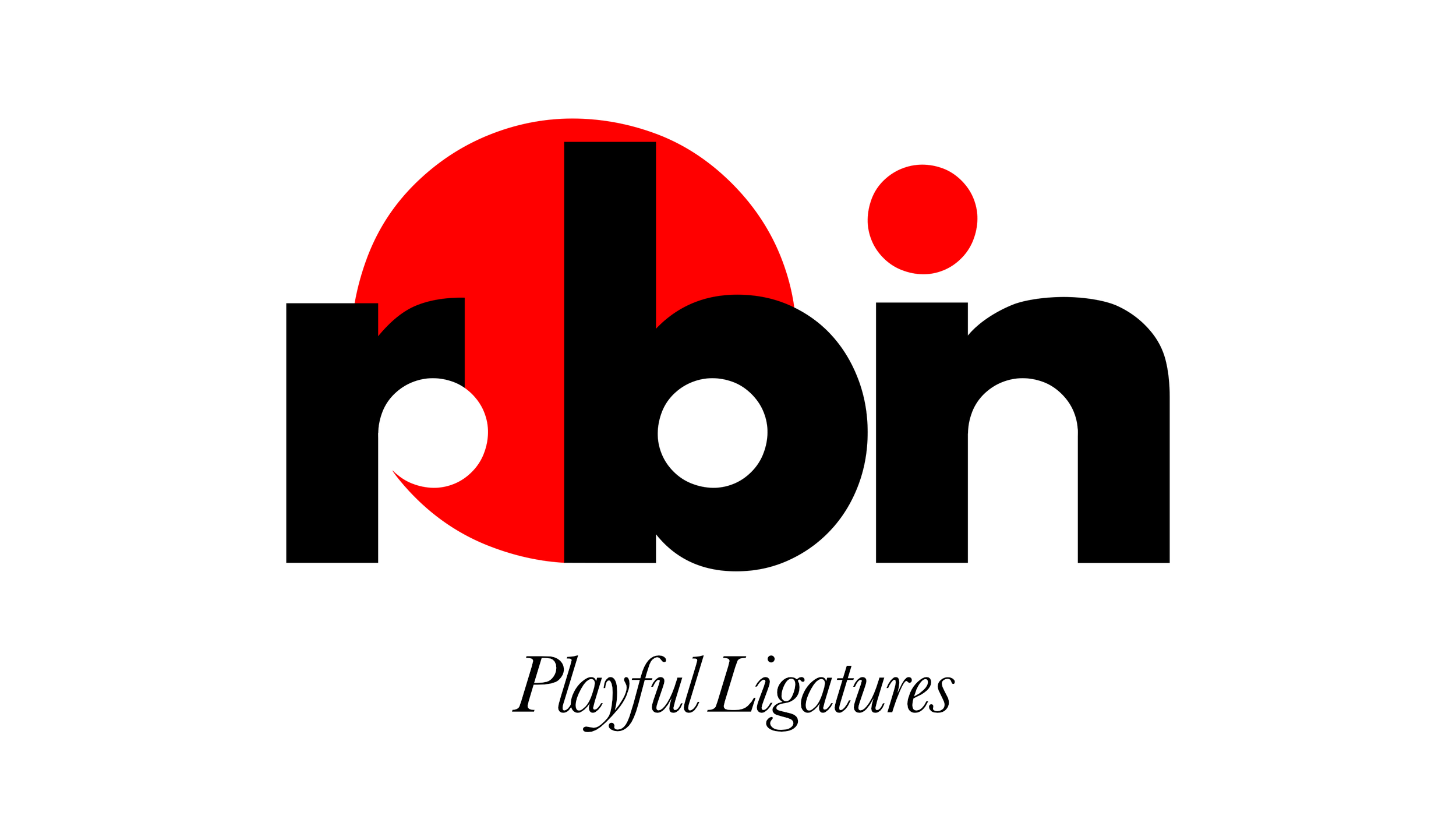
Considering his professor at Yale was Paul Rand, and he also displayed a rare talent of his own including a fascination with creating holograms as a hobby, I took his observance to heart. While I have tweaked the logo over the years it still retains 93% of its original design. “Robin,” above further explores playful ligatures in the same Yin and Yang fashion imbued with implied motion.
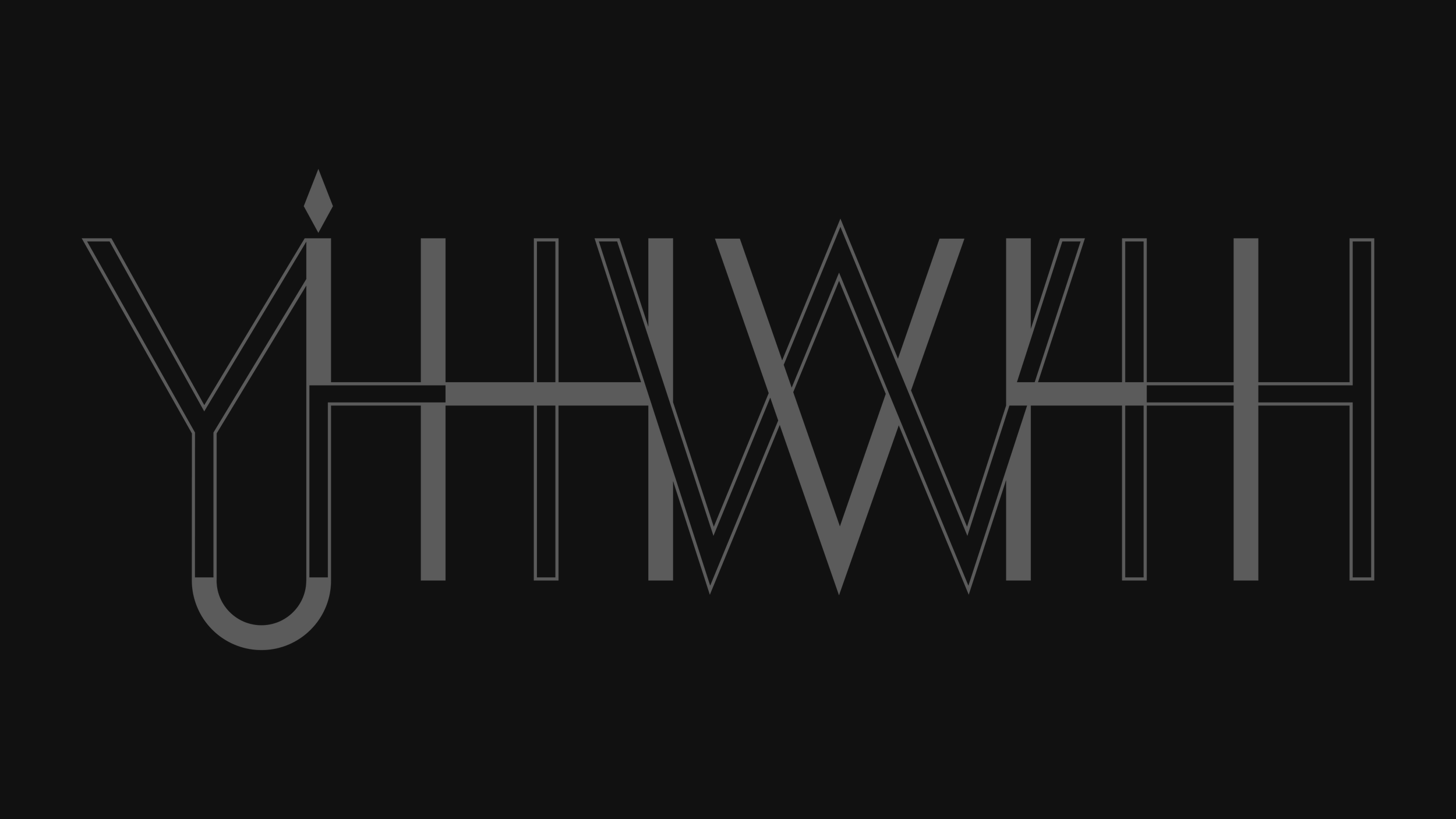
In “Hallow Be Thy Names” I incorporated an intertwined ligature system. YHWH, JHVH, and IHVH are represented as a unified symbol of the power of three. The Y/J still needs some work.

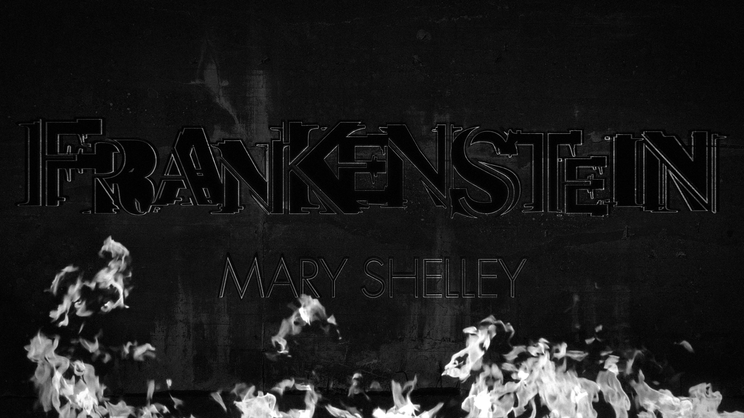
Mirrored or “Upside-Down” ligatures emphasizing the duality of Strange Case of Doctor Jekyll & Mr. Hyde by Robert Louis Stevenson, 1886. This was one of the first titles I made in 2014.
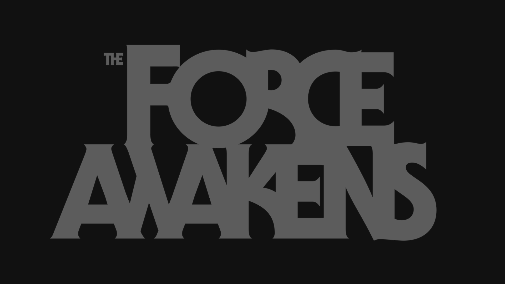
Force play. Pushing ligatures to their legible limits by combining all letterforms arriving at a bold solution for The Force Awakens. Serif Gothic by Herb Lubalin and Tony DiSpigna in 1972.