. . . : : Roots / Cultivating & Harvesting My Mind’s Eye

“When tended to patiently, passionately, even a simple seedling sprouts a root system — nearly completely unseen — tasked with the dividing of boulders, joints and marrow, now crushed into mere piles of rubble and dust. I write Stories That Come Alive. Do not be afraid.”
— D A V I D V I N S O N / A R T I S T . . : T H I N K E R : . . D R E A M E R . . : P O L Y M A T H : : : I N F J . : : : M O D E S T P S Y C H I C O F M A G E N T A S E A . : .
I’ve always been able to fly. Born exactly four weeks early, I could still see my wings as an echo before they disappeared overnight on the cusp of Aquarius and Pisces. I don’t know if it’s astral projection or a byproduct of lucid dreaming where I’m in control. As far back as I can remember, I dreamt of swimming breaststroke down the hallways of my childhood home. It started three years before I first saw Superman: The Movie in 1978. Each time I took flight I felt the air resistance pushing back against me. A similar sensation of swimming underwater at our neighborhood pool during the sweltering summers of the seventies.
As an adult, my flight plan shifted to skimming along the edges of skyscrapers on my rollerblades, able to adjust my center of gravity into a localized state in order for me never to falter. I was now flying while asleep and awake. Invincible. Then it happened. I finally fell. Then I fell again. This process repeated itself for five decades, half a lifetime. I was beaten down until one night I realized that my flame was still burning. A faint flicker hidden within the recesses of my mind’s eye. Brighter than the edges of the moon during a full eclipse.
When I close my eyes I see mysterious, glowing phosphenes of pure starlight even in the inky blackness at the intersection of deep midnight and dawn. When I stopped pretending that I knew everything, accepting that I know nothing, my life began to change. My mind shifted. Dreams weren’t mere fantasies anymore. They were real. Their inner knowings found scribbled all over my DNA written in a forgotten language that’s now crystal clear. Some consider I’ve gone over the deep end. No. I just decided to get out of the pool.
After drying off I decided to pass on the road less traveled. Instead I took to the skies where there are no limits. Anything is possible. Rules? There are no rules for one that believes. I’ve been surrounded by masters of the fine crafts of planting, nurturing, cultivating, and harvesting truly activated intuition, pure imagination, intellect, and predictive spontaneity. They’re the icons, masters, and mentors who guided me by reminding me I knew how to fly all along. My wings were just invisible. Now I can spread them while wide awake. I’m lying beyond the stratosphere breaking all false, manmade barriers. Freedom.
I’ve been a rather busy bee as of late. A well deserved three-year break from the norm has given me time to dream just a bit more. Now I’m breaking the boundaries and masks I built for decades hiding my true nature. High lithium daily dosages kept me docile and quiet for thirteen years. Now a fully awakened soul from the trivial anxieties of this shadow world. I’m so thankful now, beyond immense appreciation for the day my psychiatrist said, “you’re toxic.” He removed the lithium immediately. Within thirty-six hours I was alive and limitless.
When that thirty-sixth hour chimed on Tuesday night, I wrote a short story dialogue about our shared divine spark and the interconnectedness with everything in the universe. The following three years led to even more telling experiences. This time my own activated intuition, imagination, and intellect sent me on a journey. Now opportunities abound. I have been manifesting my dreams into living, breathing realities. What started out as daily journaling grew to thousands of notes, a book, a film, and a three-act play now in the works.
. : .

“When it is understood that one loses joy and happiness in the attempt to possess them, the essence of natural farming will be realized. The ultimate goal of farming is not the growing of crops, but the cultivation and perfection of human beings.”
— M A S A N O B U F U K U O K A / T H E O N E - S T R A W R E V O L U T I O N
Back in the 1970s, when I six years old, my Mom gave me my first drawing lesson. A Stormtrooper from a page in my Star Wars Storybook, specifically Han in disguise (below left) leading Chewbacca and Luke to the Death Star’s Detention Center in order to deliver their prisoner transfer to Cell Block 1138 (nice THX 1138 homage). Sitting side by side in the basement I’d watch her draw the defining lines, and I copied her exact moves on my paper.
We had just seen Star Wars — finally! — at an afternoon matinee a full year later after it first hit theaters. 1978 was the year Kenner, Topps, and others started flooding the attic of our local hardware store in Paoli, Pennsylvania. Action figures, puzzles, cook books, you name it, they had it. Before long I had quite the collection of 12-inch and 3 3/4-inch action figures. Sadly I opened them all and trashed the packaging missing an opportunity to retire early.

. : .

“I persevere against my adversaries’ sharklike bloodlust with intuitive resilience.”
— M Y T O T E M / T H E S T I N K B U G
. : .

“Afternoon Scrabble with Ma. Flying Tigers and checkers with Pa. Grandmom’s whiskey and honey elixir. Grandad’s toothpick center of gravity physics trick. Puzzles, riddles, jumbles, and mind games. Our lineage spanning North and South Carolina’s farmlands and coastlines.”
— D A V I D V I N S O N / S O N A N D B A B Y B R O T H E R S I N C E N I N E T E E N S E V E N T Y - T W O
My roots run deep throughout the North and South Carolina dirt roads, rural highways, and coastal tides. My two sisters and I, the baby, grew up surrounded by farmers, puzzles, and mind games on both sides of our family tree. Our family origins span wider than others in many respects. We’re connected at a subatomic level. You could say we even possess a knowing that cannot be put into words. I’ve never been known to not have the words for a particular occasion. They say my “voice carries” weighted in truths or pathological lies if the mood should strike. Keep in mind that our neighborhood was the first with HBO and MTV. I was raised on George Carlin’s masterful rhetorical unraveling of our misuse of the English language. His peculiar, yet brilliant, intellect questioned the status quo. So did my Aquarian.
I was called out and punished for my loud mouth since nursery school. The teacher used to lock me in the bathroom and flick the light off. In that dank, humid darkness is where I started to understand a side of myself that I doubt my parents could even comprehend. Inner knowing sprang forth from my psyche when I was just three years old. I began seeing things, including a shadow that seemed to follow me everywhere, and it wasn’t my own. For a moment I thought perhaps I was Peter Pan, but It was deeper like black India ink. My dark side taught me how to manipulate, steal, and force my own narrative onto the world at any cost. Also acting as a catalyst, It forced me to devise how to flood my mind with happy thoughts. I considered it my Yin and Yang. Somehow I was Jekyll and Hyde simultaneously.
All it takes is one happy thought to shift our minds. My fondest memories are checkers with Pa, a farmer and mechanic for the WWII Flying Tigers. Grandad’s fork, spoon, and toothpick center of gravity physics trickery. The daunting chess matches with Uncle Bobby, Biology Professor and Master Gardener. Ma and Grandmom, both iron chefs in their kitchens and gardens. Ma’s kitchen Scrabble, word jumbles, and crochet taming her overly active mind. Grandmom’s magic, pillowy biscuits, except her special flat and crispy one for herself, and watermelon rind pickles so sweet they could easily serve as turpentine to clean oil brushes. Like so many others, my family is full of highly intelligent, imaginative eccentrics if one takes the time to look past the curtain and take a gander what might be hiding under their rugs.
Mom and I were always very close in mind and spirit. Dad and I struggled at times, but in hindsight I now know that he always held us up as his top priority. When he got home from work he’d ignore and pass by me in the basement, but I was mistaken. He was exhausted. Dad was a true superhero. He lettered in all four sports throughout high school. Football, basketball, baseball, and track. One growing season his father and my Grandad, Doc, gave Dad two acres of land on the farm to cultivate and harvest. Dad’s yields were legendary. His efforts even caught the attention of the local farming community. He and Mom dated since she was twelve. They were high school sweethearts, “Carroll digs Jean.” He excelled at sports and farming, but he had his sights set beyond the confines of their tiny, rural town.
Dad received his Accounting degree from Chapel Hill — yes, I grew up in a Dean Smith and Michael Jordan Tarheel family — and he was wooed by multiple firms. During one of the rounds of interviews, my parents met a couple that lived just miles from where they grew up in Murfreesboro, North Carolina. That one serendipity helped them make their decision to ultimately move to Greenville, South Carolina, where I’ve always considered home. I’d describe Dad as a “fixer.” He built up a reputation as the guy who knew how to cut through all of the unnecessary excess by trimming the company’s fat. He knew how to get things done. Budgets down and in the black. Sometimes he even covered company salaries with his own assets proving to always have every employee’s back when payday arrived.
We followed very different paths, mine as an artist, and Dad’s as a businessman. However, we shared the same passion and vigor. I possessed and cultivated much of his get it done right the first time attitude as I built my own professional reputation. I was a consistently valued member of many a design team including my own twice and another as partner. While Dad sprinted the field with his teammates, I body surfed the waves at Edisto Beach and Wild Dunes on Isle of Palms. I tried football for a year and a half, but eventually told my coach I’d rather be in the art studio than on the field. Dad’s passion was for his own team and mine for my own solitude rollerblading down the streets of Savannah at full speed past many a midnight. Eventually I realized that I didn’t need rollerblades anymore.
I was so exhausted from living within the limits of the ground plane. Once I had the vision and opportunity I took to the skies and haven’t looked back once. No need for any more roads. My need for phone booths disappeared, too. Dad always supported my decision to go my own way and not follow in his footsteps too closely. One thing he did make sure of was that I understood how to support myself financially no matter what career I chose. If I was to pursue a career in the graphic arts, I needed to make sure I could pay my bills. He made crystal clear that he wasn’t raising a starving artist. Fortunately there were only a handful of years of famine for myself and my family. Even during those difficult times our bank cut us a break, and the WIC program enabled us to put food on the table.
Looking back over the first three and a half decades of my life I see the clear, irrefutable truth that it was my art, design, poetry, and short stories that gave me pleasure. This ecstasy came in the form of staying up late, my mind boiling over spilt out across dozens of cold-pressed Arches watercolor paper. I had no need for shrinks or meds to keep me going. My passions as a creator of worlds gave me full solace and peace. I was my own therapist.
Our family’s artistic heritage runs through all of us touched by the divine spark of the first artist, our Creator. My great grandmother was a charcoal master. Every time we’d visit our grandparents and great aunts and uncles in Murfreesboro and Ahoskie, North Carolina, I’d marvel at the living, breathing horse portrait my great grandmother rendered. The tufts of its fluffy mane and pulsing veins running down its majestic features gave it life, a breath. I have another one of great grand’s renderings of a gentle terrier hanging in my den. The softness of its fur gently blowing from the nearby ceiling fan above calms the entire room’s energy. I’ve attempted to duplicate that dog portrait to no avail. I’m far too impulsive and impatient to render such an illustration’s masterful chiaroscuro. Her shading was legendary.
I hope one day on the other side I’ll have a chance to meet her along with seeing my great aunts and great uncle again. We cherished visiting Pa’s brother and two sisters. Great uncle Jack and great Aunts Hen and Sara never married, but they were full of life. They were curious bookworms, too. Jack, a portly fellow, loved taking walks with me discussing the ins and outs of the latest sci-fi at the local cinema. They collected LIFE magazines, hundreds of books, poetry and prose classics, that are now in my library. I miss the three of them dearly, but not their mean kitty who was always quarantined in the kitchen during the holidays. I hear their laughter, especially Henrietta’s giddy wisecracks. Her sister, Sara, wasn’t so fortunate. She lived a life of quiet, catatonic depression. A jilted romance caused the rift.
Mental maladies riddled our family’s turbocharged DNA. Sara was full of life until my mom’s speculation an ended romance destroyed Sara’s joy. Once her debilitating depression set in, she fell deeper under its quiet, neurally necrotic spell. My Mom’s brother, Bobby, had his first serious mental appetite for destruction during his first year at college. Decades later I exhibited similar behavior. I lasted two and a half weeks at college before I dropped out and returned home. My parents gathered the top minds in the Greenville area. They arrived at a shallow conclusion. My masks had proved that I was still a master of manipulation and wasn’t ready to face my own demons just yet. The psychiatrist and doctors told my parents that they “checked me for a chemical imbalance.” According to them, I wasn’t like my uncle.
I dodged the label of mental illness until a five-second diagnosis when I was thirty-seven. Uncle Bobby’s manic depression sent him through a lifelong pursuit of relief. He never truly found it. In his memory I have been building new tools that I will share with K–12 in order to prepare students for major transitions. Eighteen is the most common age when someone is labeled bipolar. Back in the dark ages, folks with severe depression were given shock treatments and even labotamies. Hooked up to electrodes and given a small piece of wood to bite down on. Now considered cruel and unusual, it was the norm in many a mental hospital. I’ve met folks my own age who also sought out these same treatments. While rare, these procedures still exist today for some people with drug-resistant, crippling depression.
Some people think that they know depression. They describe it as low energy or having a bad day. Little do they know the truth of this silent killer. We’ve had our share of tragedies. Dad lost both of his brothers when he was young, the baby left with no siblings. No one has ever spoken about the circumstances in full detail. What we do know is one of them accidentally hung himself while doing a magic trick. His other brother drowned while attempting to show off how good of a swimmer he was to his friends. The former may have committed suicide while the latter may have been experiencing an elevated, manic state attempting to push himself too far. Both young men, two uncles I never met, have become a shrouded part of our family history. Untold stories in order to protect us from ourselves.
I’ve experienced suicidal, hypomanic, manic, depressive, and even homicidal traits and tendencies throughout the majority of my life. I’ve been observed, diagnosed, questioned, undiagnosed, and even ignored on many occasions. Being put through the very best and worst of the mental health system’s machine, I’ve seen it all. I realized one day that when a doctor labels me as bipolar or schizoaffective or whatnot, they are only placing these labels based on my current mood, a temporary condition that can be altered in microseconds. All through middle and high school I’d awake in a deeply depressed state. Yet ten minutes later I was excited to face the day. My condition cannot truly be measured as a continuum. No one’s can. It’s not a death sentence after all if we adhere to a program and learn skills.
By unlocking their super powers, these weapons come in the form of twelve steps while others, like myself, find our solace in therapy. While Cognitive Behavioral Therapy left me scratching my head, it was Dialectical Behavioral Therapy that saved the day. The DSM-5 only serves to keep the system financially sound. I’ve come to understand the point of going to therapy, staying for months at a time in mental hospitals, and meeting regularly with our psychiatrist is to graduate from the very system that keeps us sick. The most important gift I gave to myself was mental health enlightenment and awakening my soul to the notion that I knew exactly how to take care of myself. Over the last three years have I found a true sense of relief in my full mental illness remission. Read about it on The Blog.
Hindsight tells me that my current mental state is always temporary, forever in flux. Today I celebrate my mental health remission. Beating manic depression, aka bipolar 1, is not only possible, but it’s really not that complicated if we live mindfully and intentionally consistent. Consistency is the most important component of the golden elixir’s equation. My life has transformed from crippling anxiety to effortless creativity. Each day with family is a blessing.
. : .

A defining graphic design internship at Georgia’s State Museum blossomed into nineteen years of collaboration resulting in Best of Show, multiple Golds, a Silver, and First Place in Brochures at Southeastern Museums Conference.
— W I L L I A M U . E I L A N D / R E T I R E D D I R E C T O R O F G E O R G I A M U S E U M O F A R T I N A T H E N S
When you start a new job somewhere, especially a temporary one like an internship, there’s no telling what it will lead to. I heard a story years ago about a guy that answered the phones at Industrial Light & Magic who eventually became a visual effects supervisor there. I don’t work at ILM, but my college internship produced a relationship that lasted nineteen years. Plus we celebrated quite a few accolades along the journey. In 1994 while attending the University of Georgia’s Graphic Design School I was fortunate enough to begin an internship with the Georgia Museum of Art, the state’s official art museum. Around that time I was also the Graphic Editor for The Red & Black student newspaper in downtown Athens. Little did I know my design talents would eventually arrive in the Library of Congress.
Bonnie Ramsey, Director of Publications and Public Relations for GMOA, was my mentor. She and I shared a deep passion for advertising and identity design. The very first piece I designed was for an exhibition of Art and Margo Rosenbaum’s work. It was called “ShOut!” and I used the ‘O’ as a visual metaphor for a mouth shouting. Bonnie said when she saw that clever play on typography she knew we would get along quite well. After my internship ended, Bonnie and I kept in touch. Nearly every year for fourteen years (1996–2008) we produced about a dozen award-winning exhibition catalogs, checklists, and hard and soft cover texts. Our accolades included multiple Honorable Mentions, Silvers, and Golds. We also won a Best In Show at Southeastern Museums Conference for “His Horn[e] Made: Engraved Powder Horns from the Collection of James E. Routh, Jr.”
In 2015 Bonnie reached out again, and we had three more collaborations. The first was a series of video slates for a GMOA video. The second was a CD for “A Walk Through the Decorative Arts Galleries of GMOA.” The third entailed a logo redesign for Bozeman Art Museum in Montana including personalized business cards. They only used the logo and cards for about a year before changing it again, but it was a pleasure to have created the temporary mark if only for a short time. During my tenure with Bonnie I had some exciting moments including meeting one of University of Georgia’s icons, Lamar Dodd. He was once described by LIFE magazine as being “more responsible than any other man for the renaissance of art that has swept the Southeast.”
One day Bonnie asked me if I’d like to meet Lamar Dodd. Or course! We visited him in his home one afternoon while he was cataloging his works. I had designed a poster earlier that year which included his daughter Irene’s paintings. Per the University of Georgia’s Lamar Dodd School of Art website: “Founded in 1937, the School of Art is named for Lamar Dodd who as a young man in the 1920s traveled from his home in Georgia to New York to be part of the Art Student’s League. There he learned from and worked with many of the luminaries of American art. He returned to Georgia to head the Art Department at the University of Georgia from 1939 until his retirement in 1972. Under his leadership, the department grew significantly. The department was renamed the Lamar Dodd School of Art in 1996.” Visit the Lamar Dodd School of Art at the University of Georgia in Athens, and visit GMOA, too.
I FELL IN LOVE WITH ALVAR AND BOUGHT TWO ORIGINAL LITHOGRAPHS.
AMERICAN MASTERS OF HOLLOWWARE EXHIBITION CHECKLIST FOR GMOA.
HIS HORN[E] MADE EXHIBITION CHECKLIST WON A GOLD & BEST OF SHOW.
. : .

An afternoon in Florence ended at the newly opened Lion’s Fountain Pub over many pints of Guinness. It’s now the oldest Irish pub in the city.
— C O R T O N A , I T A L Y S T U D I E S A B R O A D / S C I E N T I F I C I L L U S T R A T I O N P H O T O G R A P H Y A N D A R T H I S T O R Y / 1 9 9 5


. : .

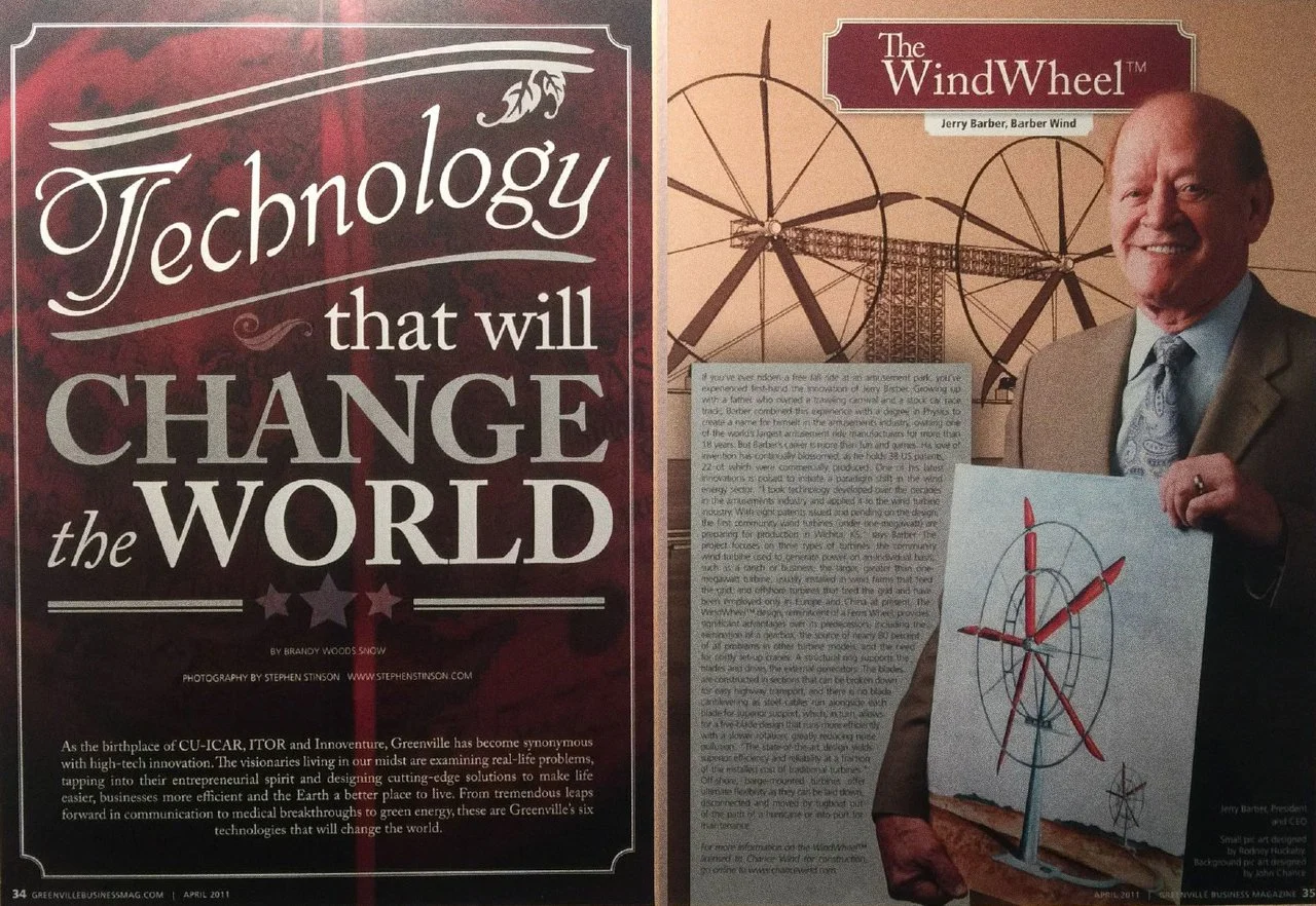
“The art work you did for me did it’s job! I have licensed a manufacturing firm in Ohio to manufacture the Amphibian Air Car amusement ride.”
— J E R R Y B A R B E R / I N V E N T O R O F F R E E F A L L A N D M Y F I R S T C O M M E R C I A L C L I E N T I N 1 9 8 8
David’s freelance career began at age twelve painting watercolors of family friends’ pets, including a rather famous bulldog’s cousin who could fit four tennis balls in his mouth side by side. Four years later, in 1988, David got his first big break. He was introduced by Kay Farmer, his high school AP art teacher, to Jerry Barber, inventor of the Free Fall amusement park ride, among dozens of other creations. Mr. Barber needed an illustrator for three new ride concepts he was pitching. Jerry asked Kay if she had the time to dedicate to the project, but she passed on the opportunity due to other commitments, so she suggested David to him for the project. With the green light in sight David worked closely with Jerry upfront in order to understand the full scope of this multitiered project.
Multiple ride concepts were illustrated with the primary pitch being the air car ride. Mr. Barber and David coined the name of the primary ride for the pitch the “Amphibian Air Car” ride. It was essentially an amphibious form of bumper cars in a mash up with Floridian fan boats. Below is the letter from Jerry the following year. David’s renditions were a combination of airbrush, colored pencil, and spray paint. It was an amazing opportunity, but what David remembers most is the moment he was invited into Mr. Barber’s home for their initial meeting. There had to be a least fifty patents covering the walls of the showman’s house. It was quite clear that Jerry had a busy mind. It was humbling to be fortunate enough to work for such an enigmatic, creative genius.
. : .

“Design can be art. Design can be aesthetics. Design is so simple, that’s why it is so complicated.”
— P A U L R A N D / G R A P H I C D E S I G N L E G E N D / P O R T F O L I O
Throughout the recorded history of graphic design communication I’ve always been drawn to Paul Rand’s clean, distilled solutions. Our prolific Typography and Advanced Typography professor, Ronald Arnholm, at the University of Georgia’s Graphic Design Program studied under Rand at Yale. Arnholm received his M.F.A. in Graphic Design in 1963. He received his B.F.A. in Graphic Design two years prior from Rhode Island School of Design in 1961.
Paul Rand was born in 1914 in Brooklyn, New York City, New York. His passion for design began at an early age. He designed signage for his Dad’s grocery store and for banners and posters at his high school for special events. Primarily self-taught he sought out European design influences from Gebrauchsgraphik magazine. Paul Rand and I have a great deal in common as I also did the same at my high school. I was also the school paper cartoonist and caricature artist. I’m also self taught in many respects to film compositing.
Paul and I both had fathers that believed we would face financial difficulties if we didn’t get a more well rounded education. While attending high school at Haaren high school in Manhattan he took night classes at Pratt Institute per his father’s wishes. He enjoyed his design studies at Parsons School of Design. Rand was also involved with the Art Students League of New York. I was also involved in design groups while in Athens. I was a member of Friends of Georgia Museum of Art, A.I.G.A., and president of the Graphic Design Club.
My own father made a deal with me before he would buy me my first computer or art supply noting that I’d need to find a way to support myself one day through these endeavors of combining studio art with technology. He signed me up for a computer course on PBS that I completed with a Commodore 64 waiting for me on my day of receiving my completed PBS computer course certificate. On the studio art side I took watercolor lessons afternoons in Mrs. McManus’s basement with my childhood pal Steve.
Within months I was selling watercolors of family friend’s and teacher’s pets including a rather famous bulldog’s cousin, Uga, who could fit four tennis balls in its mouth. A few years later in high school I sold custom airbrushed T-shirts of Bart Simpson, skateboard thrashers, construction workers, and a hyper detailed Freddy Krueger with splatter and spray effects.
Rand changed his name from Peretz Rosenbaum to what he considered not only hiding his Jewish heritage, but he also felt four letters for his first and last name would make a pleasant pairing. It was primarily a design-driven decision. I love this design purist approach as it’s so similar to my own decision to design my Vinson logotype as a three over three pairing. This is a coincidence as I was unaware of his decision until I began researching him for this brief overview. However, if you know me, you know that I don’t believe in or give clout to coincidences. Leonardo da Vinci knew everything was connected. He was right.
His earlier works primarily focused around layout design which garnered him an acclaimed reputation rather quickly. He is most widely known for his corporate logos giving them his signature synthesis of simplicity and delicate whimsy. His designs were heavily influenced by the German poster designs known as Sachplakat. They are known more commonly as “object posters” incorporating simplified shapes into the designs rather than more literal depictions utilizing photography or illustrations. He revised forms down to their essence.
He brought his timeless design to Yale as Professor Emeritus from 1956–1969 and later from 1974–1985. He left Yale rather abruptly in 1992 due to the school hiring a postmodern designer. “I haven’t changed my mind about modernism from the first day I ever did it…. It means integrity; it means honesty; it means the absence of sentimentality and the absence of nostalgia; it means simplicity; it means clarity.” — “A Paul Rand Retrospective,” Cooper Union Herb Lubalin Study Center of Design & Typography, Oct. 4–November 8, 1996.
Paul Rand died the same year as Lamar Dodd, 1996, while living in Norwalk, Connecticut. He was 82. His legacy is known far and wide especially within circles of design, but also as one of the most recognizable corporate logos still in use by many brands today proving his mantra that there is longevity in simplicity. His recognizable marks are planted in our minds.
I wonder if Paul Rand chose the four letter pairing for his name because the P is an upside down D, the U is an upside down N, the A is shared, and the L and R provide contrast. Professor Arnholm paid me a generous compliment when he first saw my Vinson logotype. He noted it would “last a long time.” Timeless design is the clearest route of immortality.


. : .

“The better people communicate, the greater will be the need for better typography — expressive typography.”
— H E R B L U B A L I N / G R A P H I C D E S I G N E R T Y P O G R A P H E R T Y P E D E S I G N E R L E T T E R E R
Herb Lubalin, born in New York in 1918, was known as an instigator. He was seventeen when he began attending The Cooper Union and immediately found a fondness for fonts. He called himself out as being “terrible, because I don’t follow the rules.” His design approaches possessed a living, breathing presence. He was truly a type designer force to be reckoned with. He designed lettering, logotypes, typography, packaging, posters, magazines, and annual reports. He reimagined The Saturday Evening Post magazine in 1961. The Americana artist, Norman Rockwell, painted a cover depicting Lubalin as redesigning the Post, for its rebirth. What a creative way to introduce the new look.
I love Lubalin’s understated sensibility by shortening the name to simply “Post,” now much larger and easier to stand out at the newsstand. He diminished the words “The Saturday Evening” shrinking and placing them inside the O. It reminds me of the first exhibition checklist I ever designed as an intern at Georgia Museum of Art. Honoring Art and Margo Rosenbaum, titled simply “ShOut!” where I gave the O its own voice. I fully appreciate his fondness for playful, stylish combinations. His masterful ligatures were visually captivating and found their homes all amongst the 1960’s zeitgeist. His curves breathed with a soul.
In 1964 he collaborated with Coca-Cola and designed the playful branding for their new beverage, Sprite. In a rare move he spoke out against the company as serving up products that promoted “tooth decay, nausea, and mutated offspring” in Fact magazine. Oddly enough, Coca-Cola continued working with him. His involvement with Fact and two other standout magazines cemented his design sensibilities as ushering in a new era of graphic design. No longer type and image. Now, type treated as its own image of expression.
Regardless of being born color blind, Herb Lubalin’s handiwork was everywhere from newsstands to grocery stores during the 1960s and 1970s. His unique typographic stylings were unmistakably his own. Lubalin designed mastheads for Eros, Fact, and Avant Garde magazines. He worked alongside his editor and publisher Ralph Ginzburg. Eros broached the topics of eroticism and after only four issues placed Ginzburg in jail for publishing “obscene material” according to the status quo. Ironically Eros won more awards in 1963 among the thousands of other magazines produced that year.
By standing out against the norm of the times its reputation led to Fact in 1964 and Avant Garde in 1968. They didn’t have long runs, but they made a significant impact on the culture and face of graphic design. I love the fact that Avant Garde magazine had a square format yet was nowhere near a square’s magazine. Square formats give structure that sometimes needs to be shaken and distressed by elements breaking its restrictive bounds. I also incorporated square formats into a handful of my exhibition checklists and hardcover texts during my nearly two decades with Georgia Museum of Art and also for The Weather Channel global weather calendar design. I’d break the design’s grid system by allowing the typography to get cut off at the edges of the page.
I also appreciate the investigative, detective-style mission of Fact calling out brands like Coca-Cola for their true missions to sell their goods to Americans regardless of how additive and dangerous their product recipes reveal. Yet among the three I have to admit Eros caught my attention due to its risqué nature and my fondness for the unfettered human form. The fact that Ginzburg served jail time and was given the most attention for its design accomplishments just sweetens the magazine’s legacy. Plus the Post redesign’s Norman Rockwell cover illustration was such a classy move. Hats off to you gentlemen.
Lubalin’s swashbuckling, hand-lettered sensibilities garnered him a reputation as a graphic design rebel with a real cause noting that “Sometimes you sacrifice legibility to increase impact.” This perspective is so true. If we, as designers, can captivate our audience by allowing them to linger for just another moment or two, we have the power to plant these brands into their subconscious. When not given careful enough attention, this concept may backfire as it has more often in recent times especially among automotive logo design.
I do wonder what he would think about the redesigned KIA logo. While it does possess a unique, everlasting quality, it reads as a K and a backwards N. Even Google searches for “what is the KN car?” spread like wildfire when it was introduced to the public. Legibility, when handled carefully, leads to longevity and brand recognition. The gift of timelessness in communication and brand recognition has the capacity to grant a brand immortality.
Lubalin famously observed that “You can do a good ad without good typography, but you can’t do a great ad without good typography.” He fully believed that “Typography can be as exciting as illustration and photography.” He proved this in every hand-lettered ligature lockup masthead he designed. His iconic style stood out against the rest of the graphic design cultural landscape influencing future designers to bend and more importantly, break the rules. This concept remained the most enigmatic lesson I learned at SCAD and UGA’s Graphic Design School. We learn the rules so it becomes quite clear how easily it is to break them. They have no power or influence over the design that freely flows from the immense minds our collective imaginations.
Lubalin’s first typeface he designed in collaboration with John Pistilli, called Pistilli Roman. In 1970 Lubalin co-founded ITC, International Typeface Corporation, and U&lc, Upper and lowercase magazine with prolific graphic designer Aaron Burns. Lubalin co-designed ITC Avant Garde, a further progression of his masthead logotype for Avant Garde magazine, with Tom Carnase. Lubalin also co-designed ITC Serif Gothic with Tony Di Spigna. Lubalin designed ITC Lubalin Graph, a slab version of Avant Garde Gothic. It was drawn by Tony Di Spigna and Joe Sundwall. Ed Benguiat rendered the oblique versions. A bold version was created for three episodes of the Public Broadcasting Service support of their 1974–1975 U&lc promotional campaign.
Among his hundreds of designs his “Seventy-two” holiday card design is one I cherish the most. Elegant simplicity in form, function, and format. This 9x9 square ambigram holiday card was designed by Lubalin and Tom Carnese. It was sent out to clients of Lubalin, Smith, and Carnese celebrating the 1971 holidays. As I’ve mentioned before seventy-two is my lucky number. I was born in 1972 as well. My Vinson logotype also has two dots and seven parts purely by chance. My “Celebrating 27 Years of Crop Marks and Keyframes” graphic also revealed two occurrences of the same number when I finished the design. Does this seem a bit spooky? Nah.
Another thing I noticed about Herb Lubalin was his birth and death dates are mirrored. Born in 1918 and passed away in 1981. It’s little accents like this that mark many an artist’s lifetime legacy. It’s quite clear now that his color blindness may have guided his genius. He fully understood the Yin & Yang language of light and dark spaces. I did the same in AP Art.
During my senior year in high school I took AP Art with “stencils across all media” as my concentration. This process gradually trained my eyes how to see the positive and negative spaces simultaneously. The interplay of black and white and positive and negative pairings.
. : .

“If we want to speak to people, we need to know their language. In order to design for understanding, we need to understand design.”
— E R I K S P I E K E R M A N N / A R T H I S T O R I A N P R I N T E R T Y P E D E S I G N E R I N F O R M A T I O N A R C H I T E C T & A U T H O R
Good things really do come to those who wait. I didn’t discover Erik Spiekermann and his clean, versatile Meta font family from FontFont (FF) type foundry until after I graduated from University of Georgia’s School of Graphic Design in 1996. I first came across Spiekermann’s sans-serif FF Meta family consisting of Roman and small caps (SC) in Normal, Medium, Bold, and Black font weights while working at The Weather Channel (TWC) in the mid-1990s. One of the weather.com designers shared FF Meta Bold with me during a collaboration while we were designing new navigational icons for TWC’s website. I found FF Meta’s sans-serif form both functional and visually flattering when combined with contrasting ITC Legacy’s serif variations. Spiekermann’s FF Meta sans-serif family was released in 1991. Ron Arnholm, my typography professor at University of Georgia released ITC Legacy a year later in 1992.
Our first assignment in Typography class was to render a letterform freehand. Ron chose a Legacy Sans Medium Italic lowercase G noting it was one of the most challenging letters he designed for Legacy. He generously gifted us his ITC Legacy Sans and Serif Roman and SC superfamily after completing his Typography and Advanced Typography courses. While I was a graphic design intern at Georgia Museum of Art (GMOA) I incorporated ITC Legacy Sans Medium Italic for my first assignment. I designed a simple exhibition checklist for Art and Margo Rosenbaum’s “ShOut!” exhibition. I played pirate for a moment when I decided to double-italicize it to give it more energy thus bastardizing the font, but it was worth the gamble. Sometimes breaking the rules is worth its weight in Spades. The exhibit’s logotype immediately caught Bonnie Ramsey’s eye. She was The Director of Publications and Public Relations at GMOA, my boss, and my mentor.
A couple of years later as a freelance graphic designer for GMOA, I utilized FF Meta mixed with ITC Legacy Serif for a Down Under Aboriginal exhibition. This pairing won me a Gold award at Southeastern Museums Conference for “Artists of Utopia: Contemporary Australian Aboriginal Art.” Aboriginal adventures followed me as I connected my dots looking forward. Not only did I design an international Australian backpacking trail company called Outpack Aboriginal Adventures for my senior Graphic Design Portfolio project, but I also owned a boomerang, eventually owned two Subaru Outbacks, brought video production to the Mac at The Weather Channel with the D1 Desktop from Victoria, Australia, and I worked as the international technical support for the Australian digital video hardware company, Digital Voodoo. Let’s steer this sidetrack back to my nearly two decades with my family at GMOA.
While working alongside GMOA’s Bonnie Ramsey, Editor Jennifer DePrima, and Museum Director, William U. Eiland, lightning struck nearly a dozen times. I paired FF Meta and ITC Legacy Sans and Serif Roman and SC for nearly all of my exhibition checklists and texts for GMOA. When placed together they formed a rich visual contrast that gave my designs a particularly unique quality. A few years later I added Centaur MT to the mix. Centaur, a serif typeface by book and typeface designer Bruce Rogers, was based on Nicolas Jenson’s 1470 Renaissance-period printings. Combining Centaur MT with Legacy led to winning not only Gold, but Best in Show at SEMC. Now let’s pause on that note and get back to Erik Spiekermann’s influence on my early print and broadcast career. He designed ITC Officina Sans and ITC Officina Serif that I incorporated into the 1998 Weather Calendar for The Weather Channel. FF Meta Medium SC and FF Meta Bold made its way into new morning show launches including “First Outlook” and “Your Weather Today.”
Spiekermann, born in 1947, is a highly prolific graphic designer, typographer, and writer. Known for designing FF Meta, ITC Officina Sans and Serif, FF Unit, FF Info, FF Govan, Fira Sans with Ralph du Carrois for Firefox OS, among others, his humble design roots run deep. He paid his own way during his art history studies at Free University in Berlin, Germany, with a letterpress printing press in his basement. His freelance career began in 1972, the year I was born, and MetaDesign came into fruition when he officially founded it in 1979 in Berlin, Germany. A decade later, in 1989, he co-founded the first mail-order publisher offering digital fonts to the masses with his wife, Joan, called FontShop. It was eventually noted as one of the largest digital type foundries during its time. Its FontFont library touted 160 type designers including the talents of Peter Biľak, Evert Bloemsma, Erik van Blokland, Neville Brody, Martin Majoor, Albert-Jan Pool, Hans Reichel, Just van Rossum, Fred Smeijers, and Erik Spiekermann (from the FontShop International Wiki).
FontFont was founded by Erik Spiekermann and Neville Brody in 1990, the year I graduated high school. The pair’s mission for the newly formed foundry was to design typography offerings that were specifically “made for designers, by designers” (MyFonts.com). They pursued their mission of providing a wide variety of designs allowing for artists and graphic designers to both bend and break the boundaries casting aside the rules with a series of “contemporary, experimental, unorthodox, and radical” (MyFonts.com) solutions. During his early years at MetaDesign Spiekermann’s clients ranged from Berlin Transit system, BVG, the Düsseldorf Airport, and Heidelberg Printing company. Erik also worked closely with automakers Volkswagen and Audi.
Spikermann authored numerous books about typography including Rhyme & Reason, A Typographic Novel in 1987 (originally released in 1982 in Germany). In 1993 his Stop Stealing Sheep & Find Out How Type Works was published by Adobe Press. After a dispute in 2001 Spiekermann left MetaDesign and started United Designers Network. He was named as Royal Designer for Industry by the Royal British Society of Arts in 2007. He received the German National Design Award for Lifetime Achievement and the TDC Medal, and a Lifetime Award from the German Art Directors Club in 2011. Erik served as creative director and the managing partner at EdenSpiekermann, a merger with the Dutch design agency Eden Design and Communication, with offices in Berlin, Amsterdam, San Francisco, and Los Angeles beginning in 2009 through 2014. In June his involvement migrated to their advisory board giving him time to pursue a new venture, p98a, self-described as “an experimental letterpress workshop in Berlin dedicated to letters, printing and paper. We explore how letterpress can be redefined in the 21st century through research, printing, collecting, publishing and making things.”
Erik’s passion for metal type found a new dream to realize with his collaboration with Neue for Akzidenz-Grotesk® Serie 57. Neue, founded by Alexander Roth, partnered with Erik Spiekermann to bring the youngest orphan of the Akzidenz-Grotesk® Serie 57 metal type family into the digital realm. They’ve branded it as neue Serie57®. When I received my Type Specimen for Neue Serie57® from Germany signed and numbered I pinched myself. Christmas came early. Another link to The Weather Channel lies in Akzidenz Grotesk. We used this entire family including narrow and extended variations across the entire TWC network redesign from 1996–1999.
. : .
C O M M U N I C A T I O N A R T S N I N E T E E N N I N E T Y - F O U R / C O L L E C T E D D U R I N G G R A P H I C D E S I G N S C H O O L A T U G A


. : .
E M I G R E F O N T T Y P E L I B R A R Y S P E C I M E N B O O K L E T S / M R S E A V E S A N D I G O W A Y B A C K


. : .

“I’ve handled color as a man should behave. You may conclude that I consider ethics and aesthetics as one.”
— J O S E F A L B E R S / C O L O R T H E O R I S T / I N T E R A C T I O N O F C O L O R 5 0 T H A N N I V E R S A R Y
In the world of Color Theory there is one and only one true icon: Josef Albers. He wrote the book Interaction of Color, Yale University Press. On the surface the book appeared rather elementary. However, upon further inspection I realized it was to Color Theory as the Bible was to Christianity. I still have my handy copy along with the index card color exercises from my time in Savannah, Georgia from 1991–1992.
I studied Color Theory under the guidance of Professor Peter Clive. He brought a wealth of color knowledge as he was also the Painting Department Chair at Savannah College of Art and Design. We spent many afternoons cutting out color squares from piles of magazines and gluing them onto index cards. My experience with Professor Clive’s coursework proved a great asset as it applies to everything, quite specifically, my quest in Color Grading.
During our time in Color Theory there was one quote from Albers that I could never forget. He noted that: “If one says ‘Red’ — the name of color — and there are fifty people listening, it can be expected that there will be fifty reds in their minds. And one can be sure that all these reds will be very different.” From Interaction of Color.
Back then in 1991 the student population was around 2,000 students. I was welcomed into a diverse friend group of sorts from day one when I arrived at the school. To them I was “Bubba” since they didn’t know my name yet, but did hear that I was from South Carolina. I spent a brief time on the SCAD Crew Team, but decided to pursue a social life instead.
Living in Savannah was nothing short a living in an artist’s dreamscape. The coastal vibe, along with a heavy dose of humidity during nights spent huddled around bonfires on Tybee Island near the lighthouse serve many fond memories. We were a passionate, rowdy bunch.
My roommate and I lived on the third floor in a converted townhouse on East Jones Street just around the corner from SCAD’s main office shared with half a dozen studio classrooms.
Interaction of Color proves now more than ever how valuable it really is in the digital world where color standards and explorations have become quite stale. My courses at SCAD all bled into one another as they directly influenced my combining of theories and media experimentation. I studied all of my Foundation Art courses there including 2D and 3D Art, Color Theory, Figure Drawing, Advanced Figure Drawing, Drawing 1 & 2, and Computer Art.
The last course I took was Intro to Graphic Design. That is where my perspective of SCAD shifted due to an overshadowing threat of it losing its accreditation. Fortunately our Graphic Design Professor huddled us up one afternoon after class. She informed us that she and other professors were leaving for other pursuits. After talking it over with my Dad, we decided for me to come home and assess my options for pursuing Graphic Design.
After a break I was luckily one of the sixteen chosen to attend University of Georgia’s highly competitive Graphic Design School. Little did I know my Typography Professor, Ronald Arnholm, had studied at Yale for his Masters degree in graphic design under Modernism graphic design legend, Paul Rand. That shared interest in the endless pursuit of design distillation sealed the deal for my fate with the world of typography. We also had the pleasure of hosting three German students opening my eyes to new layout approaches.
My graphic design journey exposed me to a plethora of mentors, professors, and artisans. It didn’t begin at SCAD. My fondness for fonts began when I was eleven while tinkering with Print Shop Deluxe on my C64.
. : .

Once described as being “more responsible than any other man for the renaissance of art that has swept the Southeast” by Life magazine.
— L A M A R D O D D / A R T I S T A N D A D M I N I S T R A T O R / L A M A R D O D D S C H O O L O F A R T
I once had the pleasure of meeting Lamar Dodd at his home studio in 1994 when I was a graphic design intern at Georgia Museum of Art. He was in the midst of cataloging his life’s works. I had designed a poster celebrating Lamar’s daughter, Irene Dodd, while working alongside my now lifelong friend and mentor, Bonnie Ramsey. Lamar was a kind, humble soul. He championed many opportunities for artists at University of Georgia including the Studies Abroad in Cortona, Italy. Fortunate in receiving a financial aid scholarship after redesigning the program’s application, I studied Scientific Illustration and Italian Art History.
Lamar was born in LaGrange, Georgia, to Rev. Francis Jefferson Dodd and Etta Cleveland. His passion for art and painting began at an early age. He studied art in New York, but eventually returned to Georgia. In 1938 he led University of Georgia’s Art Department until 1973. The year I graduated from UGA’s Graphic Design School, the Art Department was officially renamed the Lamar Dodd School of Art. Life magazine once described Lamar Dodd as being “more responsible than any other man for the renaissance of art that has swept the Southeast.” His legacy lives on in the hearts, minds, and palettes of UGA artists.
. : .

“His inking was so spontaneous. Everything he did was so goddamn fresh. It looked like he just slapped it right down on the paper. Maybe I liked it because I saw him doing what I was trying to do.” — Joe Kubert, “Tributes to Jack Davis,” The Comics Journal, 2010
— J A C K D A V I S / C A R T O O N I S T A N D C A R I C A T U R E A R T I S T / F O U N D I N G M E M B E R O F M A D M A G A Z I N E


Jack Davis honed the most memorable illustration style synonymous with Mad Magazine of which he was a founding member as editor in 1952. His loose, frenetic strokes whipped onto the page in a controlled frenzy. His goofy, exaggerated characters are unmistakeable. I collected Mad Magazine for years growing up, and when I arrived in Athens, Georgia, attending the Graphic Design Program I saw a poster one day on my way to class. As I passed it, I stopped dead in my tracks and did a double-take. It was a poster illustrated and signed by Jack Davis. I had no idea that he studied art at University of Georgia decades earlier. Oh if the walls could talk, er bark! Woof! Woof! Woof!
Born in Atlanta, Georgia, Davis began drawing at an early age. When he was twelve years old he drew a cartoon for the December 1936 issue of Tip Top Comics No. 9. It appears that twelve is a common year for artists to begin spreading their wings. Joe Kubert began inking comics when he was twelve. I started selling watercolors when I was the same age. Four years later I was the cartoonist and caricature artist for my student newspaper, The Eagle’s Cry, and drew 240+ caricatures for our senior class T-shirt that garnered me my first national award. Jack Davis was also the cartoonist for his high school paper and yearbook.
Davis was well known far and wide for his uncanny contributions to The Red & Black, UGA’s student newspaper where I served as Graphic Editor myself during my three years in Athens. He also illustrated for the ever humorous Bullsheet. Upon graduation he went to work at The Atlanta Journal as a cartoonist intern. After his time in Athens he headed to New York once he had made enough money illustrating a manual for Coca-Cola in 1949. During his time in the city he immersed himself with like minds and other talented up and coming artists at Art Students League.
During his career his work was spotted in Mad Magazine, Playboy, TV Guide, and Time as well as on magazine and album covers, movie posters, and comic book series. He even reimagined the Crypt Keeper character from Tales from the Crypt comic book. The National Cartoonists Society awarded Davis the Milton Caniff Lifetime Achievement Award in 1996. They then followed up in 2001 awarding him again with the pinnacle of all cartoonist awards, the Rueben. He was inducted into the Society of Illustrators Hall of Fame four years later in 2005. Davis garnered other awards including the National Cartoonists Society’s Advertising Award in 1980 and was inducted into the Will Eisner Hall of Fame in 2003.
. : .

“Gary Groth from The Comics Journal spent 6–7 hours with Joe Kubert for his interview. Once it reached its end, Gary wise-cracked “I’ve bled you dry, Joe.” Joe replied, laughing: “Well, it’s been a pleasant bleeding. Hardly hurt at all.”
— J O E K U B E R T / I C O N I C C O M I C B O O K A R T I S T A R T T E A C H E R A N D F O U N D E R O F T H E J O E K U B E R T S C H O O L


Joe Kubert was born in Jezierzany, Poland in 1926 and died in Morristown, New Jersey in 2012. He is a highly decorated Comic Book Artist, Art Teacher, and Founder of The Joe Kubert School of Cartoon and Graphic Art in Madison, New Jersey. He and his wife, Muriel, founded the school in 1976. During that first year their school garnered a roster of 22 students. It’s grown exponentially since its inception.
In 1938, at age 12, Joe Kubert began inking comics for $5 a page. That same year Action Comics introduced us to Superman in its debut issue. Kubert spent decades illustrating comics for DC and many others. Sgt. Rock, Hawkman, Tarzan, and Superman were some of his most iconic characters. Small world as I also got started when I was 12 years old selling watercolors to family and friends for $100 each.
In 1988 while visiting my girlfriend’s father in New Jersey we got invited to visit Joe Kubert’s home. In shock I immediately jumped at the opportunity in case I was, in fact, dreaming. My girlfriend pinched me assuring this wasn’t a dream. Kubert lived just a few miles from her childhood home. We arrived within minutes. Around every corner were framed covers of some of my favorite pantheon legends and mighty superheroes. What stood out the most during that visit was the simplicity of his basement studio. It was adorned with a drawing board and ink well. I imagined the decades of history he inked in that unassuming space. Artistic simplicity at its best. For more information visit The Joe Kubert School of Cartoon and Graphic Art:
. : .

“The more honest you are, the more open, the less fear you will have, because there’s no anxiety about being exposed or revealed to others. Give the ones you love wings to fly, roots to come back and reasons to stay.”
— H I S H O L I N E S S T H E D A L A I L A M A X I V T E N Z I N G Y A T S O / T H E A R T O F H A P P I N E S S
“Sometimes when I meet old friends, it reminds me how quickly time passes. And it makes me wonder if we've utilized our time properly or not. Proper utilization of time is so important. While we have this body, and especially this amazing human brain, I think every minute is something precious. Our day-to-day existence is very much alive with hope, although there is no guarantee of our future. Love and compassion are necessities, not luxuries. Without them, humanity cannot survive.” Hope lives and thrives in connections.
“There is no guarantee that tomorrow at this time we will be here. But we are working for that purely on the basis of hope. So, we need to make the best use of our time. I believe that the proper utilization of time is this: if you can, serve other people, other sentient beings. If not, at least refrain from harming them. I think that is the whole basis of my philosophy. If you want others to be happy, practice compassion. If you want to be happy, practice compassion.” Receiving love tenfold lies in giving all of our love away each day.
. : .

“Your thoughts can create your reality. Your thoughts, your mindset can actually help define the destiny of your life. So you are in control.”
— R A B B I S I M O N J A C O B S O N / T H E M E A N I N G F U L L I F E C E N T E R
“A true leader does not seek followers; he wants to teach others how to be leaders. He does not want control; he wants the truth. He does not impose his leadership on others, nor does he take away anyone’s autonomy. He inspires by love, not coercion. When it comes time to take credit, he makes himself invisible; but he is the first to arrive at the time of need, and he will never shrink away in fear.” Wisdom lies in being the dumbest in the room.
“He is so passionate about your welfare that when you consult him for guidance, it is like coming face to face with yourself for the first time. A true leader wants nothing more than to give people pride, to make people stand on their own, as leaders in their own right. Instead of trying to blind us with his or her brilliance, a true leader reflects our own light back to us, so that we may see ourselves anew.” I’m a lighthouse ever watchful of the rocks below.
. : .

“So although I think consciousness relates to it, the question, it’s in a completely different way. It’s not what collapses the wave function. What collapses the wave function is physics. So there is something in physics which collapses the wave function. It’s not Einstein was wrong. Quantum mechanics is wrong.”
— S I R R O G E R P E N R O S E / N O B E L L A U R E A T E F O R P H Y S I C S I N 2 0 2 0
Sir Roger Penrose understands the truth versus wild theory in how we understand quantum mechanics and its relation to physics. “So although I think consciousness relates to it, the question, it’s in a completely different way. It’s not what collapses the wave function. What collapses the wave function is physics. So there is something in physics which collapses the wave function. The Schrödinger equation, quantum theory as a whole, is wrong.”
“It’s not Einstein was wrong. Quantum mechanics is wrong. Now I say this very blatantly because it’s a blatant topic. I mean, Einstein and Schrödinger were much more polite. They said it was incomplete. Incomplete means wrong. You’ve got to change it, so it’s wrong. But incomplete is a more polite way of saying it’s wrong. I should be polite sometimes to about quantum mechanics, although it’s pretty robust as it is. It doesn’t mind…me being rude to it.”
. : .

“I am tired of hiding, tired of misspent and knotted energies, tired of the hypocrisy, and tired of acting as though I have something to hide.”
— K A Y R E D F I E L D J A M I S O N / A N U N Q U I E T M I N D A N D T O U C H E D W I T H F I R E
“There is a particular kind of pain, elation, loneliness, and terror involved in this kind of madness. When you’re high it’s tremendous. The ideas and feelings are fast and frequent like shooting stars, and you follow them until you find better and brighter ones. Shyness goes, the right words and gestures are suddenly there, the power to captivate others a felt certainty. There are interests found in uninteresting people.” Self as absolutely intoxicating.
“Sensuality is pervasive and the desire to seduce and be seduced irresistible. Feelings of ease, intensity, power, well-being, financial omnipotence, and euphoria pervade one’s marrow. But, somewhere, this changes. The fast ideas are far too fast, and there are far too many; overwhelming confusion replaces clarity. Memory goes. Humor and absorption on friends’ faces are replaced by fear and concern.” That’s when it’s time to exit stage left.
. : .

“You can’t think yourself into new ways of acting; you can only act yourself into new ways of thinking.”
— M A R S H A L I N E H A N / D I A L E C T I C A L B E H A V I O R A L T H E R A P Y G U R U / B U I L D I N G A L I F E W O R T H L I V I N G : A M E M O I R
“If you want to get out of hell, you have to get through the fire to the other side. It’s like you are in a house, and it’s on fire. There are flames all around, especially at the front of the house, surrounding the door that is the only way out. Your impulse is to retreat into the house, try to find someplace safe.” Fifty years. It took me fifty years to walk through my own.
“But, of course, you will just die there. You’ve got to find the courage to go through the flames at the front of the house, the flames around the door. Then you can get to the other side. You have to go through your anger, open up to your therapist, keep going through the pain. It isn’t overnight that you are going to feel better. But you will.” Decades are worth it.
. : .

“When empathy turns into fury, the soul becomes a storm. An awakened empath holds the power to destroy illusions.”
— C A R L G U S T A V J U N G / F O U N D E D T H E S C H O O L O F A N A L Y T I C A L P S Y C H O L O G Y
“As far as we can discern, the sole purpose of human existence is to kindle a light in the darkness of mere being. Loneliness does not come from having no people about one, but from being unable to communicate the things that seem important to oneself, or from holding certain views which others find inadmissible.” I’m not here to fit it in. I will stand out!
“Your visions will become clear only when you can look into your own heart. Who looks outside, dreams; who looks inside, awakes. The pendulum of the mind oscillates between sense and nonsense, not between right and wrong. The privilege of a lifetime is to become who you truly are.” I am light. I am darkness. I am simultaneously grounded and boundless.
. : .

“When you expect the best, you release a magnetic force in your mind which by a law of attraction tends to bring the best to you.”
— N O R M A N V I N C E N T P E A L E / T H E P O W E R O F P O S I T I V E T H I N K I N G
“The way to happiness: Keep your heart free from hate, your mind from worry. Live simply, expect little, give much. Scatter sunshine, forget self, think of others. Try this for a week and you will be surprised. Formulate and stamp indelibly on your mind a mental picture of yourself as succeeding. Hold this picture tenaciously. Never permit it to fade.” Be patient.
“Your mind will seek to develop the picture… Do not build up obstacles in your imagination. Stand up to an obstacle. Just stand up to it, that’s all, and don’t give way under it, and it will finally break. You will break it. Something has to break, and it won't be you, it will be the obstacle. Our happiness depends on the habit of mind we cultivate.” Practice mindfulness.
. : .

“Many of our dreams at first seem impossible, then they seem improbable, and then, when we summon the will, they soon become inevitable.”
— C H R I S T O P H E R R E E V E / S U P E R H U M A N W H O C O N V I N C E D U S A M A N C O U L D F L Y B O T H O N F I L M A N D I N L I F E
Christopher D’Olier Reeve (September 25, 1952 – October 10, 2004) was an American actor, film director, author, activist, and best friend to Robin Williams. The dynamic duo were first roommates at The Juilliard School which led to their lifelong friendship. In 1978 Reeve starred in Superman: The Movie, while that same year Robin Williams landed in his egg-shaped spaceship as Mork from Ork on Happy Days in “My Favorite Orkan.” In the fall of that same year Robin Williams and Pam Dawber arrived in our living rooms across America in Mork and Mindy. Today we remember and celebrate Christopher’s legacy. He will always be our Superman. I was quite fortunate to see both of my childhood heroes years later as an adult, Christopher at Broadcast Designer Awards and Robin at The Fox Theatre.
Christopher Reeve gave a talk one year in the late nineties at the Broadcast Designers Awards. He embodied a spirit unmatched. He truly was a super hero and super human. When my daughter was quite young she gave us tickets (via her mommy) to see Robin in Atlanta. Every moment was so fresh and new. He didn’t recycle any of his material from previous comedy tours. Both of these super folk will forever be in our hearts for they gave us the recipe to truly fly and follow our dreams. I haven’t worked a day in my life. Every day is just another chance to dream and play on my own stage, and every now and then, fly as I did when I was a child gliding, swimming through the air down the hallways while everyone else in my family slept. It’s an incredibly freeing feeling being wide awake while asleep.
. : .

G E O R G E C A R L I N
R O B I N W I L L I A M S
J I M C A R R E Y
George Carlin’s (left) mastery of American language observations of misuse, and his “Seven Words You Can Never Say on Television” monologue in 1972 had everyone in stitches. Carlin also appeared in two of my favorite films: Bill and Ted’s Excellent Adventure as Rufus and in Dogma, written and directed by Kevin Smith, as Cardinal Glick, the purveyor of “Buddy Christ.” Robin Williams’ (center) heartfelt portrayals in so many wonderful films spanning every genre from the Genie in Disney’s Aladdin to live action portrayals in The World According to Garp, Goodwill Hunting, Patch Adams, Dead Poets Society, and What Dreams May Come, among so many others. His live, stand-up performances rode the cusp of his seemingly supernatural ability to summon a barrage of characters to life left us speechless. Robin was a sheer gold mine of wit and wonder. His suicide left us all with sheer grief and relentless questions asking “why?” Williams’ struggles with Lewy body dementia left him a shell of a man unable to be Robin. The Robin we all loved so dearly taken far too soon from a world that’s far dimmer without his luminous glow.
For Father’s Day I was gifted two tickets to see Robin live in Atlanta. I’ll never forget that night. There he was riding his chromatic wave of imagination and creativity while dazzling us all with his abundantly endless energy. Every line was new material, too. Little did we know it would be one Robin’s last iconic stand-up performances of his career before so quickly losing himself to the vast emptiness of Lewy body dementia. Jim Carrey’s (right) uncanny facial and body contortions literally morphing himself into each character he brought to life on film and television remains unparalleled. His performances in The Mask, Bruce Almighty, The Cable Guy, Liar Liar, The Truman Show, and How the Grinch Stole Christmas transcended his comedy talents to a whole new level after starting out on In Living Color. I was hooked from day one with these three masters of comedic and dramatic craft. All three left an impression on audiences that surpassed reality. They reminded us how important it is to not take life so seriously. Live each moment in the moment without fear of the future. Now is always the best time to do something remarkable.


. : .

R A Y H A R R Y H A U S E N
P H I L T I P P E T T
Ray Harryhausen, the “Godfather of Stop Motion,” brought mythic creatures and spectacle to life on the big screen for decades. When I first saw Clash of the Titans, 1981, and Medusa slithered around her sanctuary while hunting down the hero intruders my jaw dropped. I was drawn into this mythological world dumbfounded to the core. Someone once asked Harryhausen how he portrayed his creations at such massive scale. His response was: “I just move them closer to the camera.” See “Dynamation” article for further details of his lifelong pursuit of breathing life into mythic creatures.
Phil Tippett, veteran stop motion genius, creature creator, and film director, released his masterful opus Mad God in 2021. It’s dark, fiery, flickering nature leaves us spellbound to the core with its visceral visuals. The sound design whispers, echoes, cries, and taunts us with every breath. Like many artists, including myself, Tippett’s bipolar disorder gives him immense focus and drive to reach the finish line, but many times at any cost. “My manic side is my superpower, but if I don’t manage that, it can destroy me,” Tippett said after being diagnosed with bipolar disorder later in life.
. : .

“I just did my best to depict what I thought the film should look like. I didn’t think the film would ever get made. My impression was it was too expensive. There wouldn’t be enough of an audience. It’s just too complicated. But George knew a lot of things that I didn’t know.”
— R A L P H M C Q U A R R I E / T R I B U T E T O A M A S T E R


After watching Rogue One again recently with my family I couldn’t help but daydream about all of the incredible work produced by the one man behind the vast majority of the immersive designs that defined the original Star Wars universe. Legendary concept artist, Ralph McQuarrie, was the man behind the curtain bringing key scenes in Star Wars to life.
His brushstrokes dazzled us from the moment we were jettisoned to the galaxy far, far away where a great adventure took place. George Lucas always envisioned Star Wars as an aged, imperfect universe. Rogue One was crafted paying close attention to every detail holding the ships together. Every weathered decal and rusty rivet given the aged treatment.
McQuarrie also depicted key visuals in other monumental films such as the oversized Bible illustration showing off the awesome power of the Ark of the Covenant for Indiana Jones and the Raiders of the Lost Ark, 1981. He was also involved in the mothership design for another iconic sci-fi Steven Spielberg film, Close Encounters of the Third Kind, 1977.
The mothership design for Close Encounters echoes Cloud City’s aesthetic from Star Wars Episode V: The Empire Strikes Back, 1981. Other designers brought in depicting key vehicles included Joe Johnston who designed the final schematics of Han Solo’s Millennium Falcon. All images above Copyright © Ralph McQuarrie.
. : .

“All that is gold does not glitter, Not all those who wander are lost; The old that is strong does not wither, Deep roots are not reached by the frost. From the ashes a fire shall be woken, A light from the shadows shall spring; Renewed shall be blade that was broken.”
— J. R. R. T O L K I E N / T H E H O B B I T T H E L O R D O F T H E R I N G S A N D T H E S I L M A R I L L I O N
One day in the summer of 1930 while grading his students’ examination papers J. R. R. Tolkien paused for a moment to gather his thoughts. He found a blank page and began to write the first words to the now famous beginning lines to the lore of The Hobbit: “In a hole in the ground there lived a hobbit. Not a nasty, dirty, wet hole, filled with the ends of worms and an oozy smell, nor yet a dry, bare, sandy hole with nothing in it to sit down on or to eat: it was a hobbit-hole, and that means comfort.” The Hobbit was eventually published seven years later in the United Kingdom by George Allen and Unwin on September 21, 1937. The three volumes of The Lord of the Rings arrived in 1954–1955.
Comfort was reserved for those now weary in a post-First World War, also known as the Great War. Following the war, Tolkien further expanded nurturing the roots of his stories he wrote about during his time on the front lines. These stories were eventually so fully fleshed out they included their own myths legends, races, and languages of the many dwellers of the various lands of Middle Earth. What started with his imagination in the trenches led to him completing his gift to England in what he considered now its own historical fantasies replacing the Christian, Celtic, and Germanic folktales and even the borrowed legends of King Arthur, England’s own old enemy, France.
His adventurous prose had been stimulated for nearly twenty years in two occurrences. The first instance is tied directly to his three closest friends who all shared his love for fictional fantasy. Tolkien attended King Edward's School in Birmingham, West Midlands England, where he and three friends Christopher Wiseman, Rob Gilson, and Geoffrey Bache Smith formed their literary club called Tea Club Barrovian Society or T.C.B.S. Tolkien also engaged in a discussion group known as the Inklings with C. S. Lewis for two decades from the early 1930s–1949. They believed in the intrinsic value of narrative fiction.
Tolkien’s stories are chocked full of historical fantasy locations with many rooted in reality. There’s a direct reason why his descriptive prose is so palpable. His depictions of Middle Earth in The Hobbit and The Lord of the Rings were tied directly to actual locations from his childhood. Sarehole Mill inspired Hobbiton, Cheddar Gorge for Helm’s Deep, Perrott’s Folly and Edgbaston Waterworks Tower for both of The Two Towers, and Uffington White Horse for The Riders of Rohan. The Bell Inn located in Moreton-in-Marsh is now well known as the inspiration for The Prancing Pony featured in The Fellowship of the Ring. Some believe that the town itself inspired the city of Bree.
Tied directly to his experiences and personal losses in the war, Tolkien had a dislike for allegory and machined technology. He once noted that “I cordially dislike allegory in all its manifestations, and always have done so since I grew old and wary enough to detect its presence.” He further went on sayijng “I much prefer history — true or feigned — with its varied applicability to the thought and experience of readers. I think that many confuse applicability with allegory, but the one resides in the freedom of the reader, and the other in the purposed domination of the author.” He places the importance of the reader front and center rather than getting bogged down in allegorical, interpretive ramblings.
His depictions of Mordor’s maniacal armies being bred and armed through the machined, not carefully smithed, weapons echoed his distaste for technology that was a direct result of his dark times in the First World War where he lost most of his closest friends. Some literary critics and historians believe that Tolkien’s most prominent theme is death. I disagree that it’s quite the opposite. His heroes continue no matter if the result is their own demise. No matter how challenging the times for the few, they remain hopeful and willing to sacrifice their lives for the many. Heroes aren’t born. They’re forged by fire and endurance.
. : .

“‘The Lord of the Rings,’ published in the mid-1950s, was intended as a prehistory to our own world. It was perceived by Tolkien to be a small but significant episode in a vast alternate mythology constructed entirely out of his own imagination.”
— P E T E R J A C K S O N / W E T A F X / W E T A W O R K S H O P
Sir Peter Jackson is a Kiwi filmmaker raised in the mystical lands of New Zealand, made famous in his scenic locations depicting J. R. R. Tolkien’s Middle Earth. His adaptations of The Hobbit and The Lord of the Rings for the big screen have been praised worldwide. While they did swap some dialog and added a few new characters, he wanted everyone to know that he and his creative teams had no interest in adding their own political or philosophical spin, as he put it “their own junk,” into the rich lore that Tolkien penned some forty-five years ago before Peter decided to pursue bringing Tolkien’s vision from page to the big screen. Others attempted to do this by the means of animation only scratching the surface uncovering the immense wealth Tolkien designed during his lifetime.
Jackson admitted that writing screenplays for Tolkien’s lore was quite the challenge. He specifically called out the notion as “fiendishly difficult.” There was a clear reason why no one had ever attempted to make a live action film about Middle Earth: the sheer volume of detail Tolkien laid out. This included all of the languages, both written and spoken, and fleshing out the histories of the races of Elves, Dwarves, Men, Hobbits, Wizards, and more. Then add into the mix all of the creatures, the Goblins and Orcs, Shelob, and the Ring Wraiths hell-bent on finding the ring for themselves and their master, Sauron, awaiting them at Mount Doom for one final battle for the ring. Jackson paid close attention to the world of Middle Earth, choosing to shoot most of it in New Zealand. Even George Lucas was impressed at the incredible richness brought to the lands of free folk and the Necromancer.
Speaking of George Lucas, Peter Jackson reached out to him while he was planning to make The Lord of the Rings trilogy. Lucas gladly opened the doors of Industrial Light and Magic and the Art Department to Peter. Once Jackson returned to New Zealand he went about creating both Weta Digital, now WetaFX, where they crafted all of the final shots for the films and Weta Workshop, the armory full of “bigatures” — the term they coined their miniatures because of their massive size. Jackson’s fondness of building worlds with real, tangible means led to the massive fan’s love for his films because they were grounded in reality. Both companies are both now considered among the best of the best in both form and function even rivaling ILM. Peter Jackson’s vision brought to life fully in all respects.
Although The Hobbit wasn’t greeted with such welcome arms as The Lord of the Rings films I’d attest that it was still quite an achievement on both the page and the pixel. I do believe one of its own touted technologies was its Achilles heel, shooting and delivering at 48 FPS. At double the frame rate of film it feels too much like smooth video. I also found the digital effects to be a bit jarring at that frame rate as well. We just know from life what film not only looks like but what it feels like as well. The artifacts of 24 FPS film add to its nuance. By removing the imperfections from the craft the three films feel less like filmed intention and more like faked reality. I wonder why the decision was made to quite literally abandon the historical nature of film for a glossy smoothness we’re just not used to seeing? The nuances of film are ingrained into our minds, and any derivation is clearly noticeable.
. : .

“There’s an ocean of pure, vibrant consciousness inside each one of us. And it’s right at the source and base of mind. Right at the source of thought, and it’s also at the source of all matter. We all want expanded consciousness and bliss. It’s a natural, human desire.”
— D A V I D L Y N C H / F I L M M A K E R A R T I S T A C T O R A N D M U S I C I A N / T R A N S C E N D E N T A L M E D I T A T I O N
“Enlightenment is the full potential of all of us human beings.” When we ask ourselves ‘what is the meaning of life?’ we know the answer already before we breathe our first breath. Our innate inner knowings have a dialog of free flowing activated intuition, imagination, and intellect. It took me fifty years to begin to unravel my own shared, collective consciousness. I share David’s sentimentality in that it not only gets better, but the more I allow the flow to expand, the more exponential the growth. This transcendental awakening is quite inline as to how Leonardo da Vinci describes how everything is connected to everything else. There’s no denying it. The cosmic playground is endless and filled with joy. We are forever alive and never alone. Why choose to live in the dark when the warmth of light is so pure?
Even in our quiet moments of deep bliss our creativity flows without pause or any form of limitation. “Flowing creativity, the ability to catch ideas at a deeper level, intuition grows. This field is a field of pure knowingness. You dive in there. You sort of just know how to go. You know how to solve solutions. It’s like an ocean of solutions, and you can just feel this thing growing. But the ultimate thing for me is the enjoyment of the doing, the enjoyment of life, grows.” This further expansion of a root system feeding the cosmic nutrients necessary not only to sustain life, but to transcend life itself. We are spiritual beings living a terrestrial experience, not the other way around. It just keeps getting better the deeper we go. I don’t know about you, but I’ve got some serious spelunking to do in the space between spaces.
“I love making films now more than ever before. Ideas flow more. Everybody has more fun on the set. Creativity flows. There’s no, people look like friends and not like enemies. It’s a beautiful, beautiful thing, and it’s us. In Vedic science this field of pure consciousness is called Ātma, the self, the self of us all. That level of life. We are all one. We’re one. Diversity up here. Unity down below. You experience this field when you really get there and transcend. It gets to the point where you couldn’t hurt another human being. It would be like hurting yourself. And you travel, in real peace, you travel and you meet friends, not enemies.” Seeing only the best in others by being the best of our soulful selves.
“Bliss they say is the sweetest nectar of life. Bliss is physical, emotional, mental, spiritual happiness, and you can vibrate with this bliss. And it’s this happiness from within. They have a saying that true happiness is not out there. True happiness lies within.” The absolute beauty in transcendental meditation lies within being able “To dive all the way in. It’s a huge realm between the surface of life and this fundamental pure consciousness, but it’s there. And when you’re in it, you know you’re in it. It’s familiar, but it’s you.” When we experience “stress, anxiety, depression, anger, hate, fear. That will lift because this whole thing is tied to world peace. It’s gonna be a better world, but it’s still a very tough world. And this just gives you more and more and more ability to say it just looks beautiful. It’s way, way, way, way better, and this happened right away.” Once activated it becomes our effortless extension.
. : .

G E O R G E L U C A S S T E V E N S P I E L B E R G R I D L E Y S C O T T R O B E R T Z E M E C K I S J A M E S C A M E R O N
My top five movie directors of all time. Well, at least from my childhood. George Lucas, Steven Spielberg, Ridley Scott, Robert Zemeckis, and James Cameron. They’ve proven that not only nothing is impossible, but many times they’ve invented the technology we now take for granted. Lucas always dreamt of a digital future for film, and with his second space opera prequel, Star Wars Episode 2: Attack of the Clones, he fully realized that future wish. George Lucas proved in 1981 that he really did have a better hero than James Bond. His friend Steven Spielberg always wanted to direct a James Bond film. George proved that Henry Jones Junior was even better! Harrison Ford brought Indy to life no one can match.
Although many of us GenXers’ lives changed the moment the Star Destroyer filled the frame I have to admit that Steven Spielberg has written, produced, and directed more of my most memorable films as a child in the seventies and eighties. Close Encounters of the Third Kind, Jaws, Raiders of the Lost Ark, E.T., Poltergeist, Ready Player One, and so many more. Ridley Scott’s terrifying Alien and epic Gladiator will always be my go to rewatches on a late Saturday night. Zemeckis brought us Dolorean time machines and hoverboards “where we’re going we don’t need roads.” James Cameron’s The Abyss, Terminator 2, Titanic, and Avatar barely even scratch the surface of his immense, intense genius.


. : .

E D C A T M U L L
J O H N L A S S E T E R
S T E V E J O B S
LEFT TO RIGHT: Ed Catmull, John Lasseter, and Steve Jobs all contributed greatly to the success of Pixar. Catmull was originally hired to head the Computer Division of Lucasfilm by George Lucas in 1979. Star Trek II: The Wrath of Khan featured the first computer generated graphic for the “Genesis” project. Lasseter was hired full time in 1984, joining the Computer Division after freelancing as an animator in the San Francisco Bay Area.
He has worn many hats as a film director, producer, screenwriter, and animator. The Computer Division introduced the world to the first computer generated character, the Stained Glass Knight, in 1985 in Young Sherlock Holmes.In 1986 Steve Jobs purchased the Computer Division officially forming Pixar with 40 employees on staff. In 1995 Pixar released the first fully computer animated film Toy Story.
. : .
H O W A R D S H O R E
J O H N W I L L I A M S

H A N S Z I M M E R
D A N N Y E L F M A N
Films are nothing without the most important character: the scores. Howard Shore (top left) transported us to Middle Earth in Peter Jackson’s adaptations of J.R.R. Tolkien’s Lord of the Rings and The Hobbit trilogies are all on his top 40 list. He has scored 80+ films including Philadelphia, Hugo, Mrs. Doubtfire, Se7en, The Silence of the Lambs, That Thing You Do!, Ed Wood, The Aviator, Dogma, The Fly 1986, and Big. Shore has scored 80+ films in total.
These maestro magicians have added immeasurable depth to the films we all love and hold so dear. Hans Zimmer (lower left) Interstellar, Gladiator, The Dark Knight, The Lion King 1994, Inception, Pirates of the Caribbean films, Dune Part 1 and 2, The Da Vinci Code, Rain Man, Dunkirk 2017, Driving Miss Daisy, Regarding Henry, and Inception. He worked closely with Christopher Nolan on numerous projects. Hans has scored a massive 150+ films.
Who gave Steven Spielberg — believing it to be a practical joke — a preview of the classic two-note theme for Jaws? The legendary John Williams (top right) with 120+ films under his belt including Close Encounters of the Third Kind, Star Wars, Jaws, Indiana Jones, E.T. the Extra-Terrestrial, Jurassic Park, Schindler’s List, Saving Private Ryan, and the first three Harry Potter films. Williams has scored nearly every Steven Spielberg film to date.
What do Tim Burton’s and Spiderman movies have in common? Danny Elfman (lower right) at the helm. He’s scored 100+ films including 17 of Burton’s films including Beetlejuice, Batman, Edward Scissorhands, The Nightmare Before Christmas, and Alice in Wonderland. Elfman broke one of Burton’s cardinal rules when scoring the theme for Wednesday on Netflix. They leaned into the 1960s theme giving it that iconic two-finger snap-snap.
. : .

Wisdom is “Man who catch fly with chopstick accomplish anything.” Manifesting is “Luck is what happens when preparation meets opportunity.”
— M R . M I Y A G I P L A Y E D B Y P A T M O R I T A I N K A R A T E K I D / S E N E C A A W E L L R E S P E C T E D R O M A N P H I L O S O P H E R
According to Seneca, the Roman philosopher who coined that “Luck is what happens when preparation meets opportunity,” we manifest our own luck. Luck does not happen to us. If we’re prepared luck naturally manifests itself. What is perceived as luck is actually a direct result of our being in tune with our own preparedness prior to the opportunity that arises and presents itself to us. During daily affirmations of activated intuition I employ my intellect.
It takes no additional effort in order to push ourselves into the light of discovery. It shines a spotlight on us that others seek out. My career is a direct reflection of this line of positive thinking. Seeking a job was never an issue for many years. One opportunity always led to another. Even during times of unemployment after sending out over 3,000 resumes I’d get an offer from someone else from a company I never even applied to. Once, I got three.
. : .

“I was around 4 years old and started drawing dinosaurs. Art really came natural, I could draw exactly what I wanted…no lessons, very strange.”
— E D D I E T E R R I L L / 2 D A N D 3 D D E S I G N E R I L L U S T R A T O R I M P E R S O N A T O R A N D A C T O R
Eddie Terrill, aka E.T., is a master of disguise, an entertainer enigma. His yearly tributes to Willie Nelson and Austin Powers are fan favorites. “Yeah baby, yeah!!” He’s been spotted in James Gunn’s Guardians of the Galaxy 2 as a Ravager Humanoid, a press photographer on the Watchmen TV series, a drug runner and pilot in Kill The Messenger, and a high school board member in Dolly Parton’s Heartstrings among others. Mentor. One of my favorite memories with E.T. are when we found ourselves on a deserted highway in California. We came across a telephone booth and pulled over. He looked at me with a glint in his eye and a slight smirk of a smile and said “let’s see if we can find the ever elusive ILM.” We arrived at Kerner and hanging in the lobby was the original matte painting of Neverland for Hook.
Eddie and I first met during the winter of 1996 when I first joined The Weather Channel Art Department in Atlanta, Georgia. I was always blown away at his creative genius and his technical prowess. He was always many steps ahead of the rest of our group. While we were creating graphics on the Quantel Paintbox he was mastering a Discreet Flint and SoftImage 3D. I asked him one morning if he could train me on the Flint. He looked at me, grinned wryly, and then handed me the manual, a thick binder of a couple hundred pages. I read the manual that night and hopped into the hot seat the next afternoon. When tasked to finish the redesign with Pittard Sullivan I trained a team member, and we completed the package, and shared a BDA Gold Award for our efforts. We’ve been friends for 30 years.
. : .

M I K E M Y E R S

D A N A C A R V E Y

M E L B L A N C
“Ladies and gentlemen.
Boys and girls.
The Chocolate Room.Hold your breath
Make a wish
Count to threeCome with me and you’ll be
In a world of pure imagination
Take a look and you’ll see
Into your imagination”“We’ll begin with a spin
Traveling in the world of my creation
What we’ll see will defy
ExplanationIf you want to view paradise
Simply look around and view it
Anything you want to, do it
Want to change the world?
There’s nothing to it”

Song masterfully performed by Gene Wilder as Mister Willy Wonka in Willy Wonka & the Chocolate Factory. It premiered in theaters in 1971. The movie’s theme song “Pure Imagination” was written over the telephone in one day by prolific British composers Leslie Bricusse and Anthony Newley. The phrase “pure imagination” is now associated worldwide with Wonka’s mind-bending display of manifested dreams.

“I don’t give a damn what the film is about. I am more interested in how to handle the material so as to create an emotion in the audience.” and “I have a feeling that inside you somewhere, there’s somebody nobody knows about.”
— A L F R E D H I T C H C O C K / T H E M A S T E R O F S U S P E N S E / K N O W N F O R R O P E , R E A R W I N D O W , A N D P S Y C H O
Sir Alfred Hitchcock’s thriller Rope is considered a triumph of the art of filmmaking with its seemingly uncut scenes lasting twenty minutes at a time. While the film was known for disguising five hidden cuts using foreground obscuration techniques, it still required five hard cuts every twenty minutes when the projectionist swapped out each of the reels. During the late 1940s film reels could only accommodate twenty minutes at a time per reel.
Tension mounted in the narrative supported by the literal dead elephant in the room: the dead man just inches away from the ongoing conversations. “The few are those men of such intellectual and cultural superiority that they're above the traditional moral concepts. Good and evil, right and wrong, were invented for the ordinary, average man, the inferior man, because he needs them,” noted Brandon. Mr. Kentley responded, “Then obviously you agree with Nietzsche and his theory of the superman.” Brandon agreed, “yes, I do.”
Kentley rebuffed, “So did Hitler.” Brandon further expanded, “Hitler was a paranoiac savage. His supermen, all fascist supermen, were brainless murderers. I'd hang any who were left. But then, you see, I'd hang them first for being stupid. I'd hang all incompetents and fools anyway. There are far too many in the world.” Kentley agreed with him admitting that “Then, perhaps you should hang me, Brandon.” This curt exchange tied right in with the suspense.
Hitchcock wove a tapestry of distractions keeping the viewer in the midst of the action as the story played out. Known widely throughout Hollywood as “The Master of Suspense,” he never let us down by always keeping us in bated breath on the edge of our seats. His strongest years spanning a full decade from 1954–1964 is considered his best work when he delivered one gem after another including Dial M for Murder and Rear Window. From 1955–1965 he delivered Alfred Hitchcock Presents cementing his celebrity status on TV.
. : .

“I like living. I have sometimes been wildly, despairingly, acutely miserable, racked with sorrow; but through it all I still know quite certainly that just to be alive is a grand thing” and “Very few of us are what we seem.”
— A G A T H A C H R I S T I E / W H O D U N I T A U T H O R O F 6 6 D E T E C T I V E N O V E L S A N D 1 4 S H O R T S T O R Y C O L L E C T I O N S
“The impossible could not have happened, therefore the impossible must be possible in spite of appearances.” That line sums up the entire detective genre. I grew up alongside Agatha Christie through films celebrating her beloved character, Hurcule Poirot. In 1978 I was six years old when I saw Death on the Nile. It cemented my love for the detective genre. I share a birthday, January 19th, with the originator of the genre itself, Edgar Allan Poe. DC Comics even did a mashup of Batman and Poe with Batman: Nevermore in 2003.
I recently watched the newly realized versions of Murder on the Orient Express, Death on the Nile, and A Haunting in Venice. While not as impressive as those I grew up with I’ll still give a nod to all three of them for staying fairly true to the narratives. The scenics are also quite breathtaking. I also have to give credit where it’s due for my detective fascination of Scooby Doo cartoons, the board game and film Clue, The Private Eyes goofy caper with Don Knotts and Tim Conway, and last but not least Young Sherlock Holmes with the knight.
. : .

“Who would not want an illness that has among its symptoms elevated and expansive mood, inflated self-esteem, abundance of energy, less need for sleep, intensified sexuality…sharpened and unusually creative thinking…and increased productivity?” It took me fifty years to understand that my mental illness didn’t serve me anymore, so I extinguished its flame. What happened next was remarkable.
— K A Y R E D F I E L D J A M I S O N / C L I N I C A L P S Y C H O L O G I S T A U T H O R A N D B I P O L A R D I S O R D E R R E S E A R C H E R


. : .
L E G E N D A R Y I L L U S T R A T O R S / R I C H A R D A M S E L D R E W S T R U Z A N A N D B R O T H E R S H I L D E B R A N D T
A M S E L / P O S T E R B T S
S T R U Z A N / P O R T F O L I O

H I L D E B R A N D T / P O S T E R B T S

H I L D E B R A N D T / S T A R W A R S

A M S E L / M A D M A X B E Y O N D

S T R U Z A N / T H E T H I N G
S U P E R H E R O M O V I E B L O C K B U S T E R D I R E C T O R S

R I C H A R D D O N N E R

T I M B U R T O N

S A M R A I M I

S U R F E R M A G A Z I N E
T R A N S W O R L D S K A T E B O A R D I N G

T H R A S H E R M A G A Z I N E


A V I D C O L L E C T O R O F R O A D & T R A C K A N D S T A R L O G M A G A Z I N E S

“If the machines can take the drudgery out of it and just leave us with the joy of drawing, then that’s the best of both worlds — and I’ll use those computers!” and “As you follow the escapades or the journey of the hero through a story, it evokes some kind of emotion in the viewers. The director’s job is to make sure that the audience goes through the journey and has an emotional reaction.”
— D O N B L U T H / A N I M A T O R F I L M M A K E R A U T H O R A N D V I D E O G A M E D E S I G N E R
Don Bluth is known as a true OG animation rebel, and in that vein he brought his spirit to his films and video games alike. His company, Don Bluth Entertainment, formerly Don Bluth Productions, was well-known and received accolades for his studio’s contributions to animated films. During the 1980s they battled it out with Disney with their cherished films The Secret of NIMH, An American Tail, The Land Before Time, All Dogs Go to Heaven, Thumbelina, Anastasia, and Titan A.E. Dragon’s Lair and Space Ace rocked my 1983 world.
One of my fondest memories was in 1983 once I had mastered Dragon’s Lair. For just 50 cents I’d embark on a 30-minute adventure surrounded by twenty onlookers cheering me on at every move. Once I became a Dad my daughter and I played Dragon’s Lair on my iPhone 5S. That was my most celebrated playing the game watching the excitement build in her eyes as we chased down the game’s baddies and eventually arrived in the dragon’s lair, grabbing the magic sword, slaying Singe, and rescuing Princess Daphne all in one life.
. : .
D A R K F O R C E S . X - W I N G
M Y S T . R I V E N . M Y S T I I I E X I L E
D O O M . W O L F E N S T E I N 3 D

U N R E A L T O U R N A M E N T


C O M M O D O R E 6 4 C L A S S I C S / G U I N N E S S B O O K O F W O R L D R E C O R D S F O R B E S T - S E L L I N G C O M P U T E R I N H I S T O R Y


J I M B R A N D E N B U R G / H U B E R T S H U P T R I N E / T H E L E G A C Y O F M O V I E M A T T E P A I N T I N G / W E T A W O R K S H O P


T I N K T A U G H T M E H O W T O F L Y / S W T A U G H T M E H O W T O D R A W / A D & D A N D I N D Y T A U G H T M E H O W T O I M A G I N E


T H E R E I S N O B E T T E R T I M E T H A N I N T H I S M O M E N T T O R E A L I Z E O U R D R E A M S / N E V E R G I V E I N A N D N E V E R G I V E U P


C Y A N B T S / S T A R W A R S & I N D I A N A J O N E S / D I S N E Y A N I M A T I O N / I L M & T 2 / B R I A N F R O U D ’ S D A R K C R Y S T A L


D A V I N C I N O T E B O O K S / B T S M A G A Z I N E S / S T A R W A R S C R Y P T K E E P E R A N D J O E K U B E R T S U P E R M A N C O M I C S
In the early 80s Infocom’s popular interactive fiction ZORK made an incredible impression on me. It proved that if a story is engaging enough the need for visual graphics to back it up aren’t necessary. ZORK 1 was one of the earliest fiction text-only adventures born out of a team of friends at M.I.T. They built and played the original incarnation on a PDP-10 mainframe. I can still hear my dot matrix printer screeching away in the background as I kept an ongoing transcript of my perilous adventures. The first time around it took me days to solve the game. Now I can solve the game in a speed run from the White House to the Stone Barrow in less than ten minutes.
“It is pitch black. You are likely to be eaten by a grue.”

I N F O C O M I N T E R A C T I V E F I C T I O N / Z O R K I T H E G R E A T U N D E R G R O U N D E M P I R E

D U N G E O N S & D R A G O N S
C H O O S E Y O U R O W N A D V E N T U R E
F I G H T I N G F A N T A S Y G A M E B O O K S
S P I N N I N G V I N Y L I N T H E S E V E N T I E S A N D E I G H T I E S


G A M E N I G H T S

L A B Y R I N T H
C H E S S / C H E C K E R S

P A R C H E E S I

1 9 4 8 S C R A B B L E

C L U E

T R I V I A L P U R S U I T
Growing up in the 70s and 80s we loved playing games. Labyrinth, Scrabble, and Checkers at Ma and Pa’s. Chess with Uncle Bobby. Parcheesi and Clue with my Mom and two Sisters. Trivial Pursuit Genus Edition with the whole family — that “Arts and Literature” category was a tough one. We also played Spades, Boggle, 99 and Under, Yahtzee!, UNO, Life, Gin, BlackJack, Connect4, Operation, Mousetrap, and on New Year’s Eve we played Monopoly.
Nowadays every week my Mom, Sister, and I play Scrabble on my Ma’s 1948 original edition that still has a handwritten $2.98 price tag on the box. It’s made of paper, wood, and sports hand-set Futura typography. We also still have Ma’s dictionary. Every time she looked up a word she placed a tick mark next to it. She loved the daily word jumbles and crocheted dozens of quilts, placemats, and holiday ornaments. She stayed sharp and lived a long life.
. : .
T R E A S U R E S F R O M M Y P E R S O N A L C O L L E C T I O N
If you recognize and celebrate any of the hidden gems in these photos then you’re among good company. I began collecting Topps Star Wars trading cards when I was six. I collected them all including Empire and Jedi. The fifth orange set included behind the scenes moments that I cherished more than the movie moments in the other four colored sets. This piqued my interest for filmmaking when I was just beginning to draw Stormtroopers with Mom in the basement. In 1981 Dad gifted me my Raiders of the Lost Ark: The Illustrated Screenplay. Beyond the incredible storyboards and script it included ILM’s visual effects plates near the end of the book. I pored over every last detail. Raiders is still my favorite film of all time with Star Wars in a close second and Rogue One in third. When George Lucas and Steven Spielberg get together we know something incredible will soon hit theaters taking us back to that first moment when we were inducted into the cinemas lovers’ hall of fame. Indiana was the name of George’s dog after all.
Each day when I wake up I give thanks to my childhood curiosity that has never left me. My spirit is alive and well. Anything is possible for one who believes. When two roads diverged in a wood I took neither path. Instead I took to the skies. Some call me Superman, others Neo, and my daughter claims I’m Batman. One thing I do know is that I’ve been floating through the house ever since I was three. I’m a true believer that we get to choose our own adventures in life. Fantasy and reality share the same space. Life gives is the choice to not only be the hero, but to determine our hero’s level, class, charisma, dexterity, hit points, and backstory. I’m no professor of archaeology or any sort of expert on the occult, but as you’ve now seen I am “how does one say it…obtainer of rare antiquities.” I’ve been a collector all my life. Little did I know that if I never opened my toys and kept them in mint condition I could have easily retired by now. Retired, now that’s a word my inner child’s spirit will never allow me to know or even comprehend.


“We’ve heard a lot about you…Professor of Archeology, expert on the occult, and how does one say it...obtainer of rare antiquities.”
— Major Eaton addressing Indiana Jones in the lecture hall, Raiders of the Lost Ark, 1981. Directed by Steven Spielberg. Screenplay by Lawrence Kasdan.
Story by George Lucas and Philip Kaufman. Produced by Frank Marshall.
. : .