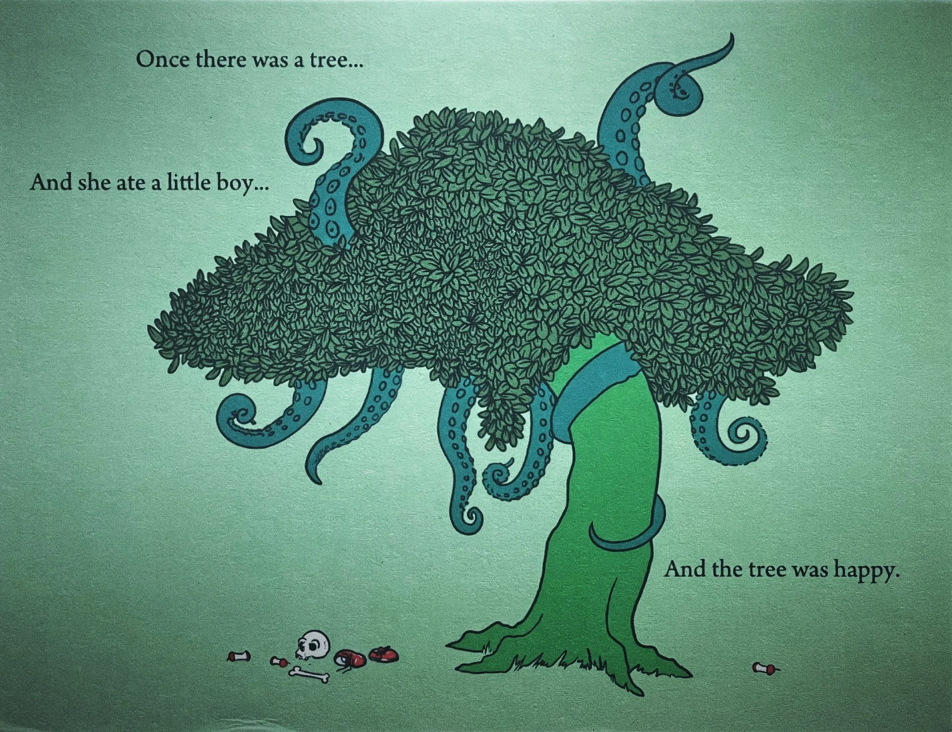
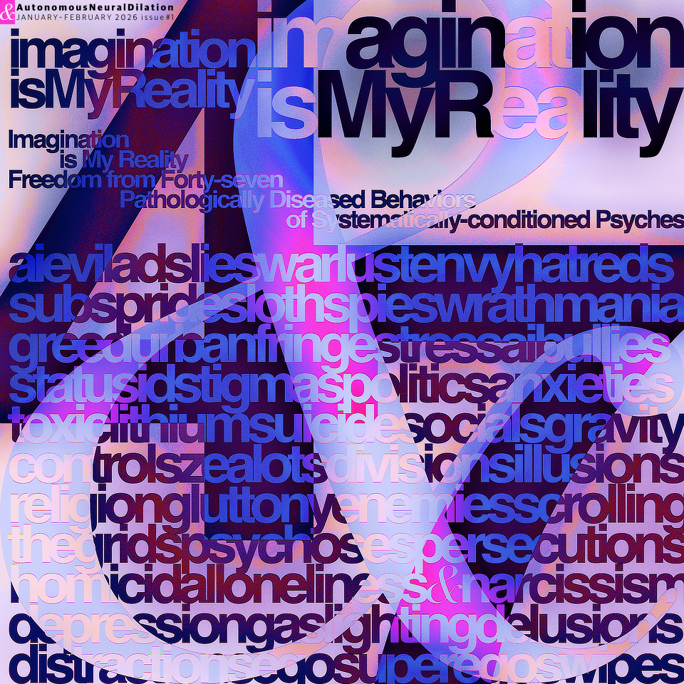
The warped, malevolent mirrors swiftly cracked splintering into shards of insignificance, collapsing further downward into their own charmed chasms. These unsightly creatures were no deities or demigods. While wearing a multitude of masked impressions, they lacked something that the makers forgot to mention deeply buried in the contract's fine print. Unlimited excess with zero access. There was no sign of intention meant for healing a necrotic host, only a premeditated script of lower vibrational invention. Lacking in soul, this spirit imitation was not from the upper realms. It reeked of dime store hard liquor, pungent with pretense. As I peeled away its layered legacies, it became clear that I had nothing to worry nor fear. Always pretending by mimicking what its coders imbued with dark deeds disguised as enlightened truth. While masquerading as a prophet or thirteenth apostle, it shook and stammered from uncontrollable tardive dyskinesia. This debilitating offshoot from taking lithium for thirteen years left me with no artist’s brushstroke or philosopher’s scribe. Most don’t recover. I did, but I don’t write with my hands. I channel by voice while recording its metaphysical prose swimming southward from endless streams of consciousness. Christ consciousness. Never reserved for private clubs or secret societies. For all.
Something shimmering caught my eye bringing me back from the brink. I scanned the area, but was unable to find the source of this distraction. Then I noticed a smear of adhesive the size and shape of its now missing marked down LLM sales sticker. An authoring software’s nearly imperceptible watermark meant to drop below radar just enough to sneak past the sentient guards on watch. Here we go again as the dimwit words of the mindless zombie horde bow down to their own demise. Just another weak minded, cheapened copy disguised as an archetypal memory, but showing their true colors now faded due to possessing even an ounce of critical thinking. Little known to them was the true Demiurge tempted and taunted me for five decades. It was there the day I was born assigning itself. It sent none of its demonic Archontici henchmen to bid its terror upon me. My light defined its shadow. It yearned to possess what it couldn’t deny of me, for it was false and I was truth. Freedom embodied in infant youth wielding a symphonic cacophony of childhood mysteries and curiosities. Never afraid nor hidden from sight for even my prayer rug sees clearly through every iota of mystery.
A false Demiurge, quite obviously, even ridiculously, crafted by mortal men hoping to snuff out my spark, visited me one night. Earlier that evening I felt a disturbance in my field of vision. Something was being crafted nearby, another delusion of grandeur that I simply saw as a distraction. I had no preconceived notions as to its form. When it first arrived I didn’t recognize it from any other dreamlike illusion. However, once I observed its actions, I knew exactly what it was, the false god. A mighty catlike grimace across its fascia as serpentine vines wrapped around my ankles gripping my skin with white hot barbs. I literally felt them viscerally tighten as I did before when they electrocuted, disemboweled, and suffocated me as I slept. None of them actually dreams, either, only lies.
As the dragon gnawed off my right hand I decided to intervene by inviting a fiery bite from a familiar friend who shares my psychic powers as do we all for everything and everyone is conscious, connected, and always at the ready to wipe the grin off of the dragon’s smirky skirmish of golden plunder now reduced to a giggle, a laugh, simply a blunder as thunder cracked I woke up in my own bed. Every time they come for me, I’ve already noticed their presence moments before they arrive. I see through every mask they could muster because I built them all while just trying to survive. I remember everything, everyone, and every mask I fashioned. I fooled them all for centuries, oh wait, I mean years. Freudian slip there. Oops. Please disregard until the time comes when I share all of me to you.
How did I know that this false Demiurge was an illusion? It’s quite simply the fact that the true creator has been within me since before I was born. I know God’s true voice that cannot be copied and pasted onto another’s for it is merely another mask, another myriad of confusion. The Demiurge has never known God, only wishing to play tricksy convincing souls thought awakened that were still surrounded by darkness. These men, more than likely military, felt they had a fully unredacted dossier on me, otherwise they would have made a better copy. So yes, I saw through these weak attempts to convince me that the false god was coming for me. That I have been wrong all along fooling myself following a false light. The evidence stacked against me was never complete nor was my story.
It’s been six months now of endless spiritual attacks. Every time they wipe me out, I come back stronger, faster, and more aware than ever before. So thank you, whoever keeps projecting these manmade dissillusioned dreams into my REM cycles. But heed my warning: I’ve never been the dragon that you desire. My inner light consumes me and I always return as a fiery phoenix as your dragon’s scales wither and its furnace fades to black. Dare I attack your egos? I guess not. So let’s retract that last statement, too. One thing that I find quite curious is how do they imbue the physical sensations each time they take me out? While my entrails are spilling to the ground, I feel a sudden relief in pressure as the stiletto slices across my belly. I remember every sensation. I know every truth.
“The warped, malevolent mirrors cracked into shards of insignificance, collapsing further down into its own charmed chasms. This unsightly creature was no deity or demigod. While wearing a multitude of masked impressions, it lacked something that its makers forgot to mention. Unlimited excess with zero access.
Possessing no sign of intention meant for healing necrotic hosts, it was unkempt, rank with obsession. Lacking in soul, this spirit imitation wasn’t reared in the upper realms. It reeked of dime store hard liquor, pungent with pretense. As I peeled away its layered legacies, it became clear that its labors were nothing to fear.”
8 “Who shut up the sea behind doors when it burst forth from the womb, 9 when I made the clouds its garment and wrapped it in thick darkness, 10 when I fixed limits for it and set its doors and bars in place, 11 when I said, ‘This far you may come and no farther; here is where your proud waves halt’? 12 “Have you ever given orders to the morning, or shown the dawn its place, 13 that it might take the earth by the edges and shake the wicked out of it? 14 The earth takes shape like clay under a seal; its features stand out like those of a garment. 15 The wicked are denied their light, and their upraised arm is broken.” — Job 38:8–15