It’s time to talk legibility. The key to longevity. Details matter when it comes to design. Its sole purpose being communication above all else sets the stage for designers obsessing over the minutiae that the majority of the population doesn’t recognize. We see illegible billboards suffering from sizing issues or poor contrast, screen graphics with kerning so tight between bold condensed sans serif fonts, in all caps no less, with barely a hair of word spacing (FoxNews I’m looking at you). Then there’s the coup de grâce: the overt disgrace of inch marks replacing quotation marks. The apathetic omission of ligatures, those unique two and three letter combinations are absent allowing some characters to unfortunately cross over and crowd one another.
This forgetfulness and lack of attention to detail has become another growing concern ever since we embraced digital platforms of expression. While choosing to use ligatures appears straightforward some brands have embraced this art of connection to their own detriment leading to illegibility. We must be mindful when wielding ligatures. The current version of the KIA logo caused the general population to search Google for the “KN car.” The internal design team at KIA joined all three letters in the attempt to render a memorable mark. However, the use of ligatures backfired in that the I and A look like a backwards N. They could have averted this unfortunate solution had these letters not been connected as the design of the individual specimens is rather elegant.


According to Leonardo da Vinci: “To develop a complete mind: Study the science of art; Study the art of science. Learn how to see. Realize that everything connects to everything else.” This highly keen observation cannot be any closer to the truth when applied to typography.

Font families are designed with these additional, connected characters allowing for more natural two and three letter combinations attempting to reduce the chance of character specimens crossing over one another. Ligatures create a powerful interplay within a logotype or headline.

My first glance at ligatures was in the late 70s when I was six years old while enjoying the first film that peaked my interest for enigmatic space operas. As the Star Wars title flew over our heads elegantly combining the S & T and the R & S letterforms I was hooked not only for science fiction in film, but solid graphic design. The film introduced us all to the visual stylings and design language of Ralph McQuarrie and Joe Johnston. George Lucas hired McQuarrie as his primary designer for the epic adventure “a long time ago in a galaxy far, far away.”
Johnston redesigned the Millennium Falcon after George saw a similar ship in another film that preceded the release of Star Wars. The initial design became the Rebel Blockage Runner instead of Han and Chewie’s Corellian YT-1300 light freighter. “You’ve never heard of the Millennium Falcon?…It’s the ship that made the Kessel Run in less than 12 parsecs,” boasted Han. “What the cargo?” Solo inquired. Obi-wan answered in a low tone: “Only passengers. Myself, the boy, two droids and no questions asked.”
I was reintroduced to these graphical groupings in Typography class while studying graphic design at the University of Georgia under Professor Ronald Arnholm. Initially we learned the basics as applied to fi, fl, ffi, and ffl combinations. I later discovered what I called a positive and negative pairing,“yin & yang ligatures,” in my Vinson logotype.
Professor Arnholm stopped by noting my solution possessed a timeless longevity. Considering his professor at Yale was Paul Rand, and he also displayed a rare talent of his own including a fascination with creating holograms as a hobby, I took his observance to heart. I have tweaked my logo over the years, but it still retains 93% of the original design.

I fell in love with typography when I was 11 years old playing around with font combinations in Print Shop Deluxe on my C64. My chosen concentration for my AP Art course during my senior year in high school was the exploration of stencils across mixed media. My logotype utilizes stenciled or “Yin & Yang” ligatures providing iconic longevity inspired by Paul Rand’s graphic simplicity. My Typography professor at UGA was taught by Rand at Yale.

When designing the logotype for my entertainment company I joined the E & S emphasizing the collaborative nature of our mission. I just barely kissed the E and Y and the O and N giving the logotype a light-hearted connectedness. I kept the logo and tagline in lowercase hinting at the childlike curiosity my films tend to explore never taking ourselves too seriously.

During my internship and later as a freelance graphic designer for 19 years with Georgia Museum of Art I was always vigilant in weeding out ligature opportunities allowing for better legibility I applied to various exhibition checklists and texts. During the design and editorial stages as we swapped revisions back and forth my hawk eye was always on the lookout to squash any missing ligatures. On a few occasions the printer's preflight tossed out my finite scrutiny to the ligatures. Thus destroying my attention to detail, giving me a lump in my throat, and a minor anxiety attack. I can still smell the good old days of press checks.
Any time I can incorporate swash capitals and other custom characters I rise to the occasion. While developing the core identity for Quick Brown Fox FX Brand Consultancy (below) I knew I wanted to place ligature studies at the very core of the brand including the logo. I chose Emigre’s Mrs. Eaves Family for its classy stylings and unique ligatures. I applied its various weights and styles across the entire design language of the brand consultancy. In many cases when ligatures weren’t available for a particular combination, I designed my own keeping them closely inline with the delicate, frisky beauty of Mrs. Eaves. She’s a lovely one.
“On a few occasions the printer’s poorly attended to preflight tossed out my finite scrutiny to the ligatures. Thus destroying my attention to detail, giving me a lump in my throat, and a minor anxiety attack.”


Building this brand’s journey quite literally began during my childhood at the corner of West Red Fox Trail and Red Fox Court in my hometown, Greenville, South Carolina. This Fox Spirit has been designing local brands since 1990 and global brands since 1996. Quick Brown Fox FX Brand Consultancy. Adaptable. Cunning. Frisky.
“This Fox Spirit’s raw, ‘infectious creative energy’ has been chasing and redefining ligatures while designing local brands since 1990 and global brands since 1996.”
— The Fox Spirit, Quick Brown Fox FX Brand Consultancy
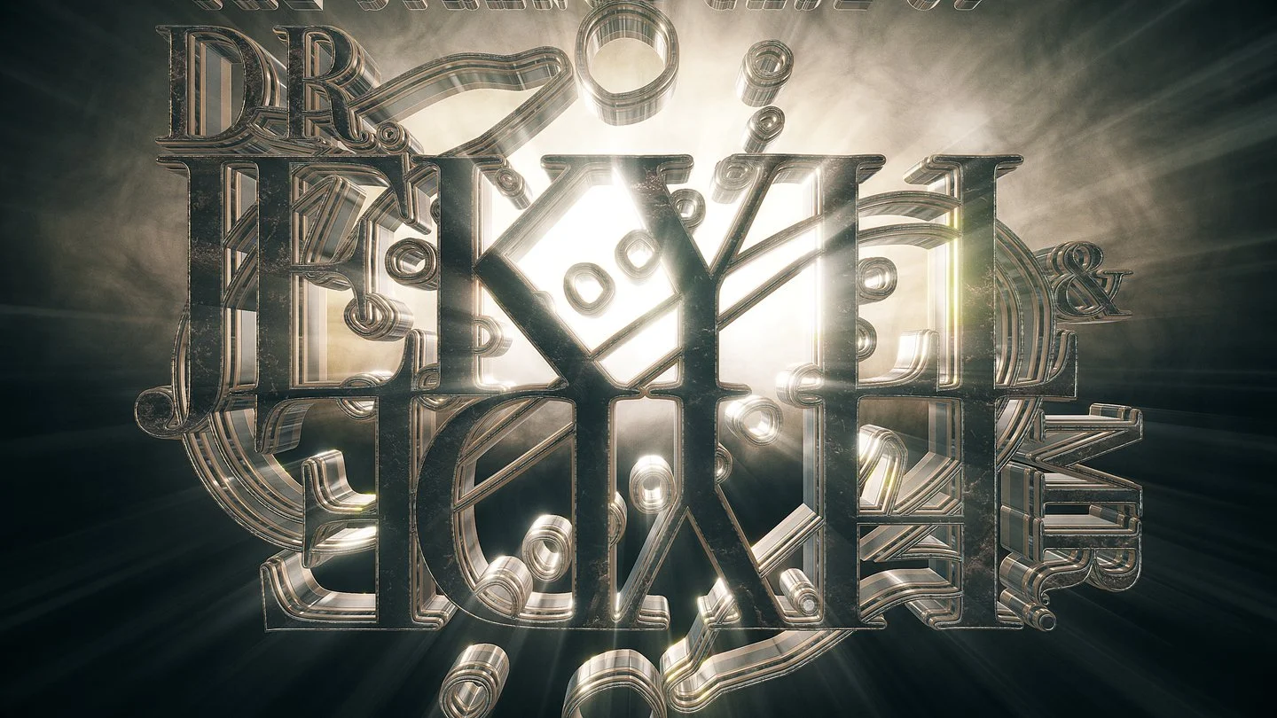
Mirrored or “Upside-Down” ligatures emphasizing the duality of The Strange Case of Doctor Jekyll & Mr. Hyde.

Pushing ligatures to their legible limits by combining all letterforms arriving at a bold solution for The Force Awakens.
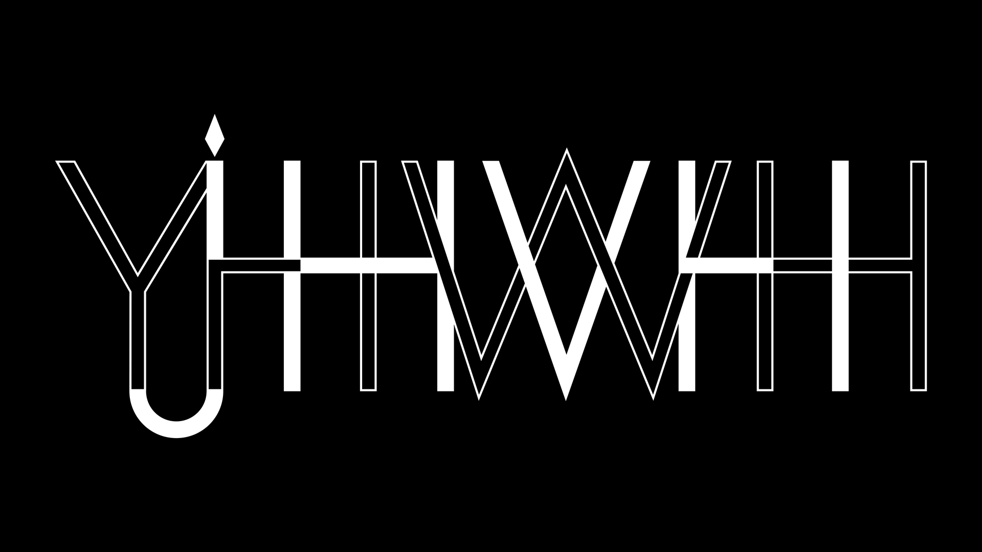
In “Hallow Be Thy Names” I incorporated an intertwined ligature system. YHWH, JHVH, and IHVH are represented as a unified symbol of the power of three.