Children have always been the best critics. They haven’t been brainwashed by societal influence. When he was 10 years old young Raynor Unwin wrote his review of The Hobbit by J. R. R. Tolkien just prior to its publication on the 21st of September, 1937. His father, Sir Stanley Unwin, a British publisher founded the Allen & Unwin publishing company the 4th of August, 1914. While watching the plethora of the making of Peter Jackson’s Lord of the Rings trilogy one of the Tolkien historians noted that “editing Tolkien would be the final sin.”
Editing the most prolific professor of English Language and Literature, an Oxford Anglo-Saxon (Old English), John Ronald Reuel Tolkien, was considered absolute blasphemy. I mused that this was quite parallel to my fascination with the need to distilling down the dozens of Star Wars logotypes into one final design with a modern twist. It’s been a long time coming since “a long time ago in a galaxy far, far away” first appeared in theaters on the 25th of May, 1977.
When I first saw Star Wars with my Mom she said I criticized the film every couple of minutes nudging her and saying “mommy, that was wrong.” At just 6 years old I noticed all of the perspective and inconsistencies and optical compositing artifacts. I wonder, did this influence me pursuing a career in graphic design and visual effects? I’m not steeped in film lore as deeply as George Lucas or Steven Spielberg, but I’ve been studying their filmmaking techniques for nearly 50 years.
I’ll never forget each time walking out of the theater feeling that sense of satisfaction knowing one day I’ll be that hero that followed the sage master, explored the Force, the dark side and the light, and finally blew up the first Death Star. Even now at 53 I’m an avid collector of Star Wars and Raiders of the Lost Ark books, toys, and trading cards. Let’s make a quick course correction and get back to that logotype that’s represented in so many variations its impact has been lessened.
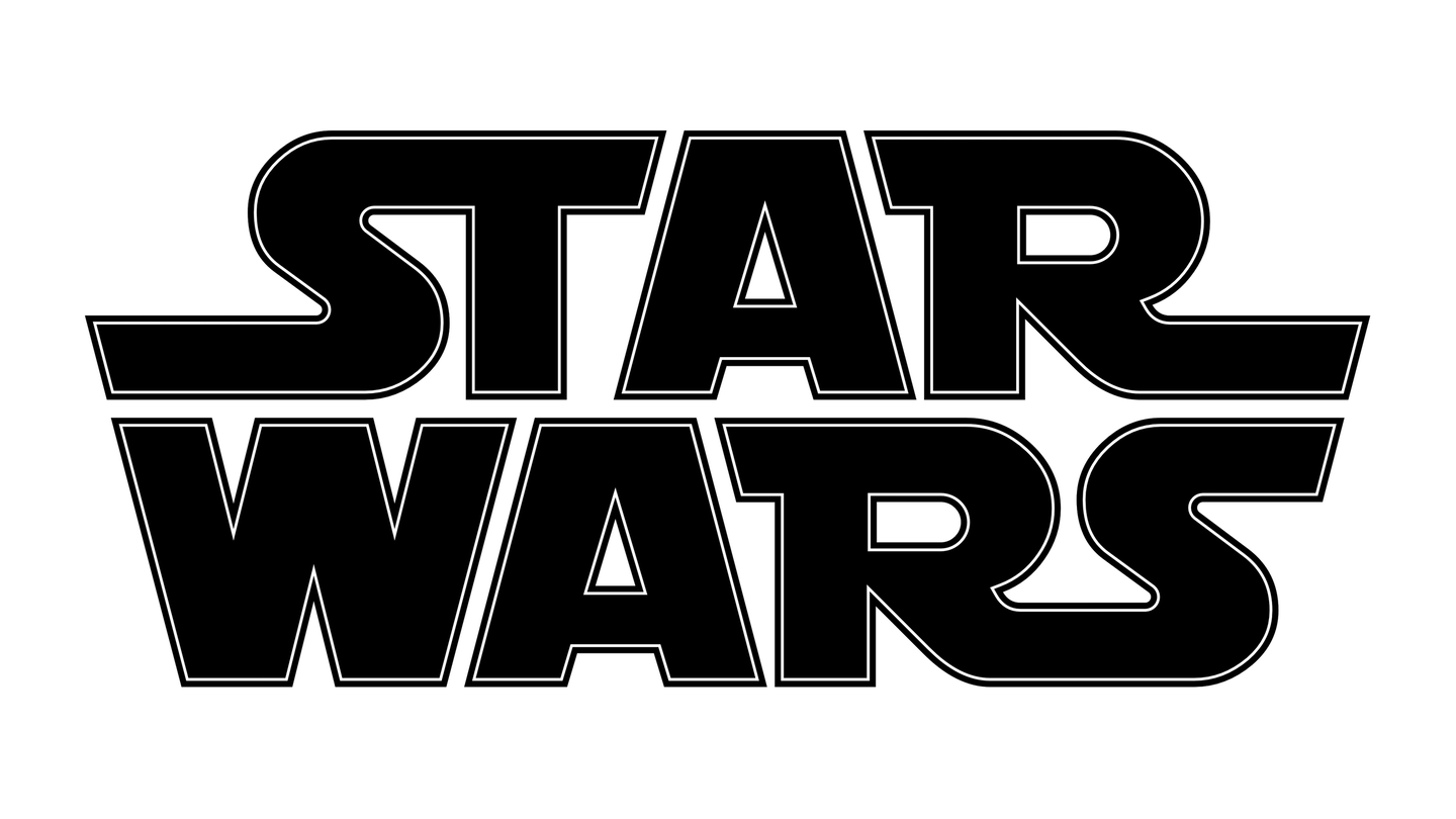
It’s time for one final, definitive mark for now that addresses the current obese version on StarWars.com also seen below on the tiny Ralph McQuarrie book cover. Over the last 48 years the Star Wars logo has seen numerous tweaks, revisions, and utter bastardizations. While unnoticed by most the original 1977 version had spacing issues as seen in the theater and vinyl album cover art (as seen below), and STAR wasn’t well balanced as the tail on the S was three times wider than the R. The R specimen has an oddity that’s always stood out in the right width being so much thinner than the left width as relative to the hole in the letterform.
While it still had issues the Whitman Star Wars Marvel Special Edition version was a bit better balanced, but the W was too sharp across its midsection and didn’t feel visually related to the other letterforms. The Star Wars Album was yet another variant similar to the Marvel one, but the As were taller and skinnier. Some of the most recent versions are so bold with extremely tight spacing that the W nearly closes up at smaller sizes particularly on the cover of the Star Wars: The Concept Art of Ralph McQuarrie Mini Book.
Even starwars.com’s masthead logo has spacing issues, and it’s teetering on being far too thick quite similar to Adobe’s obese choice applied across all of its product names. It appears that the stroked version from 1977 was unfortunately merged with the letterform’s interior space. The ST ligature is also too tight and needs some breathing room compared to the space between the ST and the A.
The spacing between the two instances of AR have always been different so I fixed that, too. The last detail I noticed in the many versions of the Star Wars logotype floating around is that the width of the T is far too thin. I tweaked its width to match the other letters as seen at the bottom of this post.


The 1977 Star Wars vinyl sleeve (above) represented the original logotype from the film. Moving forward partners like Kenner and Marvel designed their own versions. It’s not clear why there were so many logo variations, possibly for product differentiation. The Kenner packaging (below), revived in the Lucasfilm 50th Anniversary packaging for the Black Series is my favorite logotype variant. Other than a few minor issues like the holes in the Rs being too small and having slightly rounded corners it’s fairly balanced. I’d still suggest widening the curved right-side of the Rs.

I’ve been drawn to giving the famed Star Wars logotype a makeover for decades, and I even tried it nearly ten years ago as seen on the Titles page. Now that I have some time between projects it’s time to start the journey all over again. I’ll be posting updates to this post giving glimpses of nearly every version making its way into the Star Wars galaxy zeitgeist. Hopefully through these experiments I’ll arrive at a solution of my own that captures the brand’s essence while giving a nod to the original mark. I’d be happy to give it to Disney free of charge.
Let’s welcome the franchise into the world of 2025 paying close attention to ideal legibility at all sizes. The screen grabs below are from three different Star Wars films in my library. Notice they are not only all different, but one even looks like it was hand-painted. I’m not sure why Disney hasn’t dropped in the most recent incarnation into all nine films for brand consistency. If I were the head of Disney I’d not only call out any brand consistencies, I’d also replace Tarkin and Leia with Deep Fakes replacing the stiff CGI versions depicted in Rogue One.


C U R R E N T S T A T U S O F M Y O N G O I N G R E D E S I G N