Updated post discussing the necessity for native and third party theming in macOS Tahoe, aka 26. “Liquid Glass,” while appearing as an exciting new visual overhaul, is not for everyone nor every app. Similar to “Apple Intelligence” we need the option to turn it off. I’d even settle for a slider to disable the refraction effect. It’s rather distracting during normal use. The more “Liquid Glass” demos I watch, the more I see the need for a Flat mode that’s the visual opposite of “Liquid Glass.”
We’ve experienced this conundrum before regarding glossy vs matte displays. I’ve always preferred a matte screen finish as far back as my 17-inch MacBook Pro. Reflective displays wreak havoc on our eyes. This eye strain is not a personal opinion, it’s a fact. Yet we as consumers are drawn to shiny things. That is the only reason why displays are usually glossy. Now imagine Liquid Glass on a reflective display. Doubling down on distractions might work in a demo, but not daily use.
Back in 2014 I released my theme “Post Pro 1.2” via Interacto’s Flavours theming app that enabled a true “dark mode” 4 years before Apple finally showed up with their official, native Dark Mode in macOS Mojave. The latest version of Dark Mode in macOS makes me smile as it’s quite similar to “Post Pro 1.2.” The screen grab below is from Sonoma, but it has not changed that I know of in macOS Sequoia.

Even back as far as System 9 we were all obsessed with theming our Macs. “BBX Mercury” was one the hottest themes by legendary designer Max Rudberg. System 9 also had a decent built-in theme engine with custom highlights, desktop pictures, and even sounds. We also customized the icons through downloading collections from IconFactory. Back then personalizing our macOS user experience was commonplace.
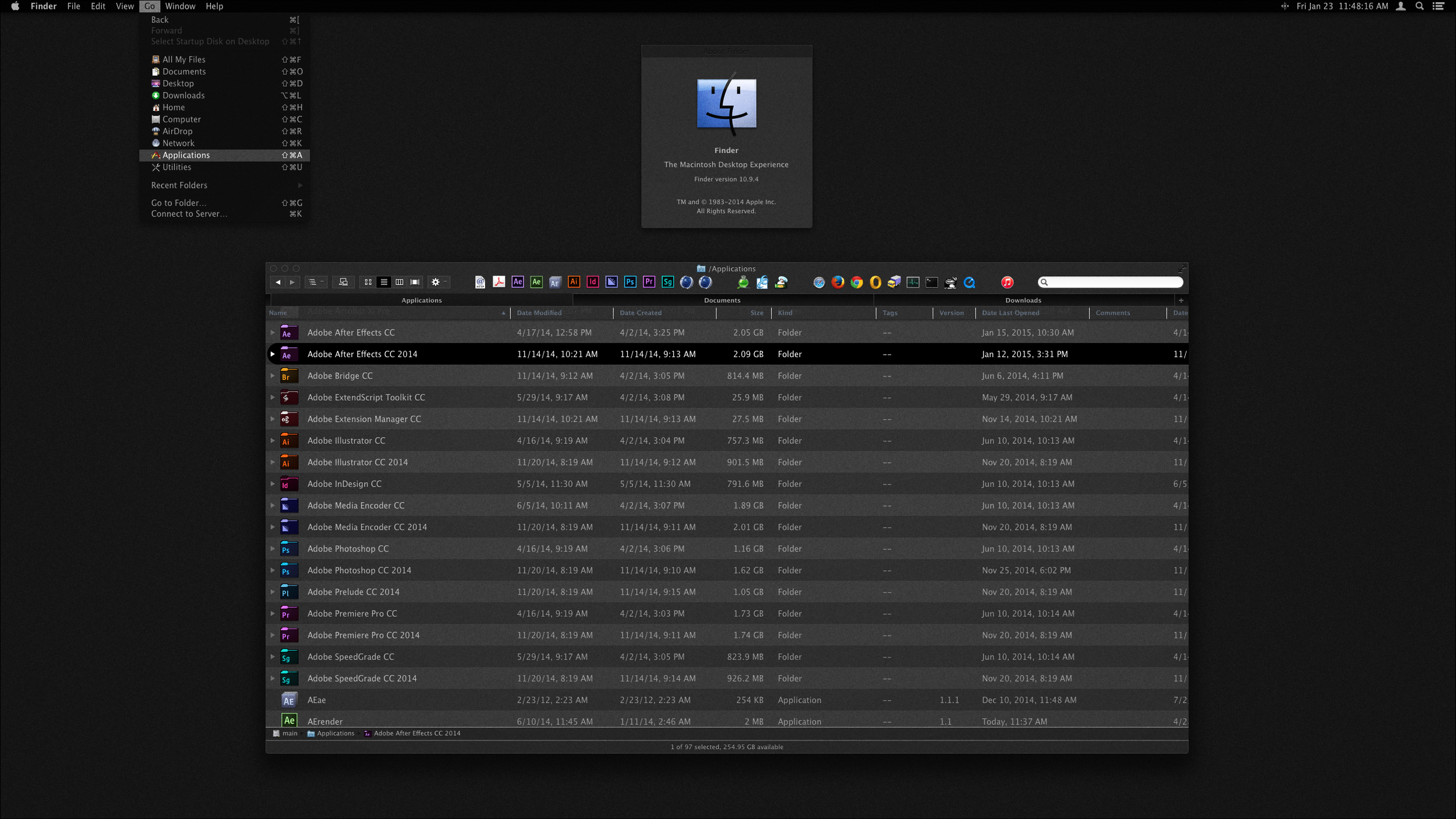
While working for NBA TV Design at Turner Broadcasting in 2013 I started playing around with Flavours by Interacto. It was the most feature-rich theming engine I’d ever seen. I could customize nearly everything in the operating system. My goal was to design a theme geared to post production professionals who preferred a darker GUI as many came from a Discreet Flint/Flame/Inferno world, like myself, and knew how helpful it was to work within a GUI that isn’t bright white like Adobe After Effects, Commotion Pro, and even the early commercial version of Digital Domain’s Nuke.
For a brief period I was on the Nuke beta team to provide feedback. Most of my suggestions revolved around the GUI which was bright white with floating palettes. Take a look at any compositing setup these days. Everyone has gone dark, preferably charcoal. While on the Adobe After Effects beta team for quite some time I remember when we got them to add the first version of darkening the GUI with direct slide ability for the user to adjust for personal taste. That first incarnation’s darkest tones weren’t even half as dark as the AE GUI is today.
It’s been eleven years since I first released my free Flavours “Post Pro 1.2 theme.” It was bundled along with hundreds of other user themes in their final release of Flavours 2.0. Unfortunately Flavours only went as far as Mac OS X Mavericks. Moving past Mavericks Apple tightened up the core system files causing theming to be impossible. So, we waited, and waited, and eventually in 2018 Apple released Mojave with a true Dark Mode. Better late than never, I guess.