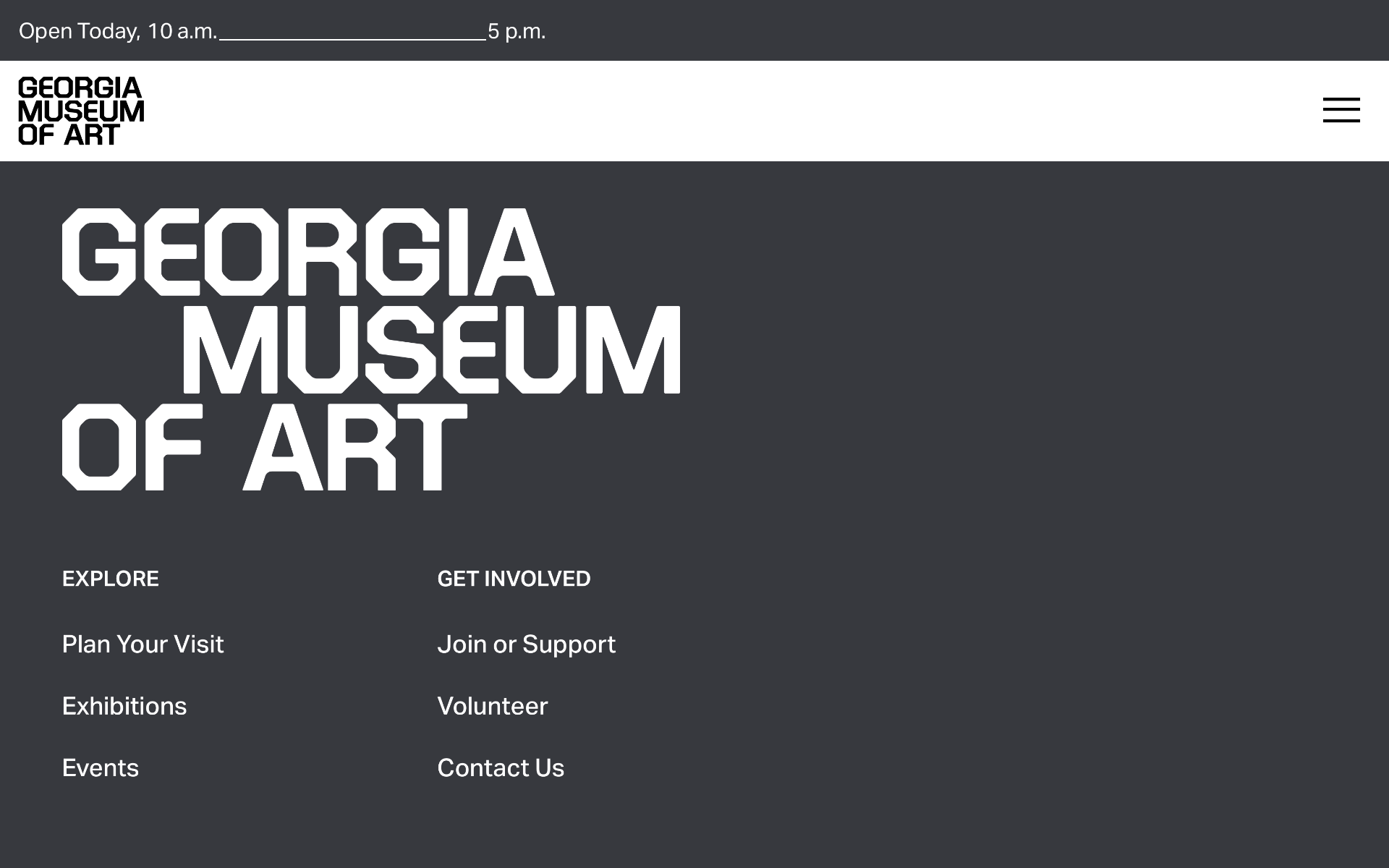
A new year and another vanilla rebrand. I recently discovered the new Georgia Museum of Art’s logo rebrand. It’s not the first, nor will it be the last, of aging firms like Pentagram pumping out bland content instead of design innovation. No matter how they want to spin it in public relations and press releases it’s clear that whoever on P’s team that approved this for consumption wasn’t used to paying close attention to the details. The rebrand immediately introduces a confusing setup; a sin against the whole concept of graphic design branding and communication.
Let’s take a look. Which one is the official logo on the GMOA website? Is it the one tucked into the top left corner or is it the less rigid version near the bottom of the page? While I prefer the latter, it still has it’s issues. The gap between OF and ART is wider than the Grand Canyon. ART feels misplaced. Don’t get me wrong. This isn’t an attack on P or my utter disgust for another soulless “refresh.” The real insult on display is that P trashed the entire lineage of the GMOA identity. Now all I see is mediocrity with no sense of design or clear brand spirit. Just content.
Which version do you prefer? I guess no one could decide so they included both. I have a feeling Paula Scher had nothing to do with this rebrand. If she did, she needs to get her eyes checked. If GMOA really wanted to make a splash they could have easily tapped into their own local resources at University of Georgia. I would have treated this as a student and professor competition so the rebrand’s story would hold weight and gravitas. I wonder how Professor Arnholm feels about it? The entire GMOA and UGA websites feel cold, distant, and sloppy. Truth.
I’m not here to make friends. UGA Graphic Design taught me how to see. Don’t blame me for pointing out inconsistencies and confusion that would have been easily remedied in a typical student/professor critique. Who are we designing for? I agree in seeking solutions that appeal to everyone, including those with visual impairments. However, must it be delivered in such a cold, shallow form? I don’t blame anyone at GMOA. They were guided by one of the most prolific design firms in the country, Pentagram. Do better, P, if your designers still have a soul. Ouch.
No more gold stars for Pentagram, self-proclaimed as “the world’s largest independent design consultancy.” Here they go again delivering another uncomfortable, custom font approach abandoning every ounce of rich history for Georgia’s state museum. The optical spacing is inconsistent. The S has a wider bottom half that feels like a mistake. The rounded interior of the R doesn’t match the other letterforms. The A and M would work better if the top of their interiors didn’t come to a sharp point. The U is wider than the R. The Grand Canyon-wide gap between OF and ART is the most offensive folly. That’s my $2 UGA design veteran critique.
Now let’s consider a wiser, more elegant and intentional approach giving full attention to GMOA’s vast history and its future aspirations. This solution is almost too obvious to comprehend. Why didn’t UGA’s graphic design professors and students enter their own designs in what could have been an exciting competition between the new guard and the old. An epic exercise proving itself as a grand gesture for reinvention. It would also provide an excellent public relations opportunity by highlighting the students’ and professors’ talents for their contributions to the cause. This further places the spotlight on the artists, GMOA’s core competency.
Final thoughts: even the most bloated, planetwide, solo design firm doesn’t mean better, and bland is boring.
G M O A M I D - 1 9 9 0 s – 2 0 0 0 s B R A N D I N G ( A B O V E ) A N D G M O A 2 0 2 6 ( B E L O W )
The letterform anatomy gives off construction company or ESPN college sports graphics vibes. This solution misses the mark entirely by not paying proper respect to this iconic museum. Georgia Museum of Art’s visual design language is now hollow. Not even a mere shadow of its former self. A classier, less sterile approach utilizing a font family with a wide range of weights, styles, and glyphs such as Centaur MT or Mrs. Eaves are far more appropriate giving weight to GMOA’s history. UGA Professor Ronald Arnholm’s Legacy might be even more appropriate with its wide array of serif, sans serif, square serif, and genuine small caps. Erik Spiekerman’s Neue Serie57 is also an excellent contender. I’d also try Helvetica and Futura.

Georgia Museum of Art’s new LinkedIn GO logo is literally a G and a narrowed STOP sign. Was anyone clever enough to think this type of irony was targeted branding? Pentagram loves sharply notched letterform exteriors with awkwardly softened interior curves.
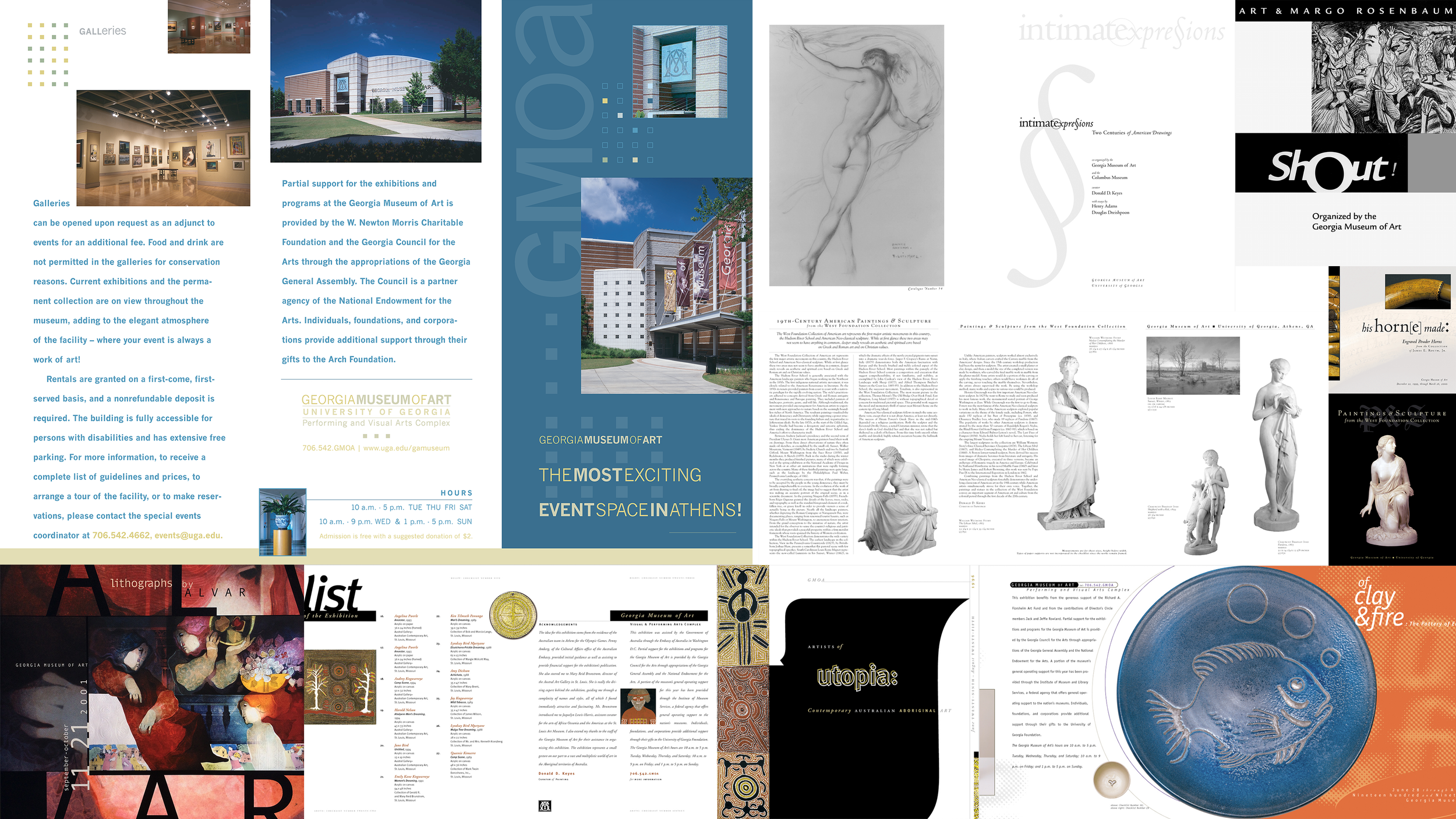
Across the span of nineteen years, my dear friends and colleagues at Georgia Museum of Art and I celebrated many victories. Every year when the Southeastern Museums Conference arrived, so did our shared accolades. We were also blessed with many other acknowledgments. Our relationship began when I was an intern during my first year at University of Georgia’s Graphic Design program in the mid-90s. I’ve always been a believer that variety is the spice of life. Rather than vanilla-fy every hard and soft cover text, poster, banner, mailer, and checklist, I always delivered branding that represented the artists on display. I never took cheap shots by incorporating my own design baggage. Each design was an extension of the artist.
By combining sans and sans-serif typography, each piece was an original expression giving full credit to the artist through the juxtaposition of shapes invoking musical notes of tone and accord. Above and below are just a small handful of these such works. Through the careful use of depth, design, color, form, and function, each piece whispers in its own language. A museum is not an institution, not a hospital or generic courtroom. Museums are where we share love. Every now and then something endearing plucks our heart strings with a rhythmic resonance. I am so fortunate to have been part of GMOA’s legacy working alongside Bonnie Ramsey, William Eiland, Jennifer DePrima, and others that never felt like work. Only pure joy.
( 2 0 1 6 – 2 0 2 4 )

( 2 0 2 4 – C U R R E N T )
I was watching a DC film recently and saw the above left logo for the first time. It felt clumsy and imbalanced from DC not being centered. Almost, but no cigar, so it comes across as a mistake. The uncomfortable angle introduced on the top right of the C letterform doesn’t do it any favors either. Let’s just say it wasn’t much of a surprise when I learned it was designed by Pentagram. Luckily the DC badge on the right was brought back from the one that reigned for nearly thirty years from 1976–2005. The subtle blue gradient doesn’t really make any sense, but I’ll let that slide. Bravo Warner Bros.