Ligatures, Weights, and Measures

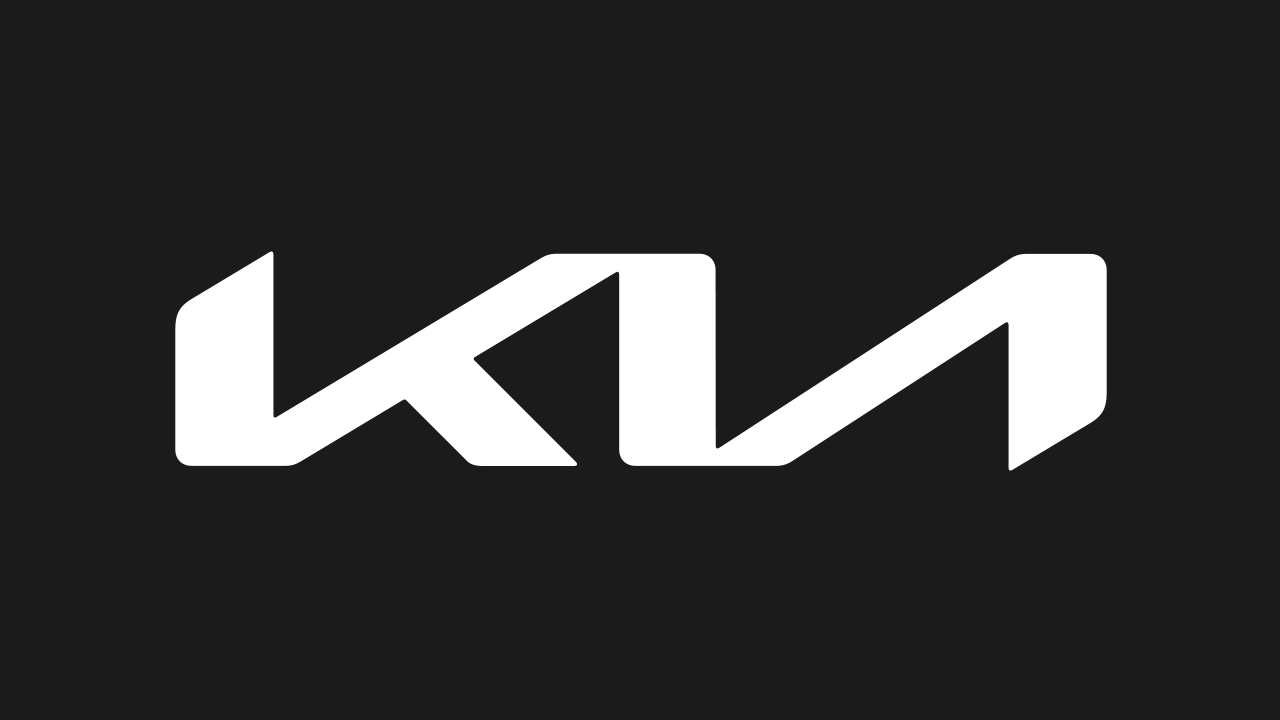
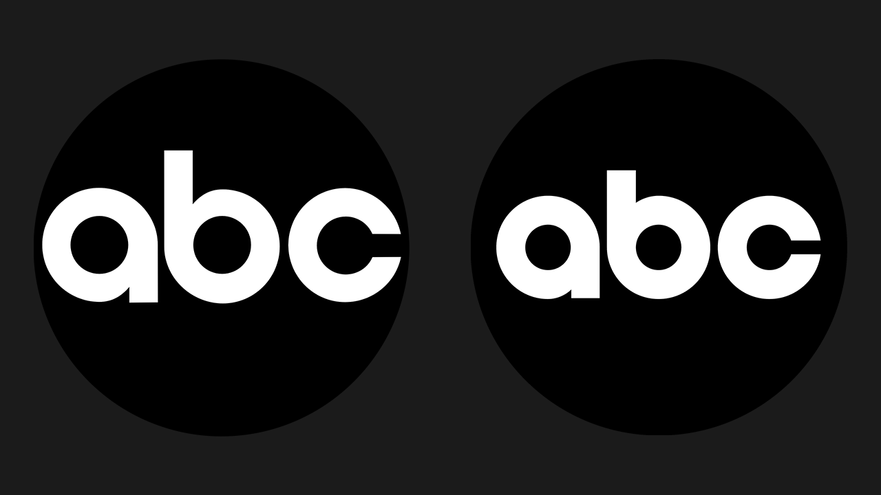
Paul Rand’s ABC logo is one of his most iconic explorations. While the inner circles are absolutely geometric, the outer circles that define the outer white edges of the letterforms are not. The vertexes on the “a” and “b” are subtly waisted as they curve around finishing the letterforms. This intentional decision allows for greater legibility at smaller sizes. The newly designed, thicker letterforms on the right rendition are perfect circles both inside and out. The negative space that cuts into the “c” almost completely plugs up forcing it to appear more like an “o” at smaller sizes. KIA’s decision to embrace a new identity caused so much confusion that thousands of Google searches for “KN car” ran rampant. Their attempt at utilizing ligatures backfired and rendered the “ia” as a backwards “n.”

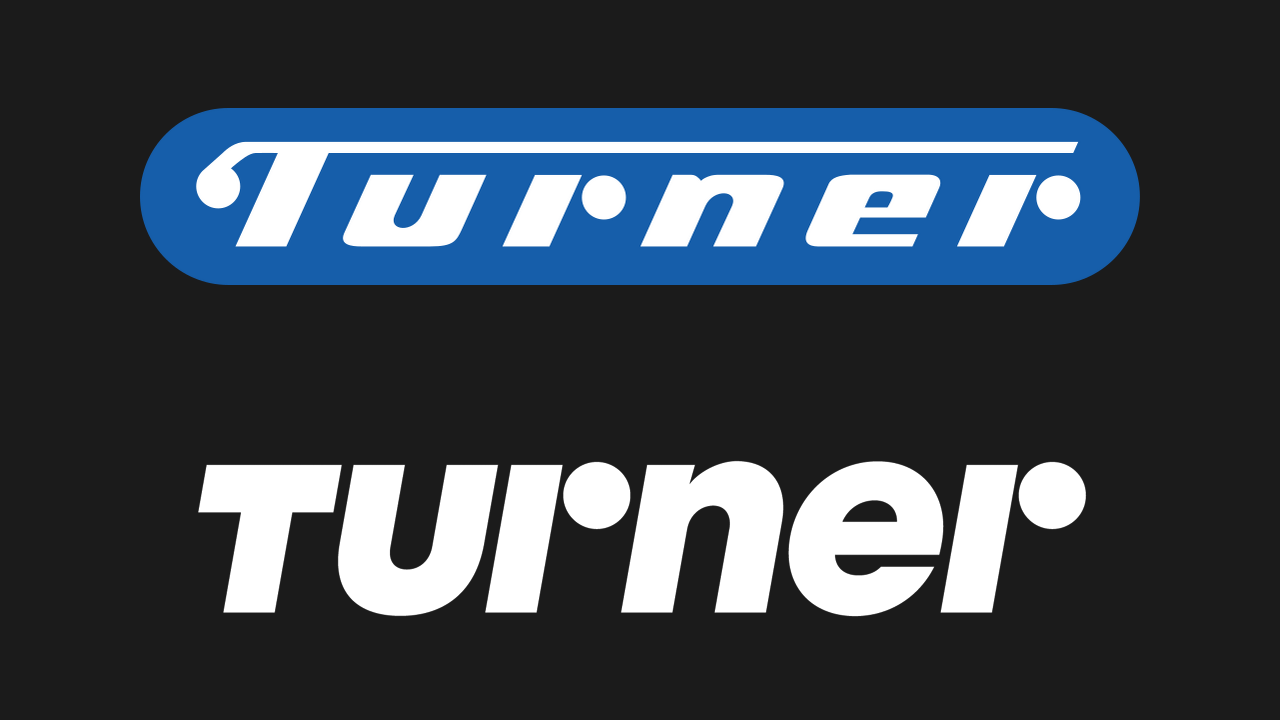
The third offender is rather personal for me as I was working full time at Turner Broadcasting within the Turner Sports NBA TV Design group when it occurred. During at least three rounds of firings which helped redirect the corporate budget toward building a new, state of the art food court we witnessed quite a solution to Turner’s needs. Keep in mind these needs were all fueled by the sheer fact that AT&T was courting to buy the entire enchilada. The redirected funds paid Troika big bucks for a logo redesign chock full of new brand design, too. Guess what happened?

No one could read the logo. No one.

Everyone kept saying “is Turner changing it’s name to Tuinei?” The branding campaign that was plastered all over the Turner campus was black and blue both literally and figuratively as we felt that whoever was behind this new “brand” had it out for Ted Turner. The black and blue hidden meaning being black eyes for Ted and his legacy. Nobody messes with Ted. Yes you all know I have bipolar, and Ted does too. When I discovered that Ted also suffers from Lewy Body Dementia, which pushed Robin Williams to suicide, I was stunned to my core. So many folks considered the highest performing levels of genius have terrible mental health challenges their entire lives. My own struggles with bipolar 1 have gotten worse over the years so I can personally attest to this.

Am I being overly critical, almost bordering on cynical?

Nope. It all boils down to the fact that these brands are failing the cardinal rule of brand design: communication. Period. It is the art to communicate which is the art itself. It’s all in the details. When the details are doing what they’re designed to do no one will even notice. It just works. On the other hand when there’s this failure to communicate it’s always obvious to everyone.

The art of designing a well thought out ligature between two characters is dying. The most basic ligatures such as ff, fl, and fi are usually left out, just as I left them out when I typed this sentence. Don’t get me started on seeing inch marks instead of quotes, hyphens instead of em or en dashes, or bullet points so bold all they do is get in the way of communication. The KIA logo has created the opposite connection in its choice of using ligatures joining all three letters into one illegible design. Google Analytics has documented thousands of users searching for “KN” automobiles. If the “I” and “A” didn’t look like a backwards “N” the solution may have worked much better. I experiment with ligatures quite a bit in my personal typographic explorations in Titles.

There’s also a trend in logo design that there should only be one logo with no varying weights depending on usage across platforms of print and digital. I learned about different font weights depending on size back in Graphic Design 101 in the mid-90s. It appears current design schools have forgotten to preach their roots and are more concerned about teaching software when it’s really the hardware, our eyes and brains, that need upgrading. Science has documented that young children have an innate gift for creating a flawless composition. I’ve spent a lifetime of daily observation learning to “see” as clearly as I did as a child.

Two logos exhibit these design sins, and both were released in 2021. I’ve waitied a couple of years to not only see what the public thinks, but I really wanted to see if I would change my mind and eventually be swayed by their design eccentricities disguised cleverly as design-speak jargon. I’m still not convinced that these design upgrades were introduced with a perfection of design prose as to seemingly make excuses disguised as the very reasons they decided to use poor judgement. I guess they didn’t think other graphic designers would notice. It appears that these two logos are apparently offensive, and illegible, to the masses, not just design masters, of which I am not myself. I am schooled in design dating back many decades, but I am so thankful that I was taught the principles of design before we ever even opened Photoshop or Illustrator which back in those times there were no layers in Photoshop and I think Illustrator was version 5. Am I a dinosaur? To some, but wisdom comes, if we’re lucky, not only through study, but also by making plenty of the same mistakes myself time and again until my eyes can finally “see” allowing me to produce a solution that does what all graphic design aspires to: to communicate above all else.

Illegibility has become a trend. Why? These designers haven’t made enough mistakes and learned to really “see” the correct solution when it naturally presents itself. Also so many logo “refreshes” are boiled down to two easy ways to make a buck: 1) change the logo back to the version from 40 years ago, changing nothing but the color by a suble hue shift, and 2) tweak one or two curves in Illustrator and show how masterfully the logo has been “released” from its own internal design flaw. Yes, they play the hero, but that’s really not the point. So much corporate level design jargon gets thrown around distilling the language down so much that it sounds like a bad “Mad Libs.”

Why am I discussing this here? What agenda am I conspiring? None, really. I just hope all of us try to remember our roots the next time we’re attempting to “refresh” another brand. Design foundation study will always be the most crucial part of the process. Wielding design language doesn’t give an agency the right to attempt a rebrand to begin with. Instead of “why not?” we need to ask ourselves who, what, when, where, why, and most importantly, how. Cicero would most heartfully agree.


Design can be art. Design can be aesthetics. Design is so simple, that’s why it is so complicated.
— Paul Rand

MGM’s “Art for Art’s Sake” Reveal By Baked Studios

I’m not sure how I missed this, but after a bit of research I discovered that the all-CGI MGM film reveal was initially planned to be revealed in theatres at the beginning of No Time To Die in 2019, but due to the pandemic that never happened. I got a chance to see the latest incarnation this afternoon while watching, you guessed it, No Time To Die on streaming in 4K. It’s nearly perfect, matching the lion in particular frame by frame. However there are so many golden touches through the reveal that areas missing that same level of attention to detail fall short. The 3D modeling, materials, and lighting is stunning, but some of the fades aren’t filmic, they just turn highlights gray during the transitions.

This spells truth to 16 bit compositing compared to 32 bit. Baked Studios should really give it a few tweaks in the correct compositing color depth to truly let it shine. The light rays are a bit too unnatural and feel quite digital. Adding some subtle smoke and variation in length as they interact with the logo reveal would give it just another little bit of subtle detailing. The lion is flawless albeit there’s something odd about the motion blur. Seeing the English translation of “Art for Art’s Sake” before transitioning into the Latin “Ars Gratia Artis” was a nice touch. All in all I’d still rate this work as a 95/100. It truly is the most historic update that MGM, or possibly any studio, has ever produced. For an abbreviated MGM logo history click here.

This beast has so many subtle beauties that it’s a joy to experience. In 2021 Metro Goldwyn Mayer released an all-CGI version of their famous film intro designed by Baked Studios. Baked Studios has offices in Los Angeles and New York and has a far proven track record of producing eye-catching content fueled by epic storytelling.


Gazing Into The Past

“The James Webb Space Telescope (sometimes called JWST or Webb) is an orbiting infrared observatory that will complement and extend the discoveries of the Hubble Space Telescope, with longer wavelength coverage and greatly improved sensitivity. The longer wavelengths enable Webb to look much closer to the beginning of time and to hunt for the unobserved formation of the first galaxies, as well as to look inside dust clouds where stars and planetary systems are forming today.” — NASA

Webb, an orbiting infrared observatory, will complement and extend the discoveries of the Hubble Space Telescope, with longer wavelength coverage and greatly improved sensitivity.
— James Webb Space Telescope, Goddard Space Flight Center, NASA

“Luck Is What Happens When Preparation Meets Opportunity”

According to Seneca, the Roman philosopher who coined the above observation, we manifest our own luck. Luck does not happen to us. What is perceived as luck is actually a direct result of our being prepared prior to the opportunity that arises and presents itself to us.

Man who catch fly with chopstick accomplish anything.

— Noriyuki “Pat” Morita as Mr. Miyagi as Ralph Macchio as Daniel Laruso looks on in The Karate Kid, 1984. The film was written by Robert Mark Kamen and directed by John G. Avildsen.


“What We Do In Life, Echoes In Eternity”

Never forget. Never give in. Never give up.

Maximus : “Three weeks from now I will be harvesting my crops. Imagine where you will be, and it will be so. Hold the line. Stay with me. If you find yourself alone, riding in green fields with the sun on your face, do not be troubled; for you are in Elysium, and you’re already dead!

[The soldiers laugh]

Maximus : “Brothers, what we do in life, echoes in eternity.”

Russell Crowe as Maximus Decimus Meridius in Ridley Scott’s 2000 epic film Gladiator


How will the world speak my name in years to come? Will I be known as the philosopher? The warrior? The tyrant...? Or will I be the emperor who gave Rome back her true self?

— Richard Harris as Marcus Aurelius in Gladiator, 2000


Marcus Aurelius : When a man sees his end... he wants to know there was some purpose to his life. How will the world speak my name in years to come? Will I be known as the philosopher? The warrior? The tyrant...? Or will I be the emperor who gave Rome back her true self? There was once a dream that was Rome. You could only whisper it. Anything more than a whisper and it would vanish... it was so fragile. And I fear that it will not survive the winter. Maximus, let us whisper now, together, you and I. You have a son. Tell me about your home.

Maximus : My house is in the hills above Trujillo. A very simple place. Pinkstones that warm in the sun. A kitchen garden that smells of herbs in the day, jasmine in the evening. Through the gate is a giant poplar. Figs, apples, pears. The soil, Marcus- black. Black like my wife’s hair. Grapes on the south slopes, olives on the north. Wild ponies play near my house. They tease my son. He wants to be one of them.

Marcus Aurelius : Remember the last time you were home?

Maximus : Two years, 264 days, and this morning.

Marcus Aurelius : I envy you, Maximus. It’s a good home. Worth fighting for. There is one more duty that I ask of you before you go home.

Maximus : What would you have me do, Caesar?

Marcus Aurelius : I want you to become the protector of Rome after I die. I will empower you to one end alone: To give power back to the people of Rome, and end the corruption that has crippled it. Will you accept this great honor I have offered you?

Maximus : With all my heart, no.

Marcus Aurelius : Maximus, that is why it must be you.

THE GREAT RICHARD HARRIS AS THE ICONIC MARCUS AURELIUS IN RIDLEY SCOTT’S GLADIATOR, 2000. HE PLAYED KING ARTHUR IN CAMELOT ON SCREEN AND WAS A TRUE KNIGHT IN REALITY BEING KNIGHTED BY THE QUEEN OF DENMARK IN 1985.


Steven Soderbergh on Steven Spielberg: The Master of Blocking

Celebrating Spielberg through a “Raiders” Soderbergh case study by Danny Boyd of CinemaStix.

This inspiring video posted by Danny Boyd of CinemaStix thoroughly explores Steven Spielberg’s master strokes of blocking, staging, and other key directorial techniques as presented in Steven Soderbergh’s unique presentation celebrating the iconic director. Through isolating the essence of the film Raiders of the Lost Ark by removing color, dialogue, and replacing the music with tracks from The Social Network and The Girl with the Dragon Tattoo Soderbergh celebrates Spielberg’s genius.


“Maybe So, Sir. But Not Today.”

Extinction? No. Mach 10+. Yes!

Hammer : [going through Maverick’s service record] “Maverick. Thirty-plus years of service. Combat medals. Citations. Only man to shoot down three enemy planes in the last 40 years. Distinguished. Distinguished. Distinguished. Yet you can’t get a promotion, you won’t retire, and despite your best efforts, you refuse to die. You should be at least a two-star Admiral by now, if not a Senator. Yet here you are...Captain. Why is that?”

Maverick : “It’s one of life’s mysteries, sir.”

Hammer : “This isn’t a joke. I asked you a question.”

Maverick : “I’m where I belong, sir.”

Hammer : “Well, the Navy doesn't see it that way. Not anymore. Those planes you’ve been testing, Captain... one day sooner than later they won't need pilots at all. Pilots that need to eat, sleep, take a piss. [glares at Maverick] Pilots that disobey orders. All you did was buy some time for those men out there. The future is coming, and you’re not in it. [to the Masters-at-Arms] Escort this man off the base. Take him to his quarters. Wait with him while he packs his gear. I want him on the road to North Island within the hour.”

Maverick : “North Island, sir?”

Hammer: “Call came in with impeccable timing just as I was driving here to ground your ass once and for all. It galls me to say it, but...for reasons known only to the Almighty and your guardian angel...you've been called back to Top Gun.”

Maverick : [in disbelief] “Sir?”

Hammer : “You are dismissed, Captain. [calling after Maverick as he goes to leave] The end is inevitable, Maverick. Your kind is headed for extinction.”

Maverick : “Maybe so, sir. But not today.”


The end is inevitable, Maverick. Your kind is headed for extinction.

Tom Cruise as Captain Pete “Maverick” Mitchell and Ed Harris as Rear Admiral Chester “Hammer” Cain, Top Gun: Maverick


Helluva Good Times Ahead

Back in the day, circa 1997, the creative brains and brawn at Blizzard released Diablo 1. It rocked the gaming world with all of its hellish wizardry. To this day I prefer Diablo 1 compared to its sequels. I even prefer it to Doom, Dark Forces, Quake, and Unreal Tournament 2004.

There were so many clever aspects to the original gameplay that keeps me coming back for more melee madness even 26 years since its original release. Every Diablo 1 game is randomized and unique which fosters repeat gameplay for years to come. With an open mind and NVidia 3090 in hand I’m stoked to experience Diablo 4 on my PC this summer. It’s gonna be a helluva good time! But will Diablo 1 still remain my favorite?

I have a sneaking suspicion I’ll still hold the original Diablo above the latest incarnation. For me it’s all about the entire experience, not just another 4K graphics FPS. I had similar experiences with Battlefront and its sequel Battlefront II. I still prefer Dark Forces. There’s just no comparison playing Diablo 1 or Dark Forces on my Blueberry iMac in good old vintage OS9 with those retro graphics. :-)

ABOVE: MEET PALLADIUM, MY INVINCIBLE WARRIOR, FROM DIABLO 1, RESURRECTED ON MY 1999 BLUEBERRY IMAC I PAID $60 FOR ABOUT 10 YEARS AGO. CAN’T WAIT FOR DIABLO 4 TO DROP! THUS FAR, DIABLO 1 REMAINS MY FAVORITE INCARNATION OF THE GAME SERIES.

ABOVE: MEET CLEVER CLEAVER, MY LATEST DIABLO 1 WARRIOR I’VE BEEN BUILDING UP IN ANTICIPATION OF DIABLO 4. HIS OPTIONAL OBSIDIAN SHIELD MAXES OUT HIS MAGIC, FIRE, AND LIGHTNING RESISTANCES FOR HELLACIOUS COMBAT SCENARIOS.


High Fidelity Storms are Brewing at The Pixel Lab

Have you ever wanted to play Emperor Ming and control the weather? With these 50 VDBs from The Pixel Lab you’re one step closer. Available in three mesh densities. This pack also includes high resolution renders with alphas for immediate comping.

VDB CLOUDS PACK VOLUME 5: “STORM” FROM THE PIXEL LAB. A COLLECTION OF 50 ULTRA-REALISTIC CLOUD FORMATIONS.


The Emperor Ming : “Klytus, I’m bored. What plaything can you offer me today?”

Klytus : “An obscure body in the S-K System, Your Majesty. The inhabitants refer to it as the planet...“Earth.”

The Emperor Ming : “How peaceful it looks.”

[He activates a console, and watches as earthquakes, floods, etc. start to occur. They both get a good laugh out of it.] 

Klytus : “Most effective, Your Majesty! Will you destroy this, er, Earth?”

The Emperor Ming : “Later. I like to play with things a while...before annihilation.

[laughs evilly]

Max von Sydow as Emperor Ming the Merciless, and Peter Wyngarde as General Klytus in Flash Gordon, 1980


A Designer’s Curriculum Vitae

MAKE AN IMPRESSION AT FIRST GLANCE BY INCLUDING YOUR LOGO AND OTHER DESIGN CUES THAT ALLOW YOUR CV TO COMMUNICATE YOUR UNIQUE STORY.

I’ve always strongly believed that designing the right CV should directly reflect the one who’s being represented in said CV, especially when the position calls for a creative individual. I understand that many companies allow for their CVs to be sorted into priority bins by a set algorithm. The first thing I would ask if pursuing a company for potential hire is simple: do they take the time to hand-select candidates by human or machine? If it is initially by machine I’d be rather wary. I go for the companies that are smaller in scale that actually go the human route. While some consider this as old-fashioned I disagree that it’s really more of a dying art form that requires resurrecting. My CV is designed to highlight my skills as a graphic designer, i.e. to produce a real connection with the reader through a well designed piece of communication. That’s all in it’s simplest form a CV is; a tool to communicate the details of a candidate’s mindset, toolset, work history, and accolades.

I’ve designed many CVs for friends and family for over 30 years. Every one of them aided very directly in them landing the job. I understand that there’s just “not enough time or people power” to personally view every resume, but if the resume stands out at just a glance it’s far more likely it will be read by a human. Machines are fine with things that can follow an algorithm, but where they are weak is with anything that makes us human. How many fingers do we usually see in A.I. art? The A.I. models forgot to teach human anatomy. I’m sure they’ll eventually get it right. For now though I will be reviewing CVs for what’s next for me and my friends just around the corner…


Mind the Details in Client Contracts

COLOR GRADED SHOT OF THE MECHANICAL DRAGON FROM THE WALT DISNEY WORLD PARADE DURING ONE OF OUR FAMILY TRIPS TO ORLANDO, FLORIDA.


Present company shall not be liable for injuries including but not limited to laceration, evisceration...incineration?

— Martin Freeman as Bilbo Baggins, Ken Stott as Balin, James Nesbitt as Bofur, and Ian McKellen as Gandalf in The Hobbit: An Unexpected Journey

Balin : It’s just the usual; summary of out-of-pocket expenses, time required, remuneration, funeral arrangements, so forth.

Bilbo Baggins : Funeral arrangements?

[reads contract] 

Bilbo Baggins : Oh, up to but not exceeding one fourteenth total profit if any. Seems fair. Present company shall not be liable for injuries including but not limited to laceration, evisceration...incineration?

Bofur : Oh, aye. He’ll melt the flesh off your bones in the blink of an eye.

Balin : You all right, laddie?

Bilbo Baggins : Yeah, I’ll be. Feel a bit faint.

Bofur : Think furnace, with wings.

Bilbo Baggins : Yeah, I-I-I need air.

Bofur : Flash of light, searing pain, then poof, you’re nothing more than a pile of ash.

Bilbo Baggins : [long pause] Nope.

[faints] 

Gandalf : Very helpful, Bofur.