Radium: the 88th Element

Incredibly radioactive, radium is an alkaline earth metal (symbol Ra). It’s silvery-white in pure form and is found in quite minute, trace amounts within uranium ore. What is “88 MPH?” Eighty-eight refers to radium’s place on the Periodic Table of Elements. Maybe “MPH” refers to the metallurgical power of hydrogen. Well that’s what my version stands for. Most folks thought I was just talking about an obvious reference to Back to the Future and time travel. Ya’ll were partially correct, but there’s far more to it than that assumption. As it turns out in my lab experiments radium is needed to send objects from our reality to alternate planes of existence. As we delve deeper we’re on the precipice of quantum teleportation but tweaked just a tad. Teleportation? Isn’t that a stretch? No, not really. Scientists have successfully transported data using this method.

Do you ever wonder where they got the idea for 88 MPH (or 39.33 meters per second) as the exact speed needed to produce enough velocity to allow a metallic object with organic passengers the ability to time travel?

Some folks think it’s rather simple in that an eight on its side is the infinity symbol. So, two eights could be infinity in both directions, past and future. That’s partially why my 88 MPH graphic has a skid mark in both directions. Infinity to the past and future. I have a better theory now. What did Doc Brown need to power his time-travelling car? Uranium. What is found inside uranium ore? Radium. 
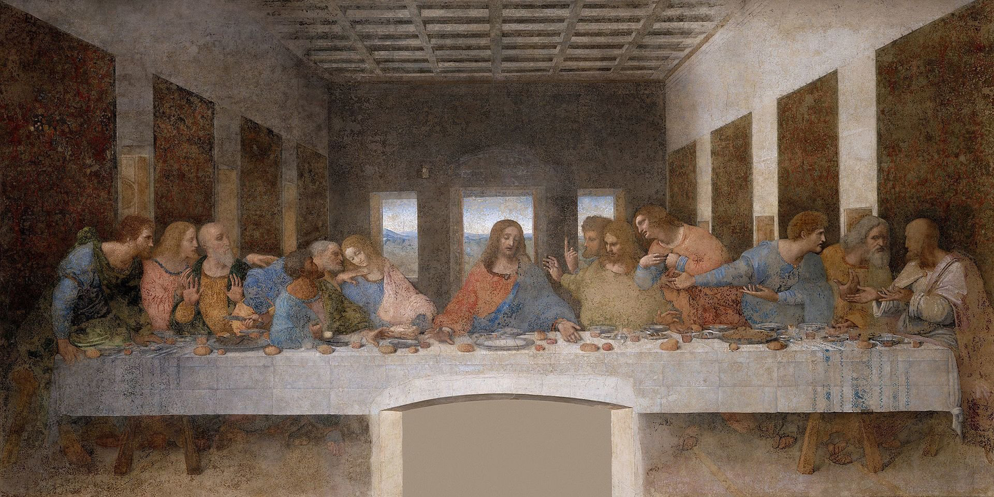
Remember radium is also the 88th element on the Periodic Table. Just a theory as I have not Googled this. But yeah, I have a sneaky suspicion that’s the case. Otherwise, this is just a neat coincidence. Either way, I’ve got to get back to my “Metallurgical Power of Hydrogen” experiments attempting to unlock the power of pure radium. Things are cooking along nicely in the lab, and the first hypothesis has been proven partially correct.

27 strikes again! If you’ve been following my Angel Number 27 rants, you’ll understand why 39.33 (3x3x3 or 9x3=27) meters per second is so amazing to me as I see 27 everywhere. Don’t worry I’m not glowing…yet. Well, maybe a little.


M.C. Escher: Synthesizing Illusions with Mathematics and Graphic Arts

M.C. Escher was the absolute master of synthesizing illusions with mathematics and the graphic arts. From his multi-faceted perspective he redefined reality. What was up was also down. He weaved imaginary worlds governed by this duality. To call Escher a genius would be an understatement. The sheer volumes of detail was astonishing to behold in person. Escher’s dizzying array of works led me to later discover decades later some of his studies which were tied together with his enigmatic system of mathematical guidance in producing these visually stunning pieces. His works totaled 448 prints over the course of a sixty year career. Although he produced a small volume per year, his works were vastly complex. One cannot deny his genius as well as his sense of humor while poking fun at himself for the absolute absurdity found in one of his most well known woodcuts and wood engravings.

ABOVE: HIS MOST AMBITIOUS WORK SMALLER AND SMALLER — M.C. ESCHER. IMAGE COPYRIGHT M.C. ESCHER. IMAGE USED FOR EDITORIAL PURPOSES ONLY.


His ability to teleport us to imaginary worlds where infinity loops abound became his hallmark signature. His work Smaller and Smaller is known as his most ambitious work. The continuously infinite details are incredible. We are transported into a world where infinity in both directions goes on for as he put it “ad absurdum.” This Latin term refers to something that has gone beyond the point of absurdity. Happily poking fun at his own craftsmanship Escher’s fascination with mathematics cannot be denied. He clearly relies on mathematical principles in order to break and redefine them while defying gravity, even planar existence in each of his works. Reality as he portrayed it possessed as having no bounds.

The halving of the figures is continued ad absurdum. The smallest animal still possessing a head, a tail and four legs is about two millimeters long.
— M.C. Escher

ABOVE: THE ARTIST’S NOTES, DIAGRAM, AND MATHEMATICAL STUDY FOR A QUARTER OF SMALLER AND SMALLER — M.C. ESCHER. IMAGE COPYRIGHT M.C. ESCHER. IMAGE USED FOR EDITORIAL PURPOSES ONLY.


Bipolar Coordinates Title Design Update

The title design for my first book, Bipolar Coordinates, is now complete. After fourteen years journaling my bipolar experiences, I’ve arrived at the notion that anything is possible. It’s all about mindset. Once I found the equilibrium within my physical, mental, and spiritual faculties I arrived at true homeostasis. I am releasing this book as historical fiction as some topics may appear a bit out there (aka X-Files). I’ll leave it up to the reader to gleam the truth for themselves. Angel Number 27, Men in Black, God’s iPhone? Coming in the spring of 2024.


The Last Supper and Angel Number 27

At 3:33 (3x3x3=27) pm on the 27th of August I was researching the hidden clues that have been discovered within one of the most famous and mysterious works in all of art history. I can only attribute the timing of my researching Leonardo da Vinci’s The Last Supper to the concept of the Divine Comedy of Dante which contains three sections: Inferno, Purgatorio, and Paradiso. Each one consisting of thirty-three cantos or the division within this long work of poetic prose (so that’s three 3s, or 27, again). I’m not referring to a literal translation, more so a wink at the idea that here I am unbeknownst to the time of day I glance at my clock and note the time is 3:33 pm. All I’m saying is that God has a sense of humor as do all gods within every culture. Also curious is that today is August 27th (3x3x3=27), my Angel Number. This number is considered by many to be the most spiritual of numbers as it is constructed of three 3s. It is three to the third power and the numbers add up to 9 which is 3+3+3. The number 27 speaks to me, guiding me with markers that always lead to something else just around the corner. I discuss the power of 27 in my life further on the eyes:/only page. For a thorough explanation of the hidden messages found within The Last Supper go here.

LEONARDO DA VINCI’S DEPICTION OF FOUR GROUPS OF THREE WITH ONE IN THE CENTER POINT SOME TO LAMENTATIONS 3:31-33 (BELOW). DA VINCI ALSO PORTRAYED ALL THIRTEEN CHARACTERS WITHOUT HALOS, THUS REVEALING THAT LEONARDO MAY HAVE BELIEVED THAT ALL, INCLUDING CHRIST, WERE ORDINARY MEN AND NOT DIVINELY INSPIRED. CHRIST IS CLEARLY SHAPED AS A TRIANGLE WITH THREE WINDOWS IN THE BACKGROUND. BOTH OF THESE ELEMENTS OF THREES ARE POSSIBLY A DIRECT NOD TO THE HOLY TRINITY. THE PORTRAYL OF JOHN “THE BELOVED” IS THE MOST CONTROVERSIAL CHARACTER HERE. TO THE RIGHT OF JESUS SOME BELIEVE, INCLUDING ME, JOHN IS ACTUALLY MARY MAGDALENE, THE WIFE OF JESUS. THE NEGATIVE SPACE BETWEEN CHRIST AND MARY IS IN THE SHAPE OF THE FEMALE WOMB OR THE HOLY GRAIL.


Lamentations 3:31-33 NIV (New International Version):

31 “For no one is cast off by the Lord forever.”

32 “Though he brings grief, he will show compassion, so great is his unfailing love.”

33 “For he does not willingly bring affliction or grief to anyone.”


Remembering the Late, Great Sean Connery on His Birthday

In the Fall of 2020 we lost one of our favorite good guy spies, adventurers, and knights, both on the screen and off. Sir Thomas Sean Connery’s delightful moments in cinematic history were far and wide. His Scottish swagger produced the best of Ian Fleming’s 007. His long life spanned 9 decades from August 25, 1930 October 31, 2020.

The very first, but not the last, Sean Connery went down in 007 history as the quintessential James Bond in seven films.


One of my favorite scenes has always been his moment on the beach orchestrating his version of Alfred Hitchcock’s The Birds in order to take down a German plane hell-bent on wiping out the father and son duo. Today we remember him and never forget his fearless, endless commitment to his craft.

— Sir Thomas Sean Connery as Doctor Henry Walton Jones, Senior, Scottish professor of medieval literature and Grail lore expert and Harrison Ford as Doctor Henry Walton “Indiana” Jones, Junior, Indiana Jones and the Last Crusade, 1989.


I suddenly remembered my Charlemagne: ‘Let my armies be the rocks and the trees – and the birds in the sky.’

— Sir Thomas Sean Connery as Doctor Henry Walton Jones, Senior, Indiana Jones and the Last Crusade, 1989


Say Hello to the Future of Vinson Design

After spending the past 14 years journaling my accounts of my manic depressive battle I’ve finally arrived at a state of homeostasis. For the first time in my life my mental, physical, and spiritual faculties are in equilibrium. I’m aiming for Spring of 2024 for the release of my first book Bipolar Coordinates: Navigating Vibrations and Undercurrents. The book will be published by eyes:/only (SM), the newly formed publishing division of Vinson Design.


Force Fact or Fiction?

I’ve been approached on occasion from folks asking me point blank: “so what’s all this nonsense about metaphysical language, extra sensory perception, and mind melding which you drone on about on your website?! Are these just fictional accounts or do you believe these events actually occurred?! Are you insane?!” I simply reply: “call what I’m writing historical fact or fiction from your perspective as the reader for your own interpretation is just that, your own.”

Keep in mind that they are mere stories, embellished or not, that I’ve been set to recall for inclusion in my book Bipolar Coordinates: Navigating Vibrations and Undercurrents. They will be penned down in my own historical accounts of my personal myths and legends. Once again, they’re just stories. True or not I’ve been asked to share them. Your response, ridicule or not, is also your own as it bears no weight in sharing my life experiences with others who may benefit.


Mark Hamill as Luke Skywalker practicing his lightsaber exercises against a remote while aboard the Millennium Falcon in Star Wars: Episode IV – A New Hope, 1977.


Han Solo delivers a similar sentiment not unlike my naysayers and those who doubt my truths regarding the Force to Luke while aboard the Millennium Falcon back in the late seventies:

“Kid, I’ve flown from one side of this galaxy to the other. I’ve seen a lot of strange stuff, but I’ve never seen anything to make me believe there’s one all-powerful Force controlling everything. There’s no mystical energy field that controls my destiny. It’s all a lot of simple tricks and nonsense.”

— Harrison Ford as Han Solo, Star Wars: Episode IV A New Hope, released in 1977

However, thirty-eight years later in The Force Awakens, 2015, Solo changed his tune, a complete 180 on the subject during a conversation with Rey and Finn aboard the Falcon:

Rey asked quizzically: “The Jedi were real?” Solo answered, “I used to wonder that myself. Thought it was a bunch of mumbo-jumbo-magical power holding together good, evil, the dark side and the light. Crazy thing is, it’s true. The Force, the Jedi, all of it. It’s all true.”

— Harrison Ford as Han Solo and Daisy Ridley as Rey, The Force Awakens, released in 2015


Back In The Saddle

Yesterday morning after leaving my therapist’s office I noticed that the license plate in front of me ended in 227. The one to my right ended in 272. Then within just a couple of seconds Piano Sonata No. 27 by Ludwig van Beethoven began playing on the car radio on NPR.

Coincidence? I think not.

I took a nap and awoke at 2:27. That’s three sums of eleven intertwined with the number 27, but wait, there’s more. There’s always more, especially when I’m not looking.

Ludwig van Beethoven (1770–1827). He was 56 years old when he died (5+6=11).


Don’t only practice your art, but force your way into its secrets; art deserves that, for it and knowledge can raise man to the Divine.
— Ludwig van Beethoven

The Universe is reaching out, guiding me to finish writing my book Bipolar Coordinates: Navigating Vibrations and Undercurrents. This series of happenings captured as short stories chronicle my life of mayhem and madness.

Making sure I was still paying attention, the Universe knocked on my chamber door for a fourth and fifth instance of eleven. The clock read 2:56 (2 x 5+6=11). Time to get back in the saddle.

If you’re interested in more little-known facts about Ludwig van Beethoven click here.


Remembering Robin

Robin Williams forever changed our world and further redefined the boundaries of comic reality when we first met Mork in 1978. He starred as Mork from Ork in “My Favorite Orkan” on the TV sitcom Happy Days. After that successful episode Mork & Mindy was born. “NA-NUU, NA-NUU. Shazbot! Mork, calling Orsen. Come in, Orsen.” One of my favorite performances were his fabulously faceted roles as Genie in Aladdin, 1992, from Disney. I was fortunate enough to experience Robin live in Atlanta on October 16, 2009 at the Fox Theatre. He blew our minds especially in that all of his material was new and fresh. His charisma and infectious, passionate nature will never be matched. Robin was such an incredible humanitarian. He requested that each of the production studios include and employ a minimum of ten homeless people in each production. Throughout his career he assisted nearly 1520 homeless people though these outreach efforts. It’s been nine years on this day since his death. Robin is never forgotten and always in our hearts. He was proof that joy could exist in physical form.

Enjoy some of Robin’s most cherished moments as the many faces of Genie from Aladdin, 1992, from Disney.


Dementia Robs Godfathers of Industry

Three of my fathers, one being my own, have built such rich neural networks in their lifetimes. All deeply rooted by absolute genius they stunned their competitors. They were unstoppable. Their instantaneous recall exhibited beyond having higher I.Q.’s than that of the entire planet’s population. They could see trends coming before anyone else. Always on the precipice of knowledge. Always leading by example. Never giving in, or let alone giving up, on anything. Some divinely inspired, bordering on precognition. Everything was possible. Always. Then something changed. Almost imperceptible at first, but the storm was just beginning. Brewing in their minds unable to overcome what appeared just a momentary lapse of reason. This lapse in brain synapse, behavior unknown.

Then one day things weren’t clear anymore. First a haze, then a fog, and finally a white out.

Please support Dementia Research.


Ligatures, Weights, and Measures

Paul Rand’s ABC logo is one of his most iconic explorations. While the inner circles are absolutely geometric, the outer circles that define the outer white edges of the letterforms are not. The vertexes on the “a” and “b” are subtly waisted as they curve around finishing the letterforms. This intentional decision allows for greater legibility at smaller sizes. The newly designed, thicker letterforms on the right rendition are perfect circles both inside and out. The negative space that cuts into the “c” almost completely plugs up forcing it to appear more like an “o” at smaller sizes. KIA’s decision to embrace a new identity caused so much confusion that thousands of Google searches for “KN car” ran rampant. Their attempt at utilizing ligatures backfired and rendered the “IA” as a backwards “N.”

The third offender is rather personal for me as I was working full time at Turner Broadcasting within the Turner Sports NBA TV Design group when it occurred. During at least three rounds of firings which helped redirect the corporate budget toward building a new, state of the art food court we witnessed quite a solution to Turner’s needs. Keep in mind these needs were all fueled by the sheer fact that AT&T was courting to buy the entire enchilada. The redirected funds paid Troika big bucks for a logo redesign chock full of new brand design, too. Guess what happened? No one could read the logo. No one. We were all left perplexed. How could have this abomination been approved?

Everyone kept saying “is Turner changing it’s name to Tuinei?” The branding campaign that was plastered all over the Turner campus was black and blue both literally and figuratively as we felt that whoever was behind this new “brand” had it out for Ted Turner. The black and blue hidden meaning being black eyes for Ted and his legacy. Nobody messes with Ted. Yes you all know I have bipolar, and Ted does too. When I discovered that Ted also suffers from Lewy Body Dementia, which pushed Robin Williams to suicide, I was stunned to my core. So many folks considered the highest performing levels of genius have terrible mental health challenges their entire lives. My own struggles with bipolar 1 have gotten worse over the years so I can personally attest to this.

Am I being overly critical, almost bordering on cynical? Nope. It all boils down to the fact that these brands are failing the cardinal rule of brand design: communication. Period. It is the art to communicate which is the art itself. It’s all in the details. When the details are doing what they’re designed to do no one will even notice. It just works. On the other hand when there’s this failure to communicate it’s always obvious to everyone.

The art of designing a well thought out ligature between two characters is dying. The most basic ligatures such as ff, fl, and fi are usually left out, just as I left them out when I typed this sentence. Don’t get me started on seeing inch marks instead of quotes, hyphens instead of em or en dashes, or bullet points so bold all they do is get in the way of communication. The KIA logo has created the opposite connection in its choice of using ligatures joining all three letters into one illegible design. Google Analytics has documented thousands of users searching for “KN” automobiles. If the “I” and “A” didn’t look like a backwards “N” the solution may have worked much better. I experiment with ligatures quite a bit in my personal typographic explorations in Titles.

There’s also a trend in logo design that there should only be one logo with no varying weights depending on usage across platforms of print and digital. I learned about different font weights depending on display size back in Graphic Design 101 in the mid-90s. The smaller versions always require additional breathing room for legibility.

It appears current design schools have forgotten to preach their roots and are more concerned about teaching software when it’s really the hardware, our eyes and brains, that need upgrading. Science has documented that young children have an innate gift for creating a flawless composition. I’ve spent a lifetime of daily observation learning to “see” as clearly as I did when I was a child.

Two logos exhibit these design sins, and both were released in 2021. I’ve waitied a couple of years to not only see what the public thinks, but I really wanted to see if I would change my mind and eventually be swayed by their design eccentricities disguised cleverly as design-speak jargon. I’m still not convinced that these design upgrades were introduced with a perfection of design prose as to seemingly make excuses disguised as the very reasons they decided to use poor judgement. I guess they didn’t think other graphic designers would notice. It appears that these two logos are apparently offensive, and illegible, to the masses, not just design masters, of which I am not myself.

I am schooled in design dating back many decades, but I am so thankful that I was taught the principles of design before we ever even opened Photoshop or Illustrator which back in those times there were no layers in Photoshop and I think Illustrator was version 5. Am I a dinosaur? To some, but wisdom comes, if we’re lucky, not only through study, but also by making plenty of the same mistakes myself time and again until my eyes can finally “see” allowing me to create a solution that produces what all graphic design aspires to: to communicate above all else.

Illegibility has become a trend. Why? These designers haven’t made enough mistakes and learned to really “see” the correct solution when it naturally presents itself. Also so many logo “refreshes” are boiled down to two easy ways to make a buck: 1) change the logo back to the version from 40 years ago, changing nothing but the color by a suble hue shift, and 2) tweak one or two curves in Illustrator and show how masterfully the logo has been “released” from its own internal design flaw. Yes, they play the hero, but that’s really not the point. So much corporate level design jargon gets thrown around distilling the language down so much that it sounds like a bad “Mad Libs.”

Why am I discussing this here? What agenda am I conspiring? None, really. I just hope all of us try to remember our roots the next time we’re attempting to “refresh” another brand. Design foundation study will always be the most crucial part of the process. Wielding design language doesn’t give an agency the right to attempt a rebrand to begin with. Instead of “why not?” we need to ask ourselves who, what, when, where, why, and most importantly, how. Cicero would most wholeheartedly agree.


Design can be art. Design can be aesthetics. Design is so simple, that’s why it is so complicated.
— Paul Rand

MGM’s “Art for Art’s Sake” Reveal By Baked Studios

I’m not sure how I missed this, but after a bit of research I discovered that the all-CGI MGM film reveal was initially planned to be revealed in theatres at the beginning of No Time To Die in 2019, but due to the pandemic that never happened. I got a chance to see the latest incarnation this afternoon while watching, you guessed it, No Time To Die on streaming in 4K. It’s nearly perfect, matching the lion in particular frame by frame. However there are so many golden touches through the reveal that areas missing that same level of attention to detail fall a bit short. The 3D modeling, materials, and lighting is stunning, but some of the fades aren’t filmic. The highlights turn gray during the transitions rather than generating that gorgeous blooming effect of pure white-hot blends.

This observation spells truth to 16 bit compositing compared to 32 bit. Baked Studios should really give it a few tweaks in the correct compositing color depth to truly let it shine. The light rays are a bit too unnatural and feel quite digital. Adding some subtle smoke and variation in length as they interact with the logo reveal would give it just another little bit of subtle detailing. The lion is flawless albeit there’s something odd about the motion blur. Seeing the English translation of “Art for Art’s Sake” before transitioning into the Latin “Ars Gratia Artis” was a nice touch. All in all I’d still rate this work as a 95/100. It truly is the most historic update that MGM, or possibly any studio, has ever produced. I also caught a glimpse of an additional MGM lead-in where we get to see the lion from profile view. It’s quite unique. For an abbreviated MGM logo history click here.

This beast has so many subtle beauties that it’s a joy to experience. In 2021 Metro Goldwyn Mayer released an all-CGI version of their famous film intro designed by Baked Studios. Baked Studios has offices in Los Angeles and New York and has a highly proven track record of producing eye-catching content fueled by epic storytelling.


Gazing Into The Past

“The James Webb Space Telescope (sometimes called JWST or Webb) is an orbiting infrared observatory that will complement and extend the discoveries of the Hubble Space Telescope, with longer wavelength coverage and greatly improved sensitivity. The longer wavelengths enable Webb to look much closer to the beginning of time and to hunt for the unobserved formation of the first galaxies, as well as to look inside dust clouds where stars and planetary systems are forming today.” — NASA

Webb, an orbiting infrared observatory, will complement and extend the discoveries of the Hubble Space Telescope, with longer wavelength coverage and greatly improved sensitivity.
— James Webb Space Telescope, Goddard Space Flight Center, NASA

“Luck Is What Happens When Preparation Meets Opportunity”

According to Seneca, the Roman philosopher who coined the above observation, we manifest our own luck. Luck does not happen to us. What is perceived as luck is actually a direct result of our being prepared prior to the opportunity that arises and presents itself to us with little to no additional effort.


Man who catch fly with chopstick accomplish anything.

— Noriyuki “Pat” Morita as Mr. Miyagi as Ralph Macchio as Daniel Laruso looks on in The Karate Kid, 1984. The film was written by Robert Mark Kamen and directed by John G. Avildsen.