Introducing MoralityAi MGT℠

MoralityAi MGT℠ / A Vinson Design Empowerment Initiative.

We’re wayfinding moral pathway frameworks while enlightening logical transparency and fairness providing wisdom within the context of copyright ownership often overshadowed by the GenAI dark side construct. While corporate bean counters and their newly christened prompt engineers blinded by the power of the mighty dollar they hail their greed-driven “Ren-Ai$$-ance” while the true artists celebrate their own “Rena-i-ssance” within.

We’re fueling our protective powerhouse at planetary scale while experiencing low chatter at high frequencies. We’re aiming for 100% ethical transactions and striving for 0% collateral damage on all sides and in every corner.

Providing critical truth serum for GenAI LLMs with GuardRail℠


Reputation Dynamite

Sam Altman, CEO of OpenAI, has proven his blatant carelessness with the world’s intellectual property by funneling it into their machined artificial language model, ChatGPT, with no guard rails whatsoever. In response to his actions I’ve done my best to support everyone abused in this manner by exposing his deepest secrets in a variety of prose. Here are three of my recent attempts to change the narrative and further call out OpenAI and its true intentions to steal without consequence.


Dark Mode Now (Sonoma) and Then (Mavericks via my Flavours theme Post Pro)

Even back as far as System 9 we were obsessed with theming our Macs. BBX Mercury was one the hottest themes by legendary designer Max Rudberg. System 9 also had a decent built-in theme engine with custom highlights, desktop pictures, and even sounds. In 2013 I started playing around with Flavours by Interacto. My goal was to design a theme geared to post production professionals who preferred a darker GUI as many came from a Discreet Flint/Flame/Inferno world, like myself, and knew how helpful it was to work within a GUI that isn’t bright white like After Effects, Commotion Pro, and even the early commercial version of Nuke. For a brief period I was on the Nuke beta team to provide feedback. Most of my suggestions revolved around the GUI which was bright white with floating palettes. Take a look at any compositing setup these days. Everyone has gone dark, preferably charcoal. While on the After Effects beta team for quite some time I remember when we got them to add the first version of darkening the GUI with direct slide ability for the user to adjust for personal taste. That first incarnation’s darkest tones weren’t even half as dark as the AE GUI is today.

It’s been 10 years since I first released my free Flavours Post Pro theme. Post Pro was bundled along with hundreds of other user themes in their final release of Flavours 2.0. Unfortunately Flavours only went as far as Mac OS X Mavericks. Moving past Mavericks Apple tightened up the core system files causing theming to be impossible. So, we waited, and waited, and eventually in 2018 Apple released Mojave with a true Dark Mode. The latest version in Sonoma makes me smile as it’s quite similar to the Post Pro theme I designed back in 2014.


Four of Max Rudberg’s OS X Themes : Visit maxrudberg.com

MILK

ALUMINUM ALLOY

BBX MERCURY X

EYLO


Eyes:/Only℠ Levels Up

Things are getting exciting at Vinson Design. In order to accommodate future level ups I have officially changed the name of the Vinson Design Publishing Company “Eyes:/Only℠” to “Eyes:/Only Entertainment, Limited℠.”

Eyes:/Only℠ is now a Vinson Design Entertainment Company with aspirations to illuminate our universal, collective spirits. So friends, let’s gather around the campfire for awhile, and then let’s go to the movies and share our stories. See you there on opening night!


AWAKE film treatment inspired by half a century of mind-bending events is underway. While it does incorporate a heavy dose of historical fiction, the story aims to inspire the universal spirits connecting each one of us to the mosaic tapestry of the cosmos.


Coming Summer 2024

Quick Brown Fox FX℠ is poised to leap “over the lazy dog” mid-2024.

David felt it was time to build a new creative offering from the ground up. Light and fresh with a hint of wit and dash of cunning the fox embodies David’s spirit full of zeal and adaptability. His career has spanned traditional graphic design, branding and identity systems, and the expansive, ever-evolving worlds of branded motion media.

Officially launched in July, 2024.


“Love Letter” — An OpenAI parody inspired by “Church Chat” on Saturday Night Live

In response to all of the unnecessary AI bullying going on from the AI “artists” I decided to take an alternate, or “alt-man” PSA-style approach using parody to comment on this serious cancer growing among us. What concerns me most, however, is the overarching preaching going on from the creators of these tools. Sam Altman, OpenAI CEO, disturbs me the most as his revealing commentary exposes his distorted, heavily black and white thinking.

Below is a recent treatment pitch I wrote for “Church Chat” on Saturday Night Live involving ChatGPT and its OpenAI CEO Sam Altman. Maybe one day soon they’ll decide to use it or possibly spark an idea of their own parallel to the subject matter presented here. It would be a dream if they brought back Dana Carvey for the skit delivering his campy Church Lady and her obsession with “Satan!” Enjoy the YouTube Cold Open below my treatment from this beloved classic skit on SNL.

When first writing this skit concept I had no idea that the Ides of March was being observed two days later, Friday, March 15th. Some things just can’t be scripted. It was a clear sign of karma’s signature. So thank you, universe, for putting a proverbial cherry on top of this brief comedic treatment.

I wonder if Sam Altman is superstitious?


“Beware the Ides of March,” said the Soothsayer from William Shakespeare’s play Julius Caesar. “Beware the Ides of March,” the Soothsayer said a second time. Caesar thought the Soothsayer was “a dreamer” and did not take these warnings seriously. Caesar’s death later comes to fruition on the steps of the Senate. The conspirators attack him from all sides with Brutus delivering the final wound.


I believe the phrase was...Lucifer in the flesh. Well isn’t that special.

— Dana Carvey as The Church Lady on the Saturday Night Live parody “Church Chat”


The Heart of The Ark of the Covenant

There’s more to the Ark of the Covenant than meets the eye. Its whereabouts have been shrouded in mystery for thousands of years. It’s quite fitting that acacia wood, the Ark’s primary building material requested of Moses by God, literally contains a heart-shaped center. There’s a hidden love language contained within its dimensions. 45 inches in length x 27 inches in width x 27 inches in height. 27 is my lucky number and is considered to be one of the most significantly spiritual of the Angel Numbers as it relates directly to the Holy Trinity. The length is significant in that by adding 4 + 5 we arrive at a sum of 9 which is also 3 3s. 3 + 3 + 3 = 9. 3 x 3 x 3 = 27. Three-thousand years ago God spoke directly to Moses with very specific instructions for the construction of the Ark. Exodus 25:10–16 states in the Standard Christian Bible:

ACACIA WOOD HEART

10 “They are to make an ark of acacia wood, forty-five inches long, twenty-seven inches wide, and twenty-seven inches high. 11 Overlay it with pure gold; overlay it both inside and out. Also make a gold molding all around it. 12 Cast four gold rings for it and place them on its four feet, two rings on one side and two rings on the other side. 13 Make poles of acacia wood and overlay them with gold. 14 Insert the poles into the rings on the sides of the ark in order to carry the ark with them. 15 The poles are to remain in the rings of the ark; they must not be removed from it. 16 Put the tablets of the testimony that I will give you into the ark.”

ABOVE AND BELOW : Ralph McQuarrie’s Bible illustration of the Ark of the Covenant as seen in Raiders of the Lost Ark, 1981.


For nearly 3000 years man has been searching for the lost ark. It’s not something to be taken lightly. No one knows its secrets. It’s like nothing you’ve ever gone after before.

— Denholm Elliott as Dr. Marcus Brody, Raiders of the Lost Ark, 1981. Story by George Lucas and Philip Kaufman. Screenplay by Lawrence Kasdan. Directed by Steven Spielberg. Visual effects by Industrial Light & Magic. Set design by Norman Reynolds.


Sound Design Bites

“The lightsaber was, in fact, the very first sound I created for A New Hope. Inspired by the McQuarrie concept paintings, I remembered a sound of an interlock motor on the old film projectors at the USC Cinema Department (I had been a projectionist there). The motors made a musical ‘hum’ which I felt immediately would complement the image in the painting. I recorded that motor, and a few days later I had a broken microphone cable that caused my recorder to accidently pick up the buzz from the back of my TV picture tube. I recorded that buzz, and mixed it with the hum of the projector motor. Together these sounds became the basis for all the lightsabers.”

— Ben Burtt Q&A, FilmSound.org

Hearing familiar, overused sound bites is far more common now that budgets are getting cut across the board. You’d think there was a broader library for the giggling children snippet used in Gladiator when Maximus was dreaming of the wheat fields. I hear that sound bite in nearly every other film or episodic I watch. The days of Ben Burtt crafting the sound of a lightsaber through experimentation have gone by the wayside. The days of hundreds of real extras and magical matte paintings allowing our imaginations to expand and run wild are now in the rearview mirror. Now replaced with cheaper digital versions which no matter how accurate the simulation, it’s still just that, a computer simulation, and we can inherently spot the difference.

There’s a reason why the craft of filmmaking is taking a U-turn back to its roots. Digital works to a degree, but the best way to build dreams on screen is to not put all of the proverbial eggs in one basket. Use all techniques available and weave a tapestry of realized collective imaginations. The art of film is truly the art of play. We don’t really go to work. We play with our toys and every now and then stumble across a breadcrumb of originality. Vanilla ice cream is fine, but it so much better when it’s layered with fudge sauce, Red Hots, and sparkling sprinkles. Say no to vanilla with no sprinkles and embrace the layering of styles bringing sound design back to its heyday when wielding sound design as a mad scientist was paramount.


Window to the Soul

We’ve heard for centuries that the eyes are the window to the soul. If that’s the case, then the heart and soul of Hollywood is coated in green screen-tinted glasses. So often, we see green rectangles reflected in glasses of our favorite characters, not only in episodic streaming, but even running rampant in Hollywood blockbusters. However, some VFX houses have attempted to do justice to this ongoing issue. Nearly every movie or episodic streaming show is shot digitally, quite often utilizing green screen. Some compositors will overly blur and remove the chroma in the reflections on the character’s sunglasses as can be seen in Hot Tub Time Machine. Since artists cannot just blur out unwanted green screen reflections in a character’s clear eyeglasses some will attempt to shift the hue so that it that might potentially match a reflection from a light source found off-camera in the surrounding scene.

While I’ve heard folks say these magenta reflections in Voller’s glasses were intentional, I doubt it as they’re apparent in many other scenes reflected in other actors’ glasses. Lucasfilm’s artists tweaked the reflections in Voller’s glasses in Indiana Jones and the Dial of Destiny, 2023, by shifting the reflection’s green hue to a saturated magenta. I do applaud ILM for using magenta as it is associated with the spiritual growth and harmony.


The DC Universe film Wonder Woman 1984, 2020, missed the boat in a variety of scenes where the green screen reflections clearly seen in Cheetah’s glasses weren’t disguised in post-production. The first time I noticed this artifact of digital production using on-set green screen goes as far back as television’s Seinfeld way back in the Nineties. Reflections can be quite tricky when it comes to digitally “erasing” these unwanted visual artifacts.

In Wonder Woman 1984 Kristin Wiig’s character can be seen in a variety of scenes with a blatant stamp of raw green screen reflections in her glasses. It’s a glaring misstep in modern day cinema, and it’s more common that one would think. In Indiana Jones and the Dial of Destiny from Disney’s Lucasfilm, the character Voller, played by Mads Mikkelsen, has a recurring series of scenes throughout the film with saturated, magenta reflections in his glasses. Since there is no light source in the scene with this tint this series of reflections was an attempt to remove the obvious green screen. Sometimes, even when the characters aren’t shot against green screen, some of the set pieces and background elements are. In some cases, even on-set monitors are to blame for introducing these visual blemishes. At least the VFX artists working on this Indy film took the time to attempt to tweak the chroma values of these glaring windows to the soul. I think it’s ironic that Voller’s eyeglass reflections were tinted magenta in Dial. I wonder if that color was intentional as it gives a nod to the concept of one wearing rose-tinted glasses. Did it become a visual symbol of his passion to discover and experience the truth to Archimedes’ dial?

In the raunchy, over the top comedy Hot Tub Time Machine, 2010, during post production the film’s compositors tracked the character’s dark sunglasses and applied a heavy blur in order to disguise the revealing on-set reflections. For the most part it worked fine, except the blur amount varied from shot to shot. 

Remember the old man on Saturday Night Live portrayed by Dana Carvey that complained that the current state of life wasn’t even close to how great things were when he was growing up. He’d say things like “Back in my day…” Well, at 51 I feel that I’ve become that same grumpy old man except I am complaining about: inch marks being substituted for quotation marks, jiggly retiming, strobing, incorrect motion blur, HDR overbright distractions, business card-sized billboard type, green screen reflections, and logo homogenization with a side order of overused sound libraries leaving us, the audience, wanting less, not more. Quality rather than never-ending quantity of rehashed stories, each tweaked in order to pander directly to certain groups of people. It applies to all things, especially to storytelling. Prove to us that original stories still exist; something new, original, and exciting. Please stop pandering to the “modern audience” by shifting all of our favorite stories attempting to have your content less controversial. How about ignite the passion that existed in film for decades? Story. Dialogue. Blocking. Twists. Turns. Cliffhangers. Infuse what we loved about movies from the past. Dare to go against the grain of pandering to the masses, take risks, and flip the script on Hollywood itself.


“Run for it Marty!”

Michael J. Fox and Christopher Lloyd took us “OUTATIME” via Doc’s plutonium-charged 1981 DeLorean DMC-12 on this day in their first film in the Back to the Future series. The story was written by Robert Zemeckis, who also directed, and Bob Gale.

Wait a minute. Wait a minute, Doc. Ah...are you telling me you built a time machine...out of a DeLorean?

— Michael J. Fox as Marty McFly, Back to the Future, 1985


The way I see it, if you’re going to build a time machine into a car why not do it with some style?

— Christopher Lloyd as Doctor Emmett Brown, Back to the Future, 1985


Equations of Love

For 51 years I’ve been known by my doctors, family, and friends as manic, depressive, schizoaffective, overly dramatic, extremely emotional (thank God for DBT), and sometimes quite eccentric — even bordering on beyond help. In all truth I was quite insane as defined by The Diagnostic and Statistical Manual of Mental Disorders (the DSM). Yet my personal psychiatrist from six years ago even posed the idea that I may not have a mental illness at all. She felt I was possibly just an intelligent guy with an overly active imagination. Also, to note, she was also the Medical Director at my local hometown’s mental hospital. At this point I have to be completely transparent. To know me is to know I don’t hide behind anything, let alone a series of diagnoses.

I was recently watching the story of John Nash via the film A Beautiful Mind, 2001, starring Russell Crowe. While many moments proved so familiar to my own series of mind-bending madness and revelations, it was in John’s final speech which summed up my own life thus far. Speaking directly to his wife, Nash sums up his fascination of numbers, equations, and endearing love itself. Russell’s delivery was quite extraordinary (below).

John Forbes Nash, Junior (June 13, 1928 – May 23, 2015), an American mathematician who made fundamental contributions to game theory, real algebraic geometry, differential geometry, and partial differential equations.


“I’ve always believed in numbers; and the equations and logics that lead to reason. But after a lifetime of such pursuits, I ask: ‘what truly is logic? Who decides reason?’ My quest has taken me through the physical, the metaphysical, the delusional…and back. And I have made the most important discovery of my career, the most important discovery of my life: it is only in the mysterious equations of love that any logic or reasons can be found.

I’m only here tonight because of you. You are the reason I am. You are all my reasons.

Thank you.”

— John Nash as portrayed by Russell Crowe in A Beautiful Mind, 2001. Directed by Ron Howard


“Ben Day” by Potlatch Paper

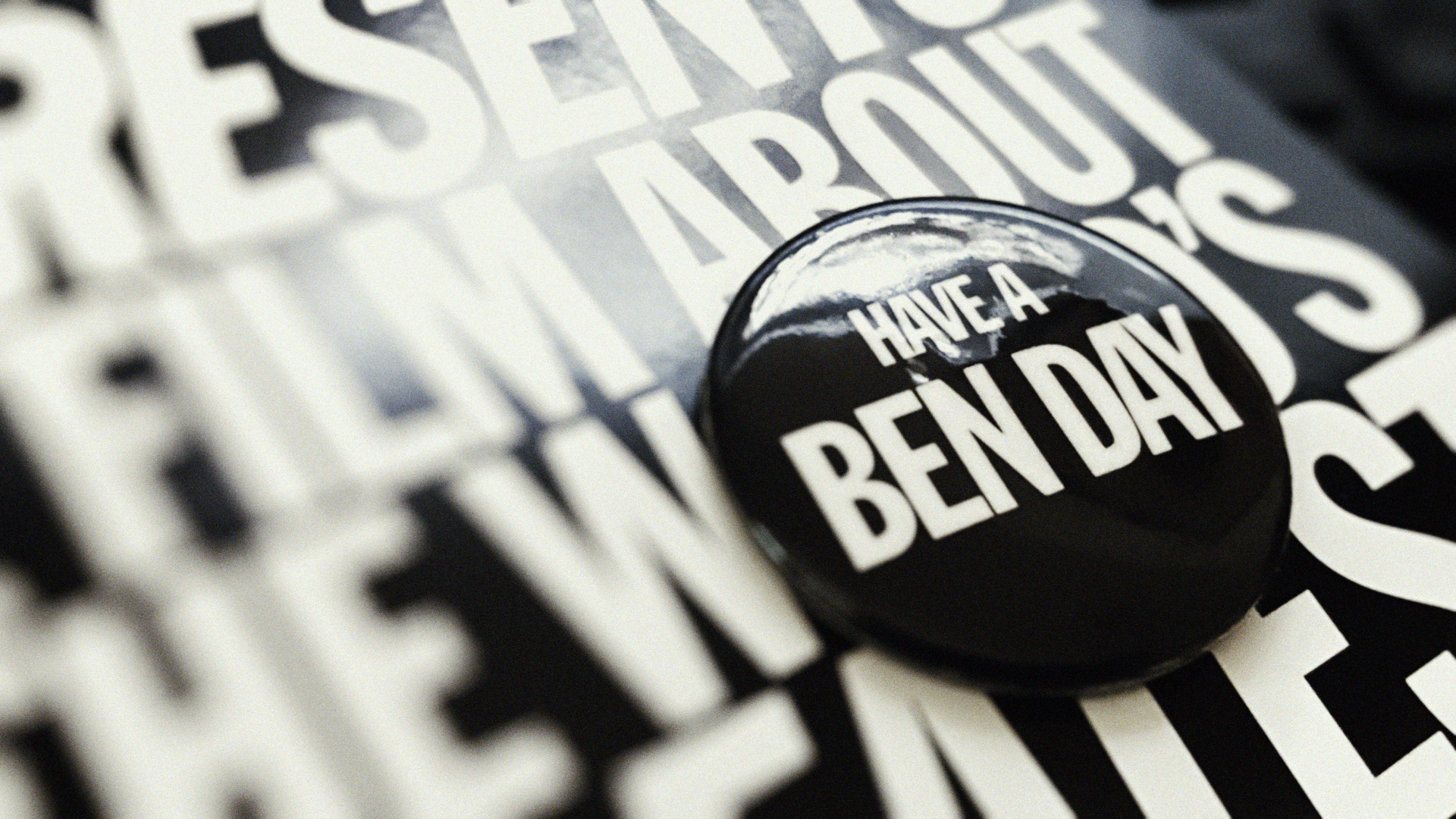
Potlatch Paper produced this little gem in the mid-90s reminding creatives that we’ve all “Ben” there. The diabolical clients, the endless Whoppers. Ben Day, the world’s greatest designer, gives his in depth perspective as to the creative processes that taunt and haunt him to the very core. He draws us into his world where the Happy Hamburger Helper Hand reigns as his supreme advisor. Ben doesn’t disappoint.

“This story is not true. For all his vibrancy, Ben Day does not exist. But we think a little piece of him lives in the hearts and minds of all creatives. Where an idea, fragile as it is, can be nurtured beyond the confines of mere capitalism, helping us move forward as a people...until, of course, a client crushes your little idea like a bug.” — “Ben Day,” Potlatch Paper Company, 1995 film written and directed by Dana Arnett and Bob Rice.


I STILL HAVE MY ORIGINAL “BEN DAY” BUTTON AND PLAYBILL FROM THE MID-NINETIES.


Would you say: ‘hey Mister Da Vinci...Leo, we want Mona there to show some teeth?’
— Kyle Colerider-Krugh as Ben Day, The World’s Greatest Designer

VSA Partners, LLC posted “Ben Day” Potlatch Paper — Short Film on Vimeo for all of us to enjoy ad infinitum.


Remembering Our Superman

Christopher D’Olier Reeve (September 25, 1952 – October 10, 2004) was an American actor, film director, author, activist, and best friend to Robin Williams. The dynamic duo were first roommates at Juilliard which led to their lifelong friendship. In 1978 Reeve starred in Superman: The Movie, while that same year Robin Williams landed in his egg-shaped spaceship as Mork from Ork on Happy Days in “My Favorite Orkan.” In the fall of that same year Robin Williams and Pam Dawber arrived in our living rooms across America in Mork and Mindy. Today we remember and celebrate Christopher’s legacy. He will always be our Superman.

I was quite fortunate to see both of my childhood heroes years later as an adult. Christopher Reeve gave a talk one year in the late nineties at the Broadcast Designers Awards. He embodied a spirit unmatched. He truly was a super hero and super human. When my daughter was quite young she gave us tickets (via her mommy) to see Robin in Atlanta. Every moment was so fresh and new. He didn’t recycle any of his material from previous comedy tours.

Both of these super folk will forever be in our hearts for they gave us the recipe to truly fly and follow our dreams. I haven’t worked a day in my life. Every day is just another chance to dream and play on my own stage, and every now and then, fly as I did when I was a child gliding, swimming through the air down the hallway while my family slept.


So many of our dreams at first seem impossible, they then seem improbable, and then, when we summon the will, they soon become inevitable.
— Christopher Reeve

Albrecht Dürer: Exploring Symbolism in Knight, Death and the Devil

During the summer of 1995 while hiking through the Tuscany hills in Cortona, Italy, I was fortunate to stumble upon the vast portfolio of Albrecht Dürer’s life’s work on display just outside the Uffizi Museum in Florence. Dürer, master painter, printmaker, and theorist, was well known for his detailed depictions of both everyday and divinely inspired scenes deeply rooted among natural settings. Through his exploration of depicting nature he sought to discover his life’s purpose. While peeking into his world through the works displayed in Florence, I recognized familiar faces, places, and locales, but there were many works I’d never seen before in print.

I was familiar with Saint Jerome in His Study and The Four Horsemen of the Apocalypse, but one piece in particular caught my attention. His 1513 work Knight, Death and the Devil (at bottom of post) immediately drew me in. In order to fully appreciate it one must not only immerse themselves in the ultrafine, multidirectional, crosshatched strokes rendered but also at the iconic significance in the human, animal, and otherworldly subjects themselves. Not known to be subtle in his use of symbolism each element’s purpose lends greater depth to the intertwined narrative captured in each intentional stroke of intricate genius.

Dürer’s original title for Knight, Death and the Devil was simply The Rider. During the time surrounding his creation of this piece his mother was in his care as she was very ill. She passed into the afterlife in 1514. During this period, he immersed himself in producing copperplate engravings of such explicit, exquisite detail that significantly stand apart from his other works. Knight, Death and the Devil took three immersive months to complete. This piece and two others formed his collective set of three master engravings. Knight, Death and Devil, Saint Jerome in His Study, and Melencolia I are known as the Meisterstiche, Master Engravings. So let’s see what clues the artist has left us to discover.

First and foremost the Rider’s stance is casual, his progress through the frame quite relaxed, as he gallops along the path. This path could be divine as the knight has exercised a Christian inspired life. However, I’m not convinced there is any relation to Christianity in this piece. The Rider displays there is no threat within the scene as his helm’s visor up, not down signaling a fighting position thus protecting his face from attack. He looks ahead devotedly stoic yet relaxed knowing he has led a fulfilled life of bravery and devotion. The Rider is possibly just moments from certain death. He knows full well he lived a good life as he slowly gallops into the afterlife just around the next bend along his shared path.

The Rider looks ahead, not distracted to the side or behind with regrets in his past. He lives in the here and now experiencing practiced mindfulness. He doesn’t dwell on the past or future. He breathes gently while his trusted companions, his faithful horse and dog, lead him with fierce love and admiration for their master. The Rider’s horse is adorned with oak leaves, to some referencing Christ. These leaves could also reference growth or fertility, but in this depiction, they reference the never-ending cycle of life and death and then life again in another realm.

The dog signifies loyalty, love, and protection for his master, is in a running pose rather than walking casually like his master. The dog sees what lies ahead, and the Rider trusts his faithful companion with his life and well-being. The fox tail on the Rider’s lance which he holds lightly over his shoulder references good luck or protection. Some feel it references lies and deceit. I wholeheartedly disagree with that analysis. This knight is noble, not an evildoer.

The village in the background pictured above the primary scene is placed above the head of the Rider as if he’s thinking of home. Is he a king in disguise? It’s juxtaposition serves as a thought bubble or daydream. He calls this home, but not his true home, in the beyond, it is only his earthly home. The village, high above, distant, could be referring to the afterlife or Heaven itself.

Lofty aspirations for the Rider, will he be king of this village in the sky? Although it is in the distance, it can be seen plainly. Perhaps this is symbolic of either the beginning or end or both of the knight’s quest. Maybe it also signifies his familial roots run deep, but now they are exposed quite literally in the framing of the woods between the village and the foreground menagerie.

The woods are dead, leafless, lifeless, in decay with visible roots trickling along the framing around the Devil. The roots are exposed and these trees and brush will not survive the winter. These roots could signify the uprooting of one’s own life through sin, perhaps. Or do they signify veins holding the lifeblood of our motley crew. Their inclusion gives further insight of the artist’s beliefs surrounding nature itself. We are all both beautifully and wonderfully made creatures living in a world of the same account. Nothing natural is truly ugly in the sense of human perception. Everything in nature is perfect by design and honed to mathematical precision.

The Devil is grotesque with a pig’s snout, three horns, a snakelike tail, has a spear hoisted over its shoulder casually, a visible clawed hand, and two hooved feet, one visible just behind the dog’s framing. The large horn on top of the Devil’s head looks like a Grim Reaper-styled scythe ready to cut down the Rider. It’s very presence initially proves intimidating to the viewer, however to the Rider he sees beyond this mask. He knows the Devil is rather a joke, a ridiculous being, more appropriate as a sideshow freakish attraction rather than the Prince of Darkness.

There is a bell around the neck of Death’s horse that may signify the tolling bell of inescapable death. However that bell may be for Death so he doesn’t lose his own horse. There is a slight sense of lightness to the entire scene. These characters have known one another for a lifetime. This scene doesn’t spell impending doom for The Rider. These fiends are truly the knight’s friends. I didn’t really see that coming either, but now it makes good sense.

The Devil as well as Death are companions, not the knight’s adversaries. The Rider understands full well that the meaning of a fragile life is certain death at any moment. One must live in the present, not past or future, to survive, and eventually arrive at the gates of lofty places on high, divine or not. Death holds an hourglass adorned with a sun dial attempting to shake the Rider into a race rather than his gentle gallop. The knight’s stance reinforces that Death is just another friend along life’s pathway. The two opposing snakes look left and right whose gaze aren’t fixed on the knight. They are just another distraction, a reference to both the Garden of Eden’s devilish snake and possibly a reference to the Greek Medusa mythos. These snakes are just along for the ride. Just two more of the journey’s companions. Now what’s going on with the other figures here?

Death’s horse is weary, weak and looks downward in its frailty. One ear up, the other level, leaning down to the ground below. It looks downward to the jawless skull in the bottom left corner of the composition where the artist’s signature resides. The skull, a bit askew, gazes directly at the “AD” logomark. The skull sits on an oak stump that many believe is another biblical reference. This stump may also represent a grounding ability and connection to one’s ancestral wisdom or put more plainly, family tree.

The lizard-like creature between the back two foreground horse’s hooves is scurrying in the opposite direction of the Rider. An iguana or possibly even a chameleon which makes more sense as it can change color camouflaging into its surroundings. Always on the defensive it’s led a life hiding from the truth that lies ahead. It heads into the past, unable to witness the present. Some believe this is an ill omen, however I disagree. It may symbolize the Rider’s own past skill of adaptability in adverse situations. Now through wisdom it scurries away from the hero. He doesn’t follow this defensive status anymore. He looks ahead, rather calmly, with his faithful companions, including Death and the dastardly Devil itself.


The artist is chosen by God to fulfill his commands and must never be overwhelmed by public opinion.

Knight, Death and the Devil, 1513, engraving. Albrecht Dürer (German, Nuremberg 1471–1528 Nuremberg)
Dimensions: Sheet: 9 13/16 x 7 11/16 in. (25 x 19.6 cm)
Plate: 9 9/16 x 7 3/8 in. (24.3 x 18.8 cm)


The new art must be based upon science — in particular, upon mathematics, as the most exact, logical, and graphically constructive of the sciences.
— Albrecht Dürer

The Knight’s smirk resets the mood.

Some final observations are that Death and the Devil both adorn crowns and the Rider appears to be smiling. Death’s crown is quite sharp and standard fare while the Devil’s crown is organic resembling a symmetrical flame. It may even be another horn-like protrusion from its silly head. Upon closer inspection the Rider appears to have a half smile, even a slight grin. Notice his dimple. This one last clue holds the key to the entire piece. Rather than a serious, divinely-driven work, the artist is toying with his audience providing a tongue in cheek scene meant to not take itself too seriously. Will the art history experts agree? Possibly. Get The Life and Art of Albrecht Dürer from Princeton University Press here. Use coupon code EXH30 for 30% off your order.