Design, Motion, and VFX Gear

I’ve been asked on numerous occasions over the past 27 years what gear do I wield in regard to computer gear for my design, motion, and VFX projects. After years of answering that question, I’m going to distill it down to this: I have specific gear for specific tasks, and I don’t pick sides anymore between Mac and Windows. Both have pluses and minuses. Also nothing beats a solid foundation of art and design studies. My time in Savannah and Athens were times well spent from 1991–1995. Plus both cities were rather quaint and quirky.

My focus at Savannah College of Art & Design was Foundation consisting of 2D Design, 3D Design, Color Theory, Drawing 1 & 2, Figure Drawing, Advanced Figure Drawing, Intro to Graphic Design, and Computer Art. At University of Georgia I applied and was accepted into the highly competitive School of Graphic Design. While in Athens I studied graphic design and was introduced to my mentor Bonnie Ramsey at Georgia Museum of Art. Our first project together, “ShOut!,” sealed our fate.

During my internship with The Publications and Public Relations Department I was responsible for designing posters, banners, and exhibition checklists. Bonnie and I were kindred spirits from day one. We collaborated for 19 years. I was fortunate to also meet Lamar Dodd in his home studio while he was cataloging his works. I designed a poster celebrating his daughter’s paintings and was invited over for a visit.

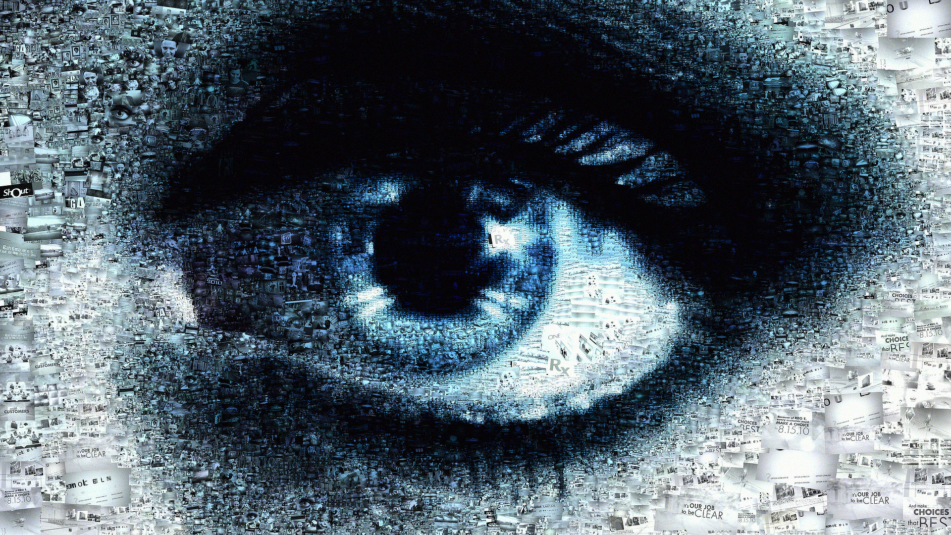
I surround myself with influences. I’m a solid believer in wielding osmosis.

Coursework at UGA included Layout, Technical Rendering, Illustration, Typography, Advanced Typography, Conceptual Design, and Portfolio. My Typography professor, Ron Arnholm, was taught by Paul Rand while he was working on his Masters at Yale. I was drawn to similar minimalist design including my own logotype that I still use today. I saw it in my mind and within ten minutes worked it out for the most part. When Professor Arnholm saw my logotype solution he commented “oh, that will last a long time.” That comment cemented my love for letterforms that started back when I was 11 playing around with fonts in PrintShop Deluxe on my Commodore 64.

Earlier this year I wrote an article about the legacy of ligatures. I coined the term “Yin & Yang” when referring to my own logotype as it features positive and negative space visual interactions. Back in high school I studied AP Art my senior year. I chose stencils as my focus which certainly influenced not only my logotype, but also my career as a broadcast designer since stencils plays a key role in animation, compositing, and visual effects.

Getting back to what some of my tools consist of now. I still have two overflowing tackle boxes filled with analog tools from Design markers and watercolors to many an X-ACTO blade. Below is a brief rundown of some of my gear.

A humble internship led to 19 years of collaboration with Bonnie at GMOA.


Gear Notes

1) First off, I don’t start with the computers, I start with a napkin, a scrap of paper, a Post-It or two, and a pen (no pencils allowed)

2) I sketch and make notes for awhile then grab my loupe and take a closer look; then I pull back ten feet and give it the squint test

3) I continue honing this newest creation, giving it time to breathe and naturally take shape

4) 2022 Dell XPS named “Vader,” Windows 11 Pro, Intel i9 12,900K, 64GB RAM, NVidia 3090 GPU, 2 x 2TB SSDs, 6TB USB Backup Drive, 4K Dell display, Wacom tablet, MX Keys Keyboard and MX Master 3 Mouse, Adobe CC, Maxon One, Affinity Suite, Blender, Unreal, and BlackMagic Design Da Vinci Resolve

5) Mid-2010 iMac 27 inch named “Yoda,” macOS Sierra, macOS High Sierra, and Mac OS X Snow Leopard, 16GB RAM, 1TB SSD, 2 x 3TB USB Drives, 8TB USB Backup Drive, Adobe CC 2019, C4D R23

6) 2009 15 inch MacBook Pro named “Obi-Wan,” Mac OS X Snow Leopard, 8GB RAM, SanDisk for backups

7) 2024 14 inch M3 Pro MacBook Pro named “Rogue One,” macOS Sonoma, 18GB RAM, SanDisk for backups; Affinity Suite, Blender, and Da Vinci Resolve

8) 2020 5K iMac 27 inch named “Skywalker,” macOS Sonoma, 32GB RAM, 1TB SSD, 2 x 3TB USB Drives, 8TB USB Backup Drive, Adobe CC, Maxon One, Blender, and Da Vinci Resolve

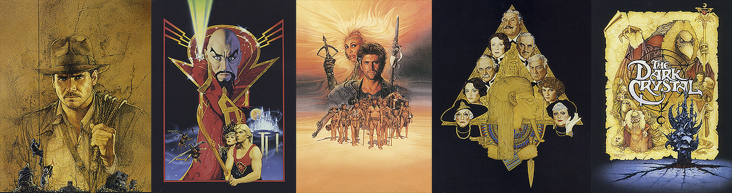
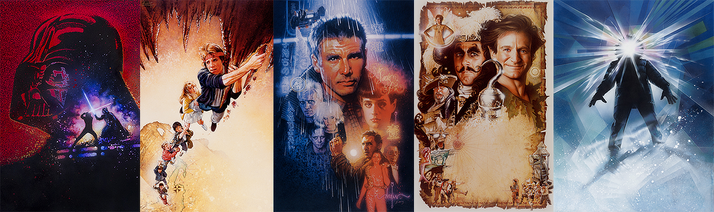
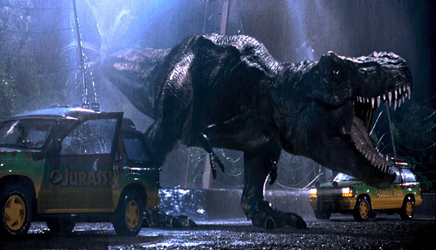
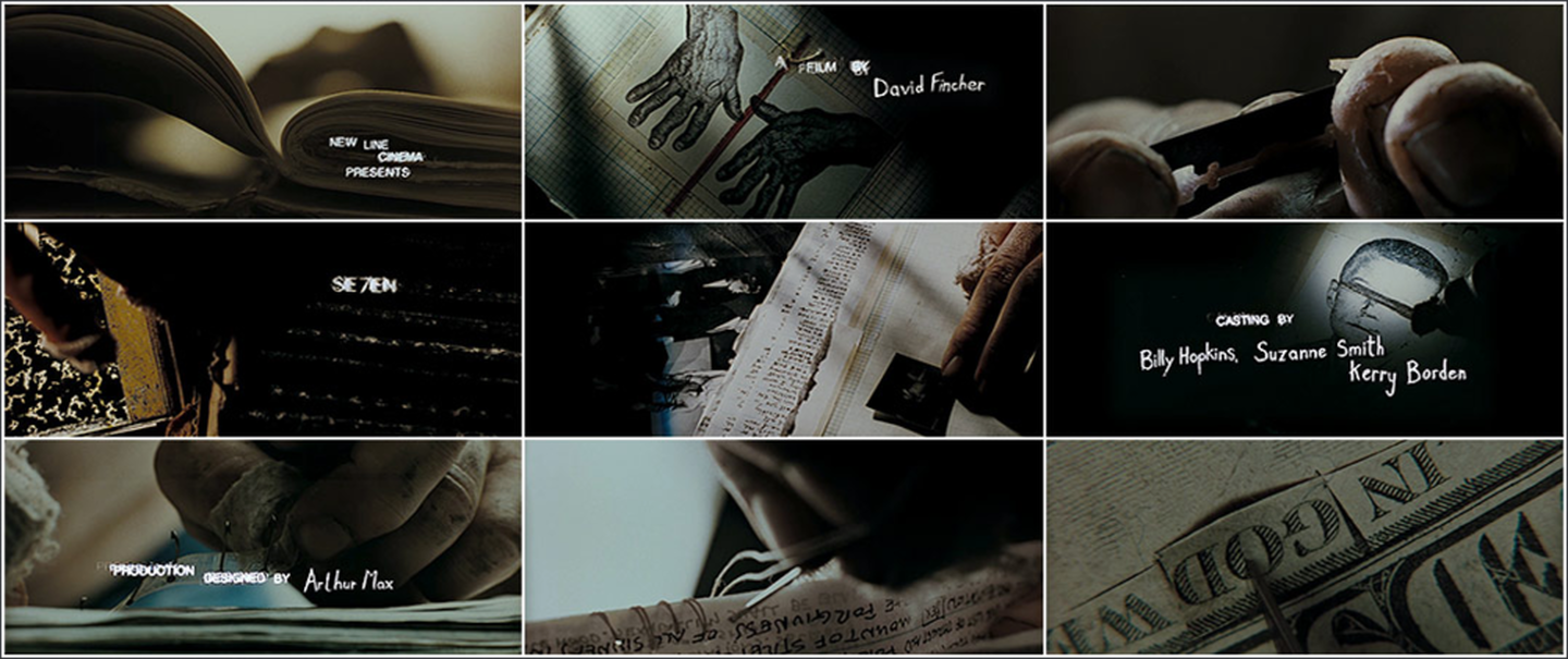
I’m also a collector of sorts. I’m not much of a reader, never have been because my mind wanders. However, everything I’ve ever experienced or seen with my own two eyes I remember in vivid detail. My cultural influences range from graphic and game design to films, screenplays, comics, role playing games, trading cards, magazines, and action figures. Beginning at the age of 9 I began collecting Road&Track, Car & Driver, and MotorTrend. I also was quite fond of Surfing and TransWorld Skateboarding magazines. In college I gathered quite a pile of Communication Arts mags.

Below are two shots from a recent photo shoot in my home studio while taking a visual inventory of my influences. I’ve been a collector for my entire life. My most prized possession is my Raiders of the Lost Ark: The Illustrated Screenplay. My Dad gifted it to me when I was 9.

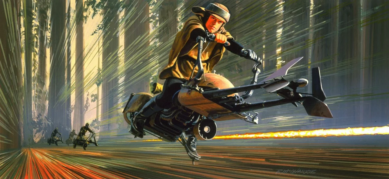
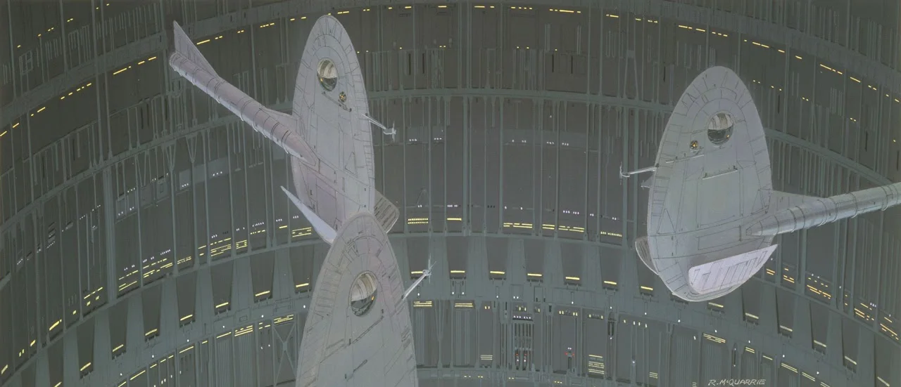
A PEEK INTO MY COLLECTION OF ARTIFACTS COVERING FIFTY YEARS OF CURIOSITY AND LOVE FOR FILMMAKING, STORYTELLING, AND ARTISTRY.

Professor of Archeology, expert on the occult, and how does one say it...obtainer of rare antiquities.

— Major Eaton addressing Indiana Jones in the lecture hall, Raiders of the Lost Ark, 1981. Directed by Steven Spielberg. Screenplay by Lawrence Kasdan. Story by George Lucas and Philip Kaufman. Produced by Frank Marshall.


Drew...Speechless

What do Luke, Leia, Elliot, E.T., Threepio, Artoo, George Lucas, and Steven Spielberg have in common? Yes, they’re all dynamic duos, but they’re also all close friends of Drew Struzan, aka “drew.” The most prolific movie poster illustrator gets a friendly nod from Kyle Lambert in this piece celebrating The Man Behind the Poster.

One word for the man behind the poster who communicates through his interpretations of many a blockbuster film: speechless. Read more in Hollywood Reporter here. More on Struzan’s journey here. One word from Struzan’s fans that rings true with all of his imagery: iconic. Kyle Lambert’s rendition of Struzan amongst the stars captures the essence of a true Struzan composition: it’s not just a bunch of Photoshopped heads in order of billing. There’s true grit, fiber, and texture holding it all together.

From the paint splatter to the colored, dramatic lighting and colored pencil, it's nearly all “drew.” Except for once his signature is prominent and not gently hidden in the background. For once it’s front and center, and it deserves that sort of recognition. With Drew’s posters every picture tells a story. The Photoshop jockeys got it all wrong because they thought it was every pixel tells a story.

Long live Drew Struzan and long live movies and mixed media full of depth and texture.

STAR WARS REVENGE OF THE JEDI, THE GOONIES, BLADE RUNNER, HOOK, AND THE THING. ALL IMAGES ABOVE © COPYRIGHT DREW STRUZAN.


Ralph McQuarrie’s Universe

After watching Rogue One again recently with my family, I couldn’t help but daydream about all of the incredible work produced by the one man behind all of the immersive designs that defined the original Star Wars universe. Legendary concept artist, Ralph McQuarrie, was the man behind the curtain working behind the scenes to bring key scenes to life.

His brushstrokes dazzled us from the moment we were jettisoned to the galaxy far, far away where a great adventure took place. The folks who crafted Rogue One paid close attention to every detail down to the nuts and bolts that held the X-wings together. Every decal. Every rivet. All images below © Ralph McQuarrie. Used for editorial purposes only.

Ralph McQuarrie also depicted key visuals in other monumental films such as this Bible illustration below of the Ark of the Covenant for Indiana Jones and the Raiders of the Lost Ark. He was also involved in the mothership design (bottom) for Close Encounters of the Third Kind.

Ralph McQuarrie’s Bible illustration of the Ark of the Covenant as seen in Raiders of the Lost Ark, 1981. Copyright Paramount Pictures.

Close Encounters of the Third Kind, 1977, mothership design. Written & Directed by Steven Spielberg. Music by John Williams. Copyright Paramount Pictures.


The Power of Positive Thinking

I recently enjoyed an afternoon of bowling with a dear family friend. I will preface that we both score in the 40s–60s per game on average. We got off to a rough start so I had them take a moment with me to refocus our efforts. I mentioned that we need to take all of our energy; the good, bad, and the ugly, and use it to make things happen for us in a positive way. We both immediately went from just a few pins to spares and strikes. We played for awhile, but suddenly my friend hit a snag. For four frames they were stuck with all threes. We had another pow-wow, and I mentioned that “it's not a sport or a game; it’s just math.” After a few minutes they were ready to try again. Strike! Strike!! Strike!!! They looked in my direction with a huge grin on their face.

With their spirits raised to quite a ruckus I decided to shake things up a bit for the two of us. With the bumpers up I thought why not try this pinball-style bumping the ball back and forth across the lane as it headed to its mark. So I took a few frames to test my theory, and I got a strike and a spare. Things were beginning to take shape.

I also started spinning my body around effortlessly numerous times while I was skipping up the lane before releasing the ball. Once we added spinning our bodies around the energy we generated was palpable. We were bending math to our will. My friend continued having a great game as I experimented with yet another test: closing my eyes while I spun around and headed to the line to release the ball. Essentially I was adhering to Obi Wan Kenobi’s advice to Luke just moments before he blew up the Death Star: “Let go your conscious self and act on instinct.” In doing so we broke free from our minds’ constraints on our performance. By living in and embracing the moment we were able to apply laser focus as we bowled along with the remainder of our games.

After numerous spares and a few strikes we had wrapped up our third game. We tallied our final combined total between three games at 598 points (our usual average was 300 points). Even with the four sets of 3s in a row my buddy beat me two games out of three.

Your eyes can deceive you. Don’t trust them,” Obi-Wan noted. “Let go your conscious self and act on instinct.

— Obi-Wan Kenobi portrayed by Alec Guinness, Star Wars, 1977. Twentieth Century Fox.


May The Fourth Be With You!

Look who I met today, R2-D2. Astromech Builder’s Club R2 unit spotted at a recent May The Fourth Be With You event at Turner Broadcasting.

Visit Astromech.net

In 1977 we were invited into Star Wars by R2-D2’s companion, C-3PO, as they headed toward an escape pod exiting the Blockade Runner eventually landing on Tatooine.

“Did you hear that? They shut down the main reactor. We’ll be destroyed for sure. This is madness. We’re doomed. There will be no escape for the Princess this time.”


Typographic Experiments

I’ve recently added a Titles page to the site. My plan is to spend no more than a couple of hours on each of these explorations. Quick little studies using napkin sketches, Illustrator, After Effects, and Element 3D.

They may be rough around the edges here and there. I’ll gradually start migrating over to Cinema 4D. I hope you enjoy these throwbacks to some of my favorite films, characters, and stories as a child.


The Lost Art of the Movie Poster

I’ll never forget the Richard Amsel-illustrated movie poster for Raiders of the Lost Ark (below far left) that donned a corner of my teenage room.

I was enamored with the rich detail he rendered for my favorite whip-wielding adventure hero. It had depth, texture, and contrast.

ALL IMAGES ABOVE © RICHARD AMSEL.


ALL IMAGES ABOVE © DREW STRUZAN.

Then one day I saw another poster thinking it was Amsel’s latest creation, but his signature was absent from the corner. Scribed in a similar location was the simple, understated, lowercase script “drew.” I didn’t know at first sight that the artist, Drew Struzan, was one of the most iconic album cover and movie poster illustrators of all time.

Drew could somehow depict an entire movie’s essence in one illustration. His rendering transcended the film itself, elevating it to a whole other level. His The Thing poster is one of the most original and captivating of all of his designs (above far right). In true artistic fashion, he rendered it in one night. The paint was still wet when it was en route.

Struzan also had no reference material to draw from for The Thing, only his own vastly rich imagination. Both artists’ works all shared one thing: they were all one of a kind original works of art, not mass produced Photoshop-styled montages. These “Photoshop jockeys,” as they’ve been called, merely attempt to capture both Amsel’s and Struzan’s essence, and nearly always miss the mark by a long shot.

Traditional materials could never be completely replaced by modern-era pixel pushers. To explore Richard Amsel’s portfolio visit this tribute by Adam McDaniel. For more information on Drew Struzan watch The Man Behind the Poster. Also enjoy his extensive portfolio site here.


Great Reference Material

Like most people these days I take my camera with me everywhere. You just never know when you’ll find a great reference whether it be a texture, color, material, whatever. Nothing beats great reference material. If you shoot it yourself you’ll notice the finedetails.

The best way to recreate something from the real world is to first observe that world in full detail and capture as many reference photos as possible. You'll be amazed what details your eyes didn’t actually “see” in person when reviewing the reference photos.

If you’re in a time crunch and need great reference material take a look at CG Textures. They have an extensive library that’s well organized.

They have an extensive array of catalogued photos from leaking concrete to paint splatter and nearly everything in between. Enjoy!

Visit CGTextures.


Element 3D V2 Test Drive

It’s been awhile so I figured it was about time to give Element 3D v2 a spin around the block. With the release of Video Copilot’s Element 3D Version 2 comes a wealth of new features. Andrew Kramer has stepped up the game for this game engine-inspired GPU plugin with raytracing, mirror and spherical reflections, shadows, new enhanced multisampling, and an animation engine that gives the user the hooks we need to push the boundaries of this ever immersive plugin. Here is one of my first tests trying out the depth of field and how it impacts the render times (top image). Feeling under the microscope vibes going on here.

I was pleasantly surprised that if sampling is set to 0,0 while one designs and animates then leaving depth of field on doesn’t cause much of a performance hit. At final render time I upped the samples to 8,8, and used enhanced multisampling. For organic scenes there's not much of a drastic change in quality, however I was working with a car model and in order for the curves to be smooth I had to up the quality to at least 8, 8. The second image below utilizes one of the new BackLight environment maps. I’ve used these maps in Cinema 4D, too. They’re quite versatile in creating moody scenes with a simple image map.

Visit VideoCopilot.


The 87th Annual Academy Awards

The 87th Annual Academy Awards were quite an event. Neil Patrick Harris was surrounded by an enormous backdrop that immersed us within the spectacle. The graphics were a throwback to poster designs from decades ago. They reminded me of Saul Bass in many respects.

The tributes to those who had passed on were tended to with an artist’s care. There is a great article on Motionographer and Art of the Title about the man behind those graphic designs, Henry Hobson, and the talented artists at Elastic.

ALL IMAGES FROM THE MOTIONOGRAPHER ARTICLE “CRAFTING GRAPHICS FOR THE OSCARS: AN INTERVIEW WITH HENRY HOBSON.”


Timeless Mosaics

Photomosaic software has been around for nearly two decades. Way back in the day folks tinkered with this technique completely by hand just as we did with colored hole punches in Color Theory class in college. The road was tedious, but the end results can be astounding when one takes the time to view from afar.

Taking notice of the closeup details can be mesmerizing. I recently experimented with cf/x’s Photomosaic. This was my first test right out of the gate with default settings. The tile rotation option really helps give this image a greater sense of depth. I’ll post additional examples when I have more time to experiment.


Got the Gist

While working on a logo design for a new show for NBA TV I came across a unique font family called “Gist” from Yellow Design Studio (YDS). For a modest $49 the family comes with a vast array of 20 fonts. Ryan Martinson from YDS has also posted a variety of free elements like dingbats, textures, and fonts for download.

Something I really appreciated about the “Gist” family was that the designer provided the inlines as separate fonts so the inlines could be easily colored and separated out. Also the ligatures, swash capitals, and alternates were very well thought out for multiple applications allowing for personal stylings.


Art Trumps Science

In a world filled with movies and television sporting the latest trends in digital, data-driven effects, we tend to forget how good optical compositing and keen artistic interpretation will trump these digital hydras every time. Just because the data in the computer for a particular shot is accurate to the laws of physics, why does it still feel rigid and cold compared to the vinyl-aged practical effects? The art is missing. The art has been slowly cornered by science, rather than an artist interpreting a scene by instinct.

In a recent video that was reposted by Prolost (Stu Maschwitz’s blog) from a previous post on FX Guide, Dennis Muren, ILM legend discusses this trend toward data and away from art. We’re leaning too heavily into having the computer tween for us. Motion needs messiness.

When Stu references the T-Rex's big reveal in Jurassic Park there is a strong blue light shining from apparently nowhere in the real world, yet it works. Why is that? Artistic interpretation for heightened effect. We don’t go to the movies to watch a film. We go to the movies to be immersed within a film. This blue light washes the scene similar to a spotlight used in a stage play for heightening dramatic effect.

We are at a crossroads where the latest digital techniques need to be corralled back toward the arts. Science is a great foundation for a shot, but knowing when to bend the rules, and sometimes even break them in order for the shot to become memorable to the viewer is key. Most images on screen are too sharp and could use some blur. Yes degrade the imagery to look and feel more like the rolling falloff of film.

ABOVE IMAGE © UNIVERSAL PICTURES.

Visit Prolost.


C64 Holds World Record

When I was 11 my Dad convinced me that if I wanted a computer I had to first take a computer course on TV. I agreed and learned about the ins and outs of ones and zeros, bits, bytes, ROM, and RAM. So that Christmas I got my first computer: a shiny new Commodore 64 with a 1541 drive and 1702 model color video display. One of my favorite things to do was challenge myself to draw pixel-by-pixel with the cursor keys and create my latest digital masterpiece. One I fondly remember is the Amsel Raiders poster that I copied to the best of my 11-year-old artistic talents. I also enjoyed designing my own games with Garry Kitchen’s Game Maker from Activision when I wasn’t playing Zork I or Bard’s Tale.

Little did anyone know how popular this computer would become. Due to its spectacular graphics and sound, in-house production and the creation of the 10,000+ games and other programs written for the C64, it flourished. It is now listed in the Guinness Book of World Records as the highest-selling single computer model of all time category. It outsold Apple, Atari, and IBM PCs for years. According to Wikipedia: “It has been compared to the Ford Model T automobile for its role in bringing a new technology to middle-class households via creative mass-production.” For Commodore 64 emulation visit Power64. I keep Snow Leopard around just so I can run it on my mid-2010 27-inch iMac.

[The Commodore 64] has been compared to the Ford Model T automobile for its role in bringing a new technology to middle-class households via creative mass-production.

— Wikipedia


The Father of Proxima Nova & the Legacy of Arnholm

Mark Simonson is a rare gem of a typography designer who not only redefines classic font families, he breathes new life into them. He doesn’t just revive them he evolves them by cleaning them up stripping away unnecessary fluff. Simonson forges out the impurities. He’s also the father of one of the cleaner, more modern fonts used extensively on the web: Proxima Nova.

The font that eventually became Proxima Nova was first used for the Star Wars Radio Drama packaging by Simonson when it was released for the first time to the public in the early 90s. The original radio drama hit the airwaves in the 80s. Here’s the full story from the man himself. When I stumbled upon Mark’s website I felt at home seeing notes about my college typography professor, Professor Arnholm.

I really enjoyed Simonson’s breakdowns of some of the more influential type designers from the early days. One in particular caught my eye: Ron Arnholm. I studied under Professor Arnholm while attending The University of Georgia’s graphic design program, I designed countless catalogs, books, and exhibition checklists for The Georgia Museum of Art all along using his extensively diverse Legacy family.

Arnholm was one of my favorite professors during my years in Athens, GA. His Aquarius font was used extensively on the campus signage at UGA. My logotype on this page was created in Arnholm’s Advanced Typography course. When I presented the final design he said it would last a long time. I've tried to redesign it over the past 21 years always returning to the original.


Classic iMac Video Gaming for Under $100

Emulators are great, but nothing beats playing a classic game on the actual hardware from ages past. I grabbed these classics so my daughter could learn about dolphins, the human body, and bugs with her Magic School Bus CD ROMs.

We opted for her to learn from these older classics rather than the latest iPad app. For a basic setup here’s all you need: 1) 1998 or 1999 iMac with OS 9 (eBay $60), 2) OS 9 Installer CDs (eBay $20), and 3) a $3 battery for the iMac. For just $83 you’re up and running in no time.


Starlog for a New Generation

Starlog magazine had been around since I was 4 years old. The magazine excelled at going into a film’s intricate details including breakdowns of the original Star Wars weaponry or fully exploded drawings of the Starship Enterprise. For decades the magazine was the de facto standard for film coverage as well as what was hot on the horizon for television and video game consoles. Unfortunately after 33 years in publication in 2009 Starlog was shut down like many other print-related entities.

Luckily in 2014 there were rumblings about Starlog making a come back 5 years after the print edition was shut down. With much thanks to Fangoria, Starlog.com became a reality in late 2014. Now Starlog is available to a whole new generation of sci-fi fans.

A FEW KEY ISSUES FROM MY OWN PERSONAL COLLECTION


Art of the Title

If you enjoy a great film, but find more satisfaction in the art and design of the film’s title sequences this site is for you. From Saul Bass’s spirographic Vertigo to Kyle Cooper’s demented Se7en one can spend hours pouring through the sheer volumes of titles.

One thing I find curious is that the titles created in the days of optical compositing stand out as stronger in regard to design, color, and composition in many respects, although the animation can be quite crude compared to today’s digitally interpolated scenes.

ALL IMAGES ABOVE © CECCHI GORI PICTURES, © JUNO PIX, AND © NEW LINE CINEMA.


The Best Training I Ever Had Was on VHS

Back in the 90s we didn’t have an internet filled with a plethora of training videos to learn about image manipulation in the computer, especially those produced by real experts, let alone free. There were a handful however that rose far above the rest and didn’t break the bank: Total Training’s After Effects VHS series with Brian Maffitt, and Masters of Visual Effects VHS series with Forest Key, John Knoll, Ron Brinkmann, Scott Squires, Stu Maschwitz, Matt Silverman, and Alex Lindsay.

On the one hand there was Brian Maffitt, full of energy and most of his tutorials used impractical materials (giraffes with wheels for their feet), but he always delivered on the concepts and provided excellent training. I learned After Effects overnight watching Brian’s tapes when transitioning from a Discreet Flint. On the other hand were folks like Ron Brinkmann whose monotone voice could put you to sleep if you weren’t fascinated by every last detail of image processing in the Masters of Visual Effects series. But there was nothing mundane about what he was discussing. It kept me on the edge of my seat.

I learned After Effects overnight by watching Brian’s VHS tapes.

Those tapes were priceless, and I was lucky enough to convince my boss to spend a couple hundred bucks and get them for us. Alex Lindsay formed DV Garage some time later. He was able to convince the EI Technology Group to offer a free copy of an older version of ElectricImage with his 3D Toolkit. The 3D Toolkit focused more on the foundation concepts of 3D rather than a specific application, much like the Masters series did. One thing I’ve shared with my students is to consider their foundation studies like Color Theory and Figure Drawing much more important than learning the latest, greatest shiny effect making its rounds across the internet.

Now we have an internet filled with free training videos from every one that has a computer and an internet connection. You’d think with all of the offerings it would be hard to decide which training to use. But just like in the 90s sheer volume isn’t what’s important. There are a handful of solid training opportunities out there if you take the time to wade through the white noise.

Matt Silverman posted some of the Masters of Visual Effects videos online years ago so now they’re not only digital, but free. Get them here.