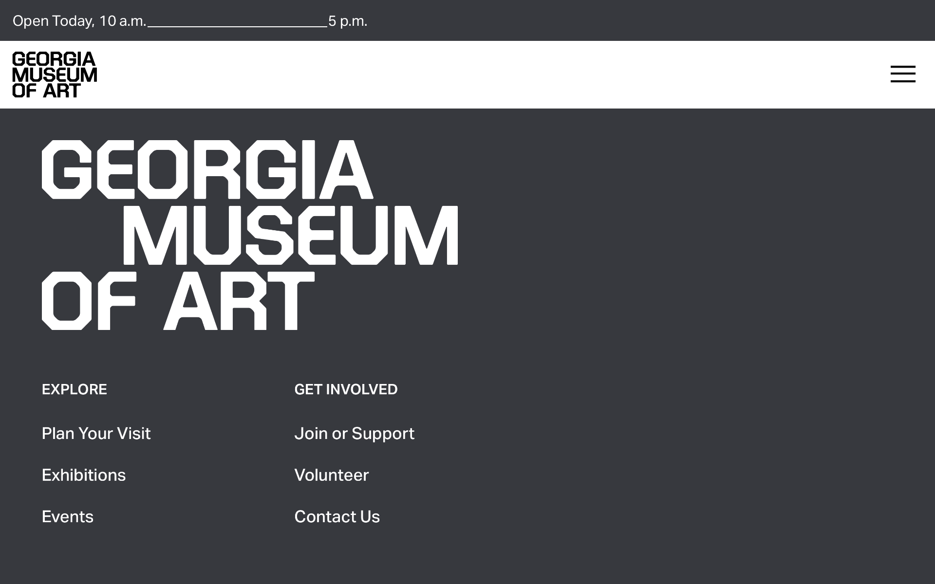
A new year and another vanilla rebrand. I recently discovered the new Georgia Museum of Art’s logo rebrand. It’s not the first, nor will it be the last, of aging firms like Pentagram pumping out bland content instead of design innovation. No matter how they want to spin it in public relations and press releases it’s clear that whoever on P’s team that approved this for consumption wasn’t used to paying close attention to the details. The rebrand immediately introduces a confusing setup; a sin against the whole concept of graphic design branding and communication.
Let’s take a look. Which one is the official logo on the GMOA website? Is it the one tucked into the top left corner or is it the less rigid version near the bottom of the page? While I prefer the latter, it still has it’s issues. The gap between OF and ART is wider than the Grand Canyon. ART feels misplaced. Don’t get me wrong. This isn’t an attack on P or my utter disgust for another soulless “refresh.” The real insult on display is that P trashed the entire lineage of the GMOA identity. Now all I see is mediocrity with no sense of design or clear brand spirit. Just content.
Which version do you prefer? I guess no one could decide so they included both. I have a feeling Paula Scher had nothing to do with this rebrand. If she did, she needs to get her eyes checked. If GMOA really wanted to make a splash they could have easily tapped into their own local resources at University of Georgia. I would have treated this as a student and professor competition so the rebrand’s story would hold weight and gravitas. I wonder how Professor Arnholm feels about it? The entire GMOA and UGA websites feel cold, distant, and sloppy. Truth.
I’m not here to make friends. UGA Graphic Design taught me how to see. Don’t blame me for pointing out inconsistencies and confusion that would have been easily remedied in a typical student/professor critique. Who are we designing for? I agree in seeking solutions that appeal to everyone, including those with visual impairments. However, must it be delivered in such a cold, shallow form? I don’t blame anyone at GMOA. They were guided by one of the most prolific design firms in the country, Pentagram. Do better, P, if your designers still have a soul. Ouch.
Pentagram delivers another uncomfortable custom font approach abandoning every ounce of rich history for Georgia’s Official State Museum. The optical spacing is inconsistent, the S has a wider bottom half that feels like a mistake, but the Grand Canyon gap between OF and ART stands out as the most offensive.
A wiser approach seems almost too obvious to comprehend. Why didn’t UGA’s graphic design professors and students enter their own designs in what could have been an exciting competition between the new guard and the old. An epic battle that would prove to be a grand gesture of intention of reinvention.
Georgia Museum of Art’s new LinkedIn GO logo is literally a G and a narrowed STOP sign. I doubt anyone was clever enough to think this type of irony was targeted branding.


