Children have always been the best critics. They haven’t been brainwashed by societal influence. When he was 10 years old young Raynor Unwin wrote his review of The Hobbit by J. R. R. Tolkien just prior to its publication on the 21st of September, 1937. His father, Sir Stanley Unwin, a British publisher founded the Allen & Unwin publishing company the 4th of August, 1914. While watching the plethora of the making of Peter Jackson’s Lord of the Rings trilogy one of the Tolkien historians noted that “editing Tolkien would be the final sin.”
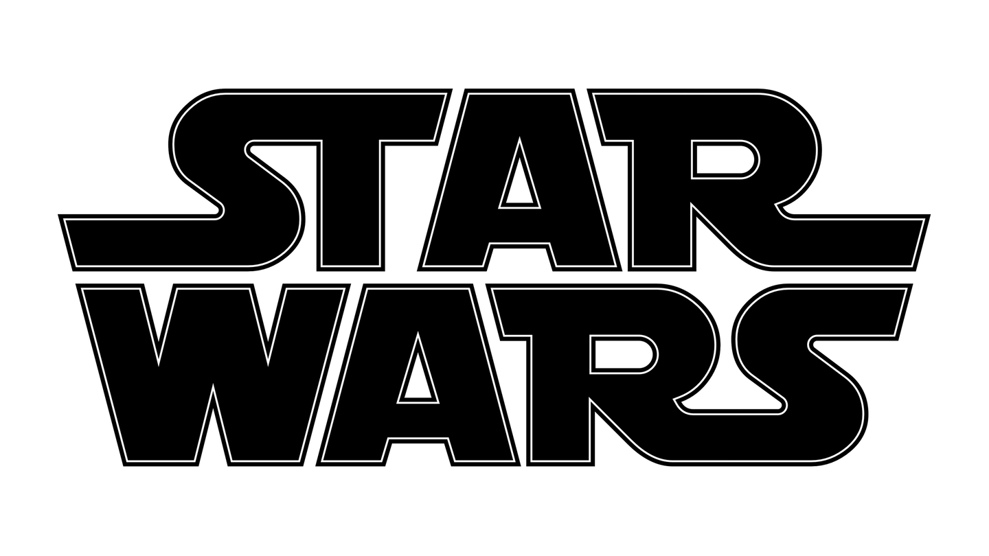
Editing the most prolific professor of English Language and Literature, an Oxford Anglo-Saxon (Old English), John Ronald Reuel Tolkien, was considered absolute blasphemy. I mused that this was quite parallel to my fascination with the need to distilling down the dozens of Star Wars logotypes into one final design with a modern twist. It’s been a long time coming since “a long time ago in a galaxy far, far away” first appeared in theaters on the 25th of May, 1977.
When I first saw Star Wars with my Mom she said I criticized the film every couple of minutes nudging her and saying “mommy, that was wrong.” At just 6 years old I noticed all of the perspective and inconsistencies and optical compositing artifacts. I wonder, did this influence me pursuing a career in graphic design and visual effects? I’m not steeped in film lore as deeply as George Lucas or Steven Spielberg, but I’ve been studying their filmmaking techniques for nearly 50 years.
I’ll never forget each time walking out of the theater feeling that sense of satisfaction knowing one day I’ll be that hero that followed the sage master, explored the Force, the dark side and the light, and finally blew up the first Death Star. Even now at 53 I’m an avid collector of Star Wars and Raiders of the Lost Ark books, toys, and trading cards. Let’s make a quick course correction and get back to that logotype that’s represented in so many variations its impact has been lessened.